August’s Top 5 Projects 2012
Opinion by Richard Baird Posted 31 August 2012

Established in 1977 and located in the Delta district of British Columbia, the Delta Lion Pub is a popular local drinking and dining spot that serves pub classics and chef specials. Their new visual identity, created by graphic design studio St Bernadine, combines a wonderfully constructed logo-type, warm colour palette and plenty of retro inspired illustrative detail that celebrates local history and conveys the pub’s open and friendly atmosphere.
Read the review here

The Monday Room is a cafe and wine bar located on Christchurch’s Avenue & Madras Street with an intimate, decadent and down-to-earth character. Its visual identity, developed by independent and multidisciplinary design agency Strategy, is an elegant mix of simple typography, rich illustrative detail and high quality print finishes (a union described as 19th century naturalist meets alice in wonderland) that compliment the warmth of a wood, brick and fabric interior.
Read the review here


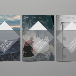
Established in 1996 The New Zealand Antarctic Research Institute is the body responsible for developing and managing New Zealand’s scientific research and conservation activities in Antarctica, Southern Ocean and Ross Sea region while also raising ‘public awareness of the international significance of the continent’. The institute’s new identity, which replaces an illustrative fern and penguin mark, was designed by Auckland based BRR and delivers a broader and more scientific sensibility through symbology, metaphor, simple geometry, monochromatic colour and a neutral typeface.
Read the review here

Triumph & Disaster is a new male skincare and accessory range created by Dion Nash that aims to unite the traditional grooming experience with the high quality, natural and scientifically formulated expectations of today’s market. The range’s packaging, developed by New Zealand based design studio DDMMYY, references and confidently brings the type-heavy, heraldic, structural and material choices of the past into the present with a contemporary consistency and a distinctive white on black colour palette.
Read the review here

Living Earth is a New Zealand based brand of organic compost created by collecting, recycling and ‘brewing’ green waste likely to have ended up in landfill sites. Digital design agency Fracture, working in collaboration with packaging specialist Ryan Marx, recently redeveloped the brand’s range of compost bags and bottles replacing a plain single and two colour economical design with a bright and playful resolution of vivid spot colours, simple plant illustrations, an expressive character style and a subtle sense of narrative.
Read the review here