New Zealand Antarctic Research Institute by Richards Partners
Opinion by Richard Baird Posted 30 August 2012
Established in 1996 The New Zealand Antarctic Research Institute is the body responsible for developing and managing New Zealand’s scientific research and conservation activities in Antarctica, Southern Ocean and Ross Sea region while also raising ‘public awareness of the international significance of the continent’. The institute’s new identity, which replaces an illustrative fern and penguin mark, was designed by Auckland-based Richards Partners (formerly BRR) and delivers a broader and more scientific sensibility through symbology, metaphor, simple geometry, monochromatic colour and a neutral typeface.
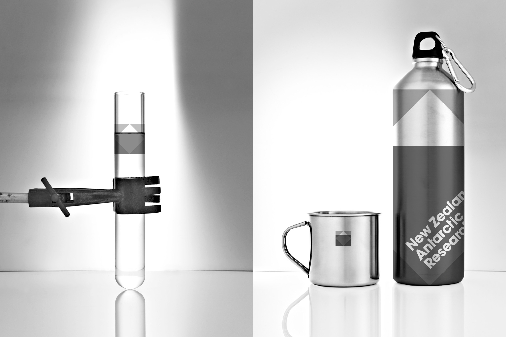
“The design challenge for BRR was to capture the essence of Antarctica – ‘The Earth’s White Box’ whilst retaining both the integrity of the scientific research and capturing the visual beauty of this majestic continent. The BRR team realised that information on this continent was like an iceberg floating in the ocean. As icebergs reveal a small section of themselves above the horizon whilst concealing a greater part underwater, there is a large percentage of information that still requires investigating for the betterment of our planet’s future.” – Richard Partners
The original identity was a well illustrated union of fern and penguin, a simple and communicative representation of both country and continent, but perhaps lent more towards conservation rather than a broad and hard scientific research remit. In contrast the new identity strips away the detail in favour of an elemental, geometric composition, overlays, intersections and a grey colour palette that resolves a neat sense of structure, process, pragmatism and analysis. Its straightforward combination and orientation of basic forms to create an iceberg is an incredibly clever, powerful and well appropriated visual metaphor that works incredibly well to hint at the expansive and predominantly hidden nature (and scientific value) of a continent that on the surface looks desolate. Inside a neutral sans serif type choice delivers a formality and professionalism while the tilt adds a slightly curious personality.

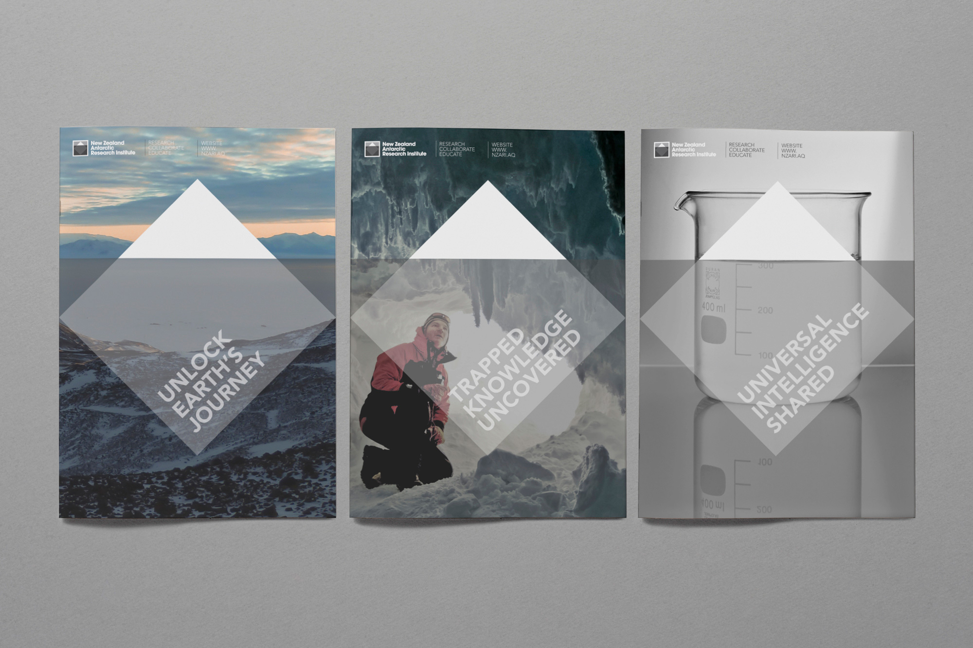
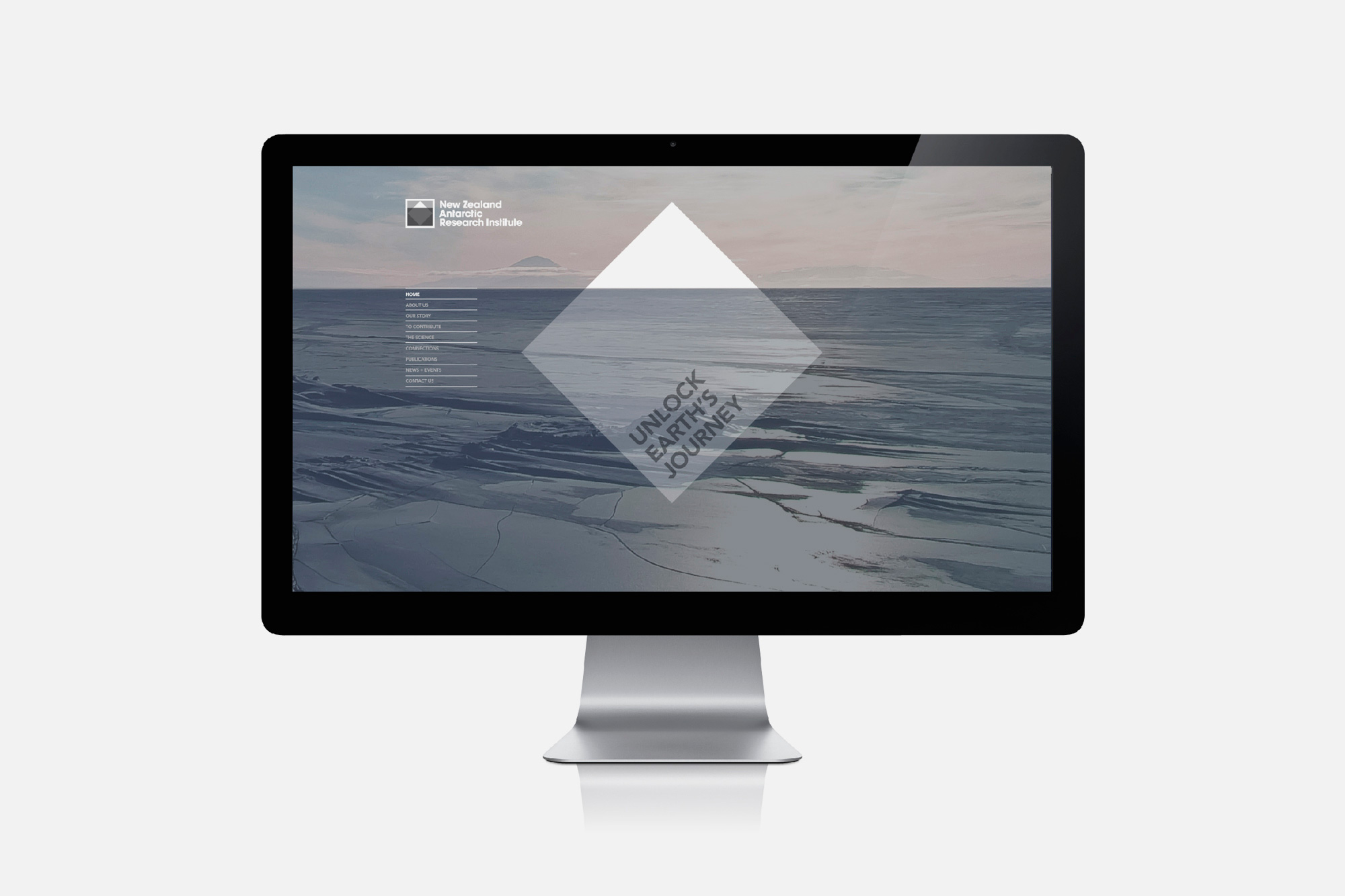
The waterline, extending outside of the logo-mark and across the website and collaterals, establishes a very strong union between identity, information and communication but perhaps also refers to the infinite possibilities of the never-ending horizon, another nice metaphor for research and exploration. The very simple, structural and grid based nature of the graphic components is neatly juxtaposed alongside the organic and detailed nature of the photography that, while very different and striking in contrast, appear to resonate very well together.