Sam Flaherty by Sam Flaherty
Opinion by Richard Baird Posted 17 September 2012

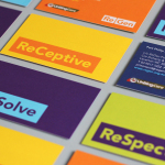
Sam Flaherty is a Sydney based freelance graphic designer and art director with a client roster that has included Citibank, Penguin Publishing and Panasonic. His visual identity, a juxtaposition of machine production and hand-finish – communicated through stamp and marker detail, craft material and personal language alongside modernistic non-hierachical, sans-serif typography, grid-based layouts, conventional print techniques, a limited colour palette and plenty of space – bound together by a contrasting circular logo-type – neatly reflects his belief in ‘clear, concise messages through design elegance and reduction’. It is a design solution that resolves a personal but professional approach through a smart combination of creativity and restraint, an aesthetic that is consistently reflected throughout Sam’s portfolio.