Cuckoo by Band
Opinion by Richard Baird Posted 24 September 2012

Cuckoo is an underground electronic music venue, cocktail and tapas bar located on Adelaide’s Hindley Street. To celebrate their fifth year in business multi-disciplinary design studio Band was commissioned to develop a new visual identity and interior design for the venue. The result is an unusual mixed typographical solution that favours personality over design convention appropriately tempered by a consistent collateral and interior solution with craft-cues.
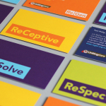
“We were engaged to not only rebrand the venue but also consult on a revised floor plan to help activate dead areas. A logotype was created with various weights of monotype fonts that gave a quirky character which perfectly suited the different types of electronic music that is played at the bar. As the main colour scheme for the interior was black and white, pastel coloured papers were used for the menus and various collateral to give splashes of colour throughout the space and again ad to the quirky nature of the venue. The main graphic walls were pasted with black and white posters of various imagery, these were layered, ripped and torn to create an interesting textural collage of imagery. Old pallet timber was used to create feature walls behind the bar and dj booth, this added warmth into the interior and visually highlight these key areas. The update to the venue has seen a great response from the public and numbers have been gradually increasing every week since it’s launch.” – Band

I have broken from my usual criteria and posted a logotype that, in isolation, I do not really like but one that neatly utilises what is perhaps the typographical equivalent of onomatopoeia to fuse visual and verbal qualities. For me the true design merit lies in the smart juxtaposition of the multiple line weights, type inconsistencies and non-format qualities of the visual identity set within the formatted context of the collateral’s grid based layout, use of a lighter geometric sans serif and non-hierarchical typesetting. It is a balance that achieves an anarchic sense of individuality without sacrificing a sense of consistency and reliability. The strike-through detail and vertical typesetting, pastel colour palette and a cut, torn and paste newspaper interior introduce a contemporary arts and crafts sensibility that resonates well with underground/left-field performance and the independent nature of the bar.
It is an odd but memorable solution that avoids appearing superfluous while managing to leverage an intentionally awkward design aesthetic within the context of good to deliver significant contrast and brand character.