BritBag by Salad Creative
Opinion by Richard Baird Posted 19 October 2012

Classic Bag is a UK-based cost-effective packaging solutions business that prints and manufactures carriers, boxes and bags for a variety of retailers, hotels and fashion brands including Browns, Vivienne Westwood and The Dorchester. Independent graphic design studio Salad was commissioned by Classic Bag to develop an identity and a series of ‘innovative and exclusive’ retail bag concepts under the new label BritBag. Utilising a simple combination of monogram, sans-serif logo-type, limited colour palette and illustrated pattern work with a familiar Britishness, the solution mixes the playful and iconic with a high-street fashion quality.

“The British made bag, which is made in a completely new way, offers versatile size options, a reduction in paper and a construction method which allows for a lighter paper weight. Allowing for less waste and noteworthy cost savings. In keeping with the 2012 patriotic revival, the brand name ‘BritBag’ was conceived. We then set about creating an identity and series of bag designs which would showcase the product and position it in the mid to upper high street fashion brand arena.” – Salad


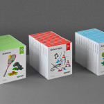
Salad’s visual identity solution is a simple well executed looping and concentric double B monogram bound by a single line. Its consistent monolinear weight and soft terminals tie it well to a tall and neatly spaced uppercase sans-serif logo-type. The solid fills of the illustrations deliver a weighty contrast to the monogram and logotype, and although perhaps thematically a little saturated, their flat geometric construction appears simple yet contemporary and draws on a stereotypical Britishness to compliment the name and origins of the business.

The linear arrangement of the patterns across the bags introduce a good sense of motion and interest, while the slightly muted and cream colour palette and rendering of image delivers cohesion. The nipped rather than folded edges of the structural design, as well as their unusual proportions, deliver a more unusual, unique and creative quality reflective of Britbag’s expertise. The result is a neat balance of classic and contemporary graphic and structural design cues that blend the traditional with modern fashion sensitivities.