Christopher Elliott by Studio Brave
Opinion by Richard Baird Posted 30 October 2012

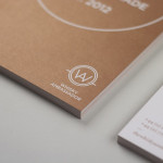
Christopher Elliott is an Australian interior designer based in Melbourne with a modern luxurious and clean architectural style. His new visual identity, created by Studio Brave, neatly unifies and communicates the practicality and functionality expected of modern architectural spaces and the fine detailing and high quality of the fabrics, fixtures and furniture that fill these. This is achieved through the juxtaposition of the tall and light uppercase and reductionist forms of a mono-spaced logo-type, light monolinear shapes, plenty of space and the grid-based layout of the website, set alongside the very classic qualities of a tactile, letterpressed, cream, uncoated substrate, gold metallic spot colour and the gilded edges of Christopher’s business card.

“Christopher Elliott approached us at time when his interior design profile was making waves in the industry as an emerging talent. With recognition growing, the time was right to establish a distinctively identity, both bold and restrained, reflective of his core principles.”
“We began with a brand workshop to define the unique attributes of the practice. A theme that emerged was that of ‘harmonious contrasts’. While Ironic in essence, they are characteristics which differentiate Chris’s style. The meticulously crafted identity combined juxtapositions of subtle and bold elements, and marriages of nature and geometry.” – Studio Brave