Calabuch by Tres Tipos Graficos
Opinion by Richard Baird Posted 7 January 2013

Calabuch is a Spanish agency that provides management and representative services to international actors, actresses and directors. The agency’s visual identity, developed by multidisciplinary design studio Tres Tipos Graficos, builds on a name created to evoke the Spanish and ‘golden age’ of fifties cinema through modernistic typography across the etched illustrative detail of a classic, hand-wound camera, a tactile collection of uncoated substrates and a bright but restrained two-tone colour-palette.
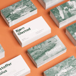
Built from the bold, consistent weight and geometric, uppercase, sans-serif characters of Gotham – a typeface that captures the functionality of mid 19th century American signage – the logo-type, set over the hand illustrated dimensionality, fine lines, shading and accurate depiction of a classic camera, delivers a distinctive contrast that neatly resolves both a sense of formality and technical skill. The leveraging of the current typographical popularity of Gotham within movie poster design – see the Dark Knight, Prometheus and Inception – and its reference to 1950’s American introduces a subtle but appropriate contemporary/retrospective duality that, intentional or not, adds a conceptual weight to its selection. The identity is consistent rather than diverse and coherent across a collateral design that utilises a couple of uncoated material choices, stamps, an overlay treatment that has a screen-printed quality and light emboss to further the period aesthetic of the graphic design with tactile, traditional and humanistic touches.
It is smart but simple juxtaposition of fine and classic detail, bold and contemporary typography with conceptual relevance across communicative material choices that resolved work well to represent professional and experienced artists who value and understand the history of their industry.