Packaging: TANGENTGC

TangentGC designed by Essen

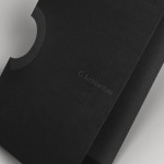
Design agency Essen have recently completed a packaging and rebranding project for TANGENTGC, a Stockholm-based company committed to the development of organic garment and shoe care products that aim to ensure longevity. Their design solution – a simple, utilitarian, monochromatic typographical approach – delivers a sense of information purity through the rejection of superfluous language or superficial graphic detail and choosing to divide content only by the uppercase and lowercase typesetting of a neutral sans-serif. A subtle combination that works quite well to convey a collective brand practicality and researched effectiveness, and the open and honest use of natural ingredients in each product – appropriately placed at the centre of each label.

TangentGC designed by Essen

TangentGC designed by Essen

TangentGC designed by Essen

TangentGC designed by Essen

TangentGC designed by Essen

If you liked this then you may also like:

Casa Bosques    Healgel    Cure

Richard Baird

Richard is a British freelance designer and writer who specialises in visual identities and packaging. He’s written for Brand New, Design Week and The Dieline, featured in Computer Arts magazine and also runs the resource Design Survival.

Follow:     |     Twitter     |     Facebook     |     Portfolio     |     Contact


Leave a Reply

Fill in your details below or click an icon to log in:

WordPress.com Logo

You are commenting using your WordPress.com account. Log Out / Change )

Twitter picture

You are commenting using your Twitter account. Log Out / Change )

Facebook photo

You are commenting using your Facebook account. Log Out / Change )

Connecting to %s

Follow

Get every new post delivered to your Inbox.

Join 2,828 other followers