Level Improvements by Studio Hi Ho
Opinion by Richard Baird Posted 19 February 2013

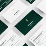
Level Improvements is a small-scale builder that possesses, in the words of Hi Ho – the studio responsible for their new identity – a characteristic often lacking in others in their field — a high level of craft and attention to detail. To reflect these values, Hi Ho developed a ‘easily managed and straight talking’ visual identity solution that leverages the similarities between an uppercase L and a carpenter’s square – a measure of straightness and a steady hand – and isolates it with a typographical quirk to convey both continued consistency and a sense of individuality that distances it from other unreliable services.

The neutrality and heavy weight of the logotype’s tightly spaced, sans-serif letter-forms mixes corporate professionalism with a structural, bold and no nonsense utilitarian functionality. This is tempered slightly by the accessibility associated with lowercase typesetting and the unusual switching of the capital from front to back, clearly marking the L out as communicatively relevant, neatly reinforcing the name with iconic form and adding a proprietary quality. This typographical detail and its representative value is effectively enhanced by the logo-type’s confident, over-sized monochromatic execution across the stationery, reinforced by lighter grid and guide-based elements and layouts, and complimented by the more personal promise of the strapline ‘Always on the level’.


The result is an incredibly simple but smart observation that manages negative perceptions, appropriately unites build quality and straightforward manner through a basic, fundamental and broadly understood tool of construction.