Manor Studio by Manic
Opinion by Richard Baird Posted 22 February 2013

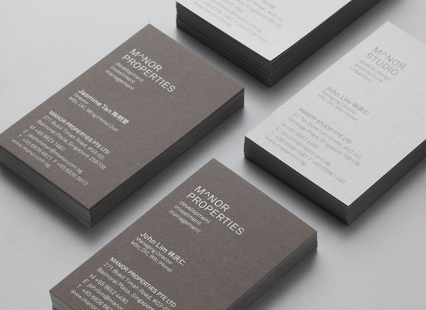
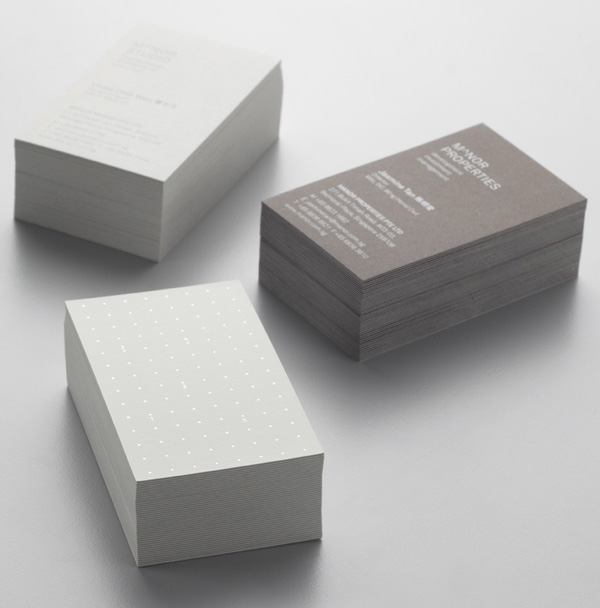
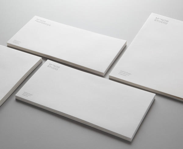
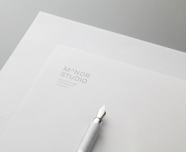
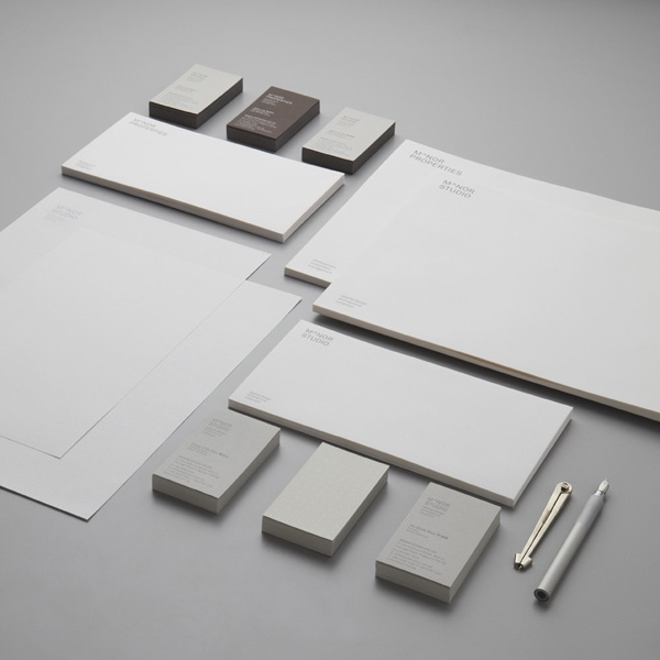
Manor Studio is a Singapore-based architectural and spatial design practice serving both commercial and residential clients, while its sister company, Manor Properties, specialises in development and investment. To accommodate this duality design agency Manic created a visual identity solution that fuses a set of logo-types – ‘subtly accented by the mathematical symbol for exponentiation’ – with a grid-based pattern device, two uncoated, dyed material choices and a reflective print finish across the stationery.
While the letter-form’s stroke width and colour are a little lighter than the average architectural identity – perhaps to accommodate the aspect of property development – the logo-type has a solid sense of space, in and around the characters, geometry and a confident, uppercase professionalism and authority. Its consistent weight, square terminals and junctions have a near neutrality which has been given a subtle proprietary twist and additional communicative value in the abstract/reductionist sensibilities of the A. A detail that, through the forming of an upward arrow, the peak of a roof and an almost founding, elemental, structural nature, neatly binds the disciplines of upward, high-rise commercial builds and residential development.
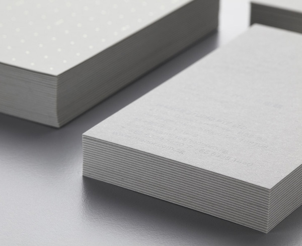
Rather than the complete monochromatic abstraction of light and shadow common to the industry, Manic have opted for the reflective and light absorbing combination of what looks like a foil deboss print treatment over the uncoated substrate of a duplex business card. Its cool and warm concrete grey, duplex weight and texture sharing some of the qualities of raw, architectural materials. A dot-to-dot detail across the front and a grid-based typographic layout on the reverse neatly draws together the themes of connections – modular construction and collaboration with contractors – pragmatism and a technicality with an unusual level of engagement that is a little unrewarding.
The result is a combination of familiar industry cues that confidently leverage established perceptions to resolve and convey structural reliability, collaboration, technical proficiency and an appreciation for light and space.

