Longton by Longton
Opinion by Richard Baird Posted 25 February 2013

Longton is a Melbourne-based multidisciplinary design studio, established in 2012 by Michael Longton, that offers its clients holistic design solutions built on Michael’s past experience—under his previous agency And—with large, international businesses such Sony Music, Billabong, Stussy and Warner Music.
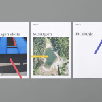
The studio’s brand identity—an unusual, modernistic arrangement of neutral sans-serif characters, recurring circular forms and a single consistent line weight forming a logo—has a reductionist quality with the underlying qualities of a logic game or mind map. Its expanded letter-forms – isolated by generous spacing but collectively united by the container—establish a simple, proprietary value that perhaps reflects the arrangement or coming together of external sources—be that information or experience—into a single and cohesive resolution.
“We offer experience behind every job and approach work attentively. Intensive research allows us to be reactive, and challenging our designs keeps the work fresh and inspiring. By intentionally remaining small, our efforts on each project are larger. Our designers are in direct contact with clients, from start to finish. For us it ensures the message never gets lost in the design process, and for clients, it means the work is aligned with business objectives. When required, our studioʼs creative rigor combines input from our extensive creative network to ensure the right fit for each project.” – Longton


A debossed, black gloss foil across a weighty, 600gsm, uncoated, cotton substrate adds a subtle, tactile and high quality crafted finish to the restraint and geometric structure of the graphic design, lifting it without creating contradiction. On-line the mark unobtrusively sits over Longton’s portfolio of work, claiming, with a traditional stamp-like sensibility, a pride in ownership. The result has a quiet confidence, it speaks of individuality with a comfortable, experienced and pragmatic restraint rather than of excessive personality, flashy behaviour or superfluous detail.