Sancy & Regent by OK-RM
Opinion by Richard Baird Posted 12 March 2013
Sancy & Regent is a UK-based online boutique retailer of limited edition jewellery created by young international designers. Their visual identity, developed by independent design studio OK-RM, combines classic type, proprietary quirk and subtle embellishment with tactile material choices and a hidden high quality print finish, to convey small-scale craft with consistent, curated quality.

“We are an online boutique designed on a gallery or museum framework to be an immersive experience showcasing unique handcrafted work. Sancy & Regent present jewellery objects alongside the inspirations and processes that produced them as well as relevant collaborations in the fields of film, photography, literature, art and music from up and coming creative voices. Sancy & Regent is an obsession with all that is unique in the world of jewellery; an attempt to break out of the established parameters of selling jewellery online and inject some excitement into the sphere; to bring it closer to the pace of the fashion and art worlds.” – Sancy & Regent


Built from sans-serif characters with a nice contrast of two stroke widths, solid letter and line spacing and a tall, uppercase authority, the logotype delivers a professionalism and slightly retrospective fashion sensibility that avoids the trend for typographic neutrality in the industry. The unusual orientation of the ampersand introduces a distinctive proprietary quality that appears individual and quirky – something I think works well to convey an eclectic approach – while the two diamonds below perhaps implies an eye for classic aesthetic detail.
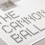
The tactile combination of a blind emboss, uncoated, bleached and unbleached, mixed fibre material choices and taped edge detail across the box deliver a clear sense of craft to the more formal aspects of type. A gold foil hidden within the internal walls is an unexpected finish that provides significant, communicative contrast that reflects the metallic and high quality nature of the jewellery. The use of plenty of white space and print finish across the printed collateral, the utility of the website, the heavy white borders and unusual crops of Matthieu Lavanchy’s monochromatic photography, while having a contemporary restraint neatly conveys the brand’s interest in the art, craft and fashion.