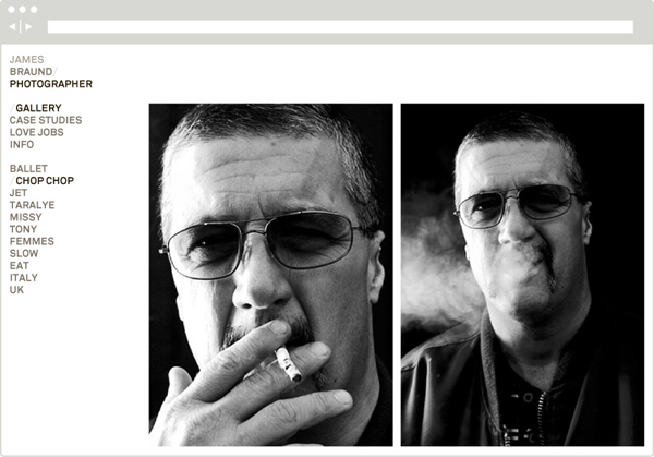
James Braund by Hofstede
Opinion by Richard Baird Posted 7 May 2013
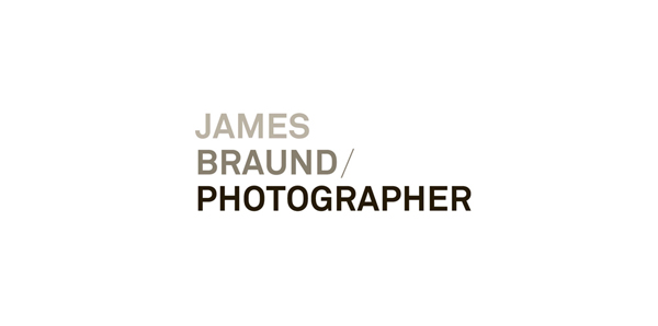
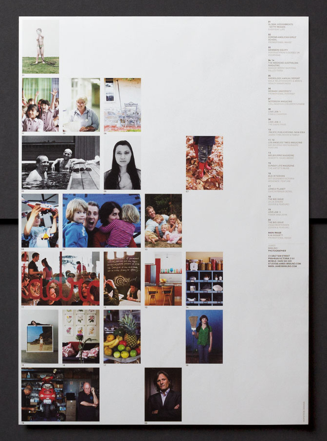
James Braund is a Melbourne-based photographer with a background in journalism, an approach ‘characterised by an unfussed, direct methodology’ and over twenty years of experience in the design editorial and advertising fields.
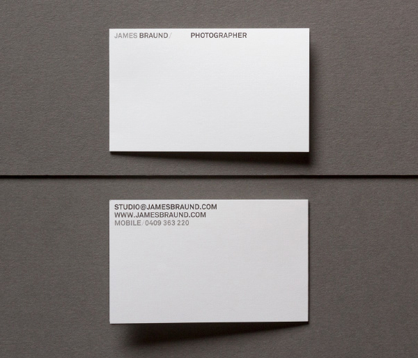
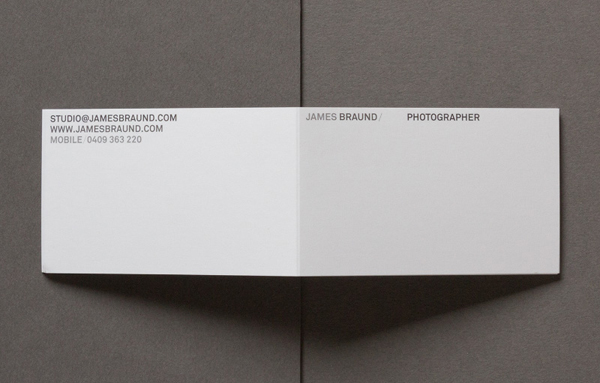
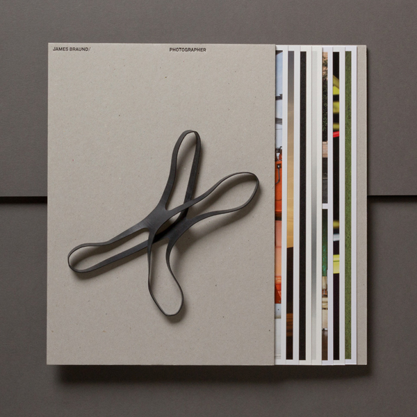
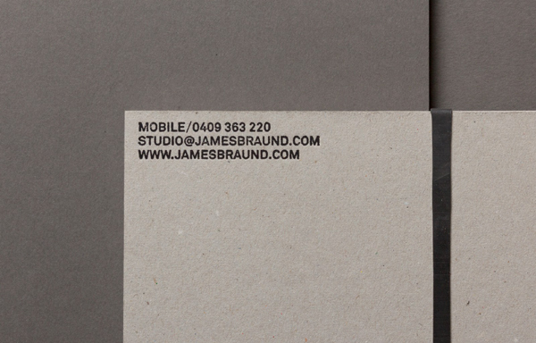
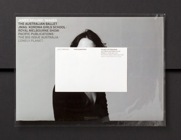
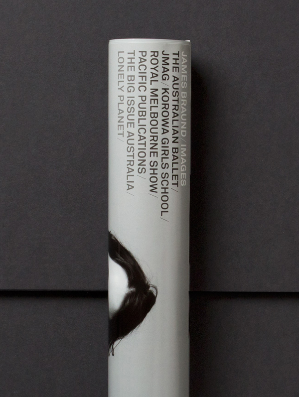
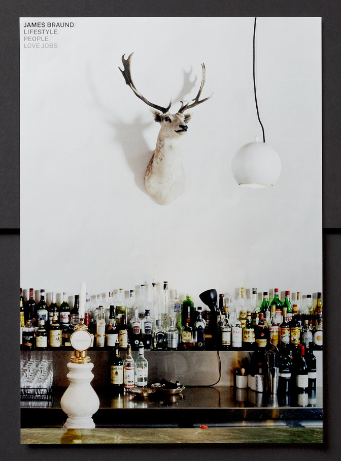
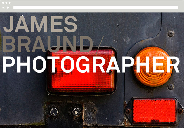
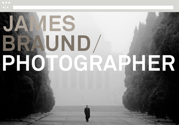
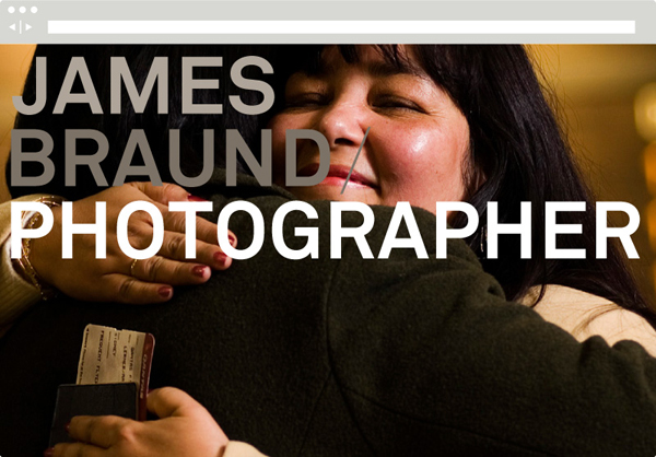
Arising out of a ‘desire for a more contemporary look aimed at designers and art directors’, James’ new identity, developed by Hofstede – an agency committed to typographical craft and detailing – conveys his methodology by leveraging the economy, utility and contemporary sensibilities of a heavy, uncoated, unbleached mixed fibre board, an urban combination of cool and warm concrete greys, the restraint and what Hofstede describe as the robust typographical choice of Akkurat executed with a stacked, uppercase confidence and a good eye for letter and line spacing. This type-only approach is elevated by the high quality finish of a foil set within the reductionist context of broad unprinted regions used across the collateral. The result is a modern aesthetic neutrality and fine detailing that neatly frames the rich detail of James’ photography.
Design: Hofstede
Opinion: Richard Baird
Fonts Used: Akkurat
