May’s Top 5 Projects 2013
Opinion by Richard Baird Posted 31 May 2013
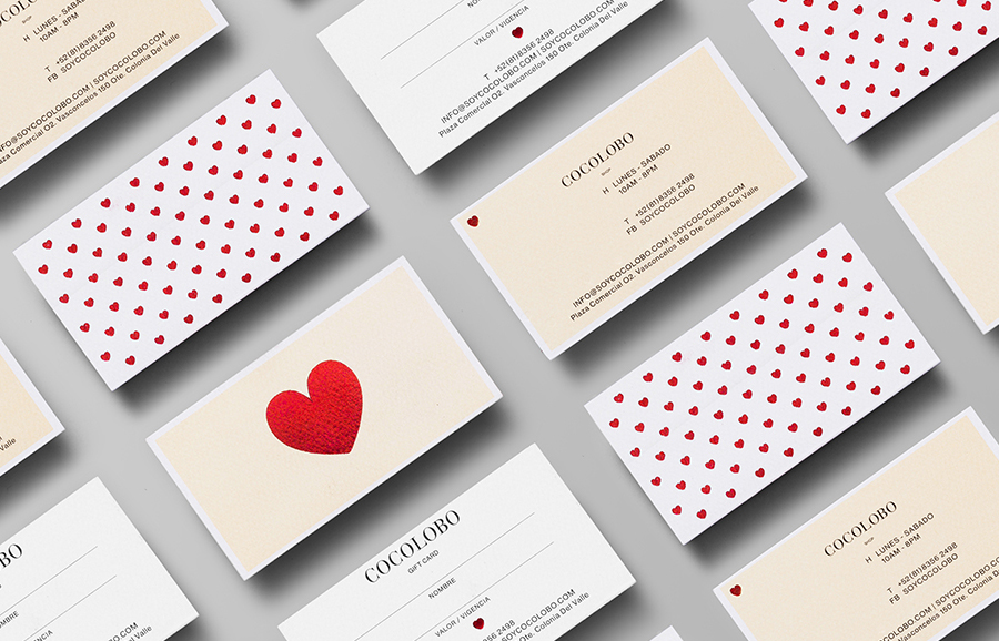
Cocolobo is described by Anagrama – the multidisciplinary design agency behind their new visual identity – as a ‘high-end shopping boutique that caters exclusively to strong women with a confident and in vogue fashion sense’. For the name, Anagrama played with the patrons’ ‘characteristic duality’, with a ‘catchy and fun’ compounding of “Coco” (coconut in Spanish) and “lobo” (Spanish for wolf), which helped to define the ‘Cocolobo woman’ as ‘not only feminine and sweet, but also independent, aggressive, sensuous and daring’
Read the review here.
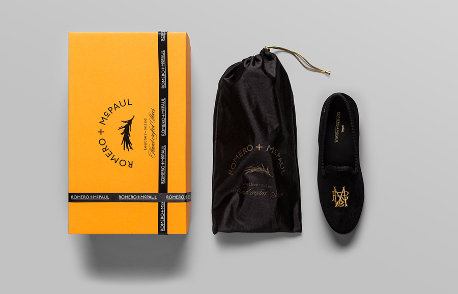
Anagrama have just completed the branding of Romero+McPaul, an English-style velvet slipper manufacturer and retailer established by Italian shoemaker Mr. Migliori that produces bespoke lines handcrafted by artisans with a ‘trendy twist’.
Read the review here.
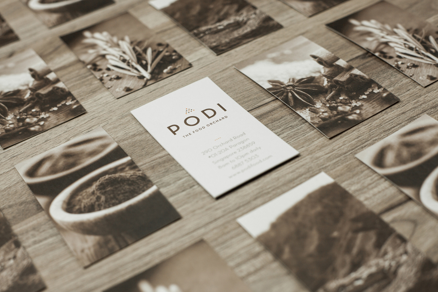
Podi is a Singapore-based organic restaurant that ‘celebrates bold, robust and unique flavours’ and the responsible sourcing and cooking of ingredients. Drawing inspiration from the restaurant’s name, a Hindi word to describe a mixture of ground dry spices and herbs, design agency Bravo Company developed a visual identity that pairs a small, abstract interpretation of heaped spices with a bold logo-type, earthy tones and tinted imagery to reflect Podi’s mission of making ‘good, natural and organic food’.
Read the review here.
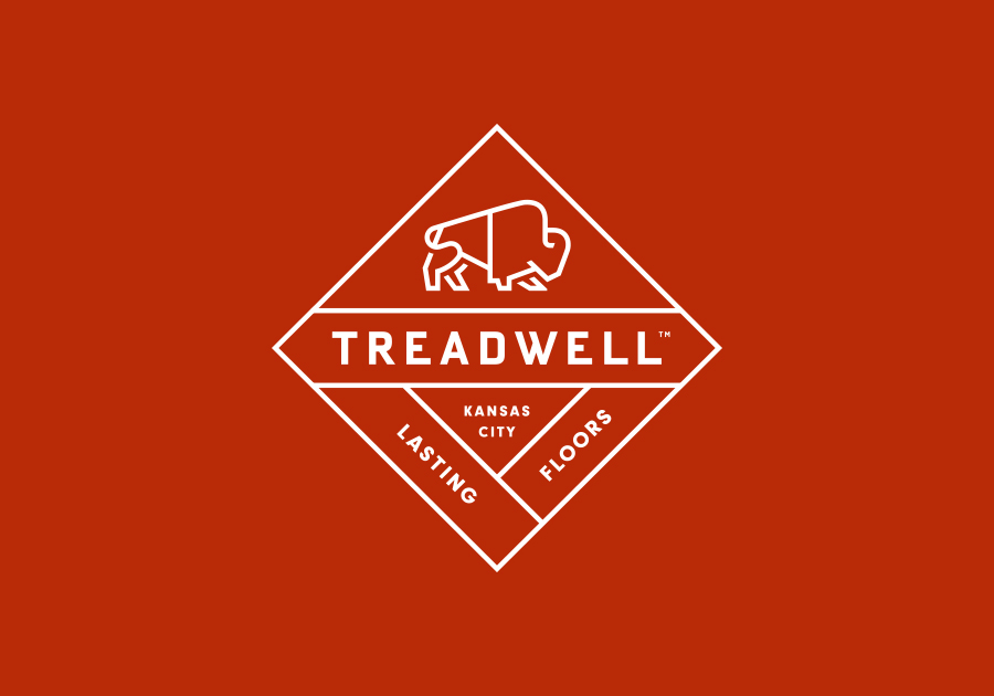
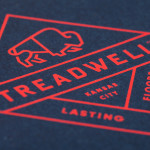
Treadwell is a Kansas-based floor installer who specialise in no-nonsense solutions that last. Perky Bros – the agency behind their name, visual identity and website – describe Treadwell’s philosophy as about ‘standing upright, walking the walk and empowering clients to move forward with confidence, secure in the knowledge that they’ve chosen the right product and the right people for the job’. The agency distilled this philosophy into an identity that unties the perceived strength of buffalos and geometry with the contemporary, on-trend restraint of a single consistent line weight and a matching logo-type.
Read the review here.
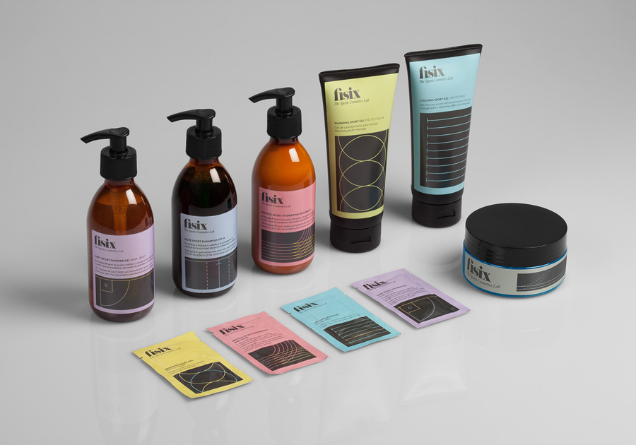
Fisix is a line of cosmetic products that includes shower gels, shampoos and hydrating skin balms, developed by four marathon running friends who ‘couldn’t find a range that met their needs as sportsmen’, branded and packaged by multidisciplinary design agency Mucho.
Mucho’s design solution unties the diagrammatic, geometric forms and typographical, sans-serif utility and neutrality of the pharmaceutical and sports science industries with the subtle fashion and on-trend design sensibilities of a tightly spaced, lowercase serif logo-type, italics, and a flat, economical, unisex grey and pastel colour palette. A smart balance of formulated effectiveness and the more exclusive, restrained qualities associated with high fashion and professional cosmetics.
Read the review here.

