Curious Space by Mash Creative & May Ninth
Opinion by Richard Baird Posted 10 June 2013
Curious Space is a London-based scenographers—a specialist scene setter—that creates “unique and inspiring spaces for museums, galleries and more”. Their visual identity, developed by Mash Creative and May Ninth, ‘splits apart to create a physical space that intrigues whilst the type can sit either horizontally or vertically in numerous layouts within the dotted grid”, establishing a flexible and unusual yet structured solution that extracts a proprietary value from the near-neutrality of Gotham’s geometric sans-serif characters.

The deconstructed nature of the logo-type, set within the boundaries of a grid which expands and contracts to accommodate different canvas and screen sizes, lend the typically corporate communicative impact of Gotham, a distinctive and quirky personality. The logo animation and multiple static layouts in print both manage to convey the themes of exploration, pragmatism, reinterpretation and non-conventional perspectives that really build on the ‘curious’ nature of the name as well as adding a creative dimensionality to a practice that works with predefined areas.
The jumbled and puzzle-like union of the characters perhaps contribute to a legibility limitation but one that places the values and services of Curious Space ahead of its own name, an interesting approach that makes the visual identity more of a mark with a lot more communicative value than a conventional logo-type.


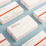
The use of a black ink, grey tint and plenty of white space across the stationery and business cards establishes a conventional sense of professionalism and formality but this is appropriately juxtaposed alongside a vivid, flat neon orange that provides significant contrast and an energy that resonates really well with the corporate/creative duality of the ID.
The contemporary restraint of a two ink print solution is also reflected in the economical functionality of a united address label and complement slip that can be separated from the letterhead through a simple perforation detail. These are elevated but not contradicted by the subtle but high qualities of a blind deboss and edge-painted detail.