Lulu Cake Boutique by Peck and Co.
Opinion by Richard Baird Posted 9 July 2013
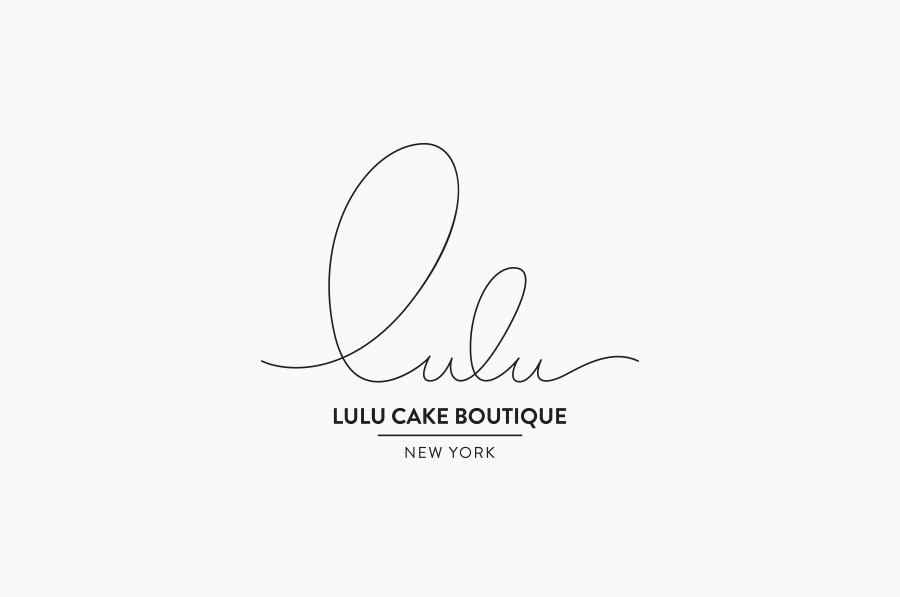
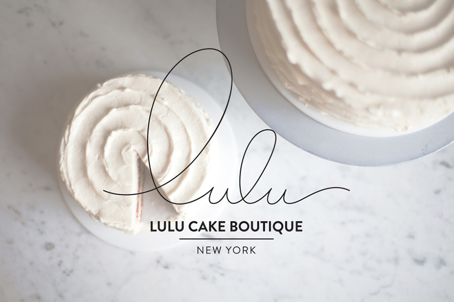
Lulu is a New York-based cake boutique who, in the words of Peck and Co., the design agency behind the boutique’s new visual identity, craft ‘masterpieces unmatched in flavor’ and are obsessed with detail, artistry and flavour.
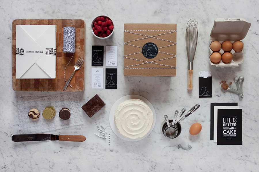
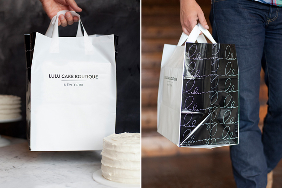
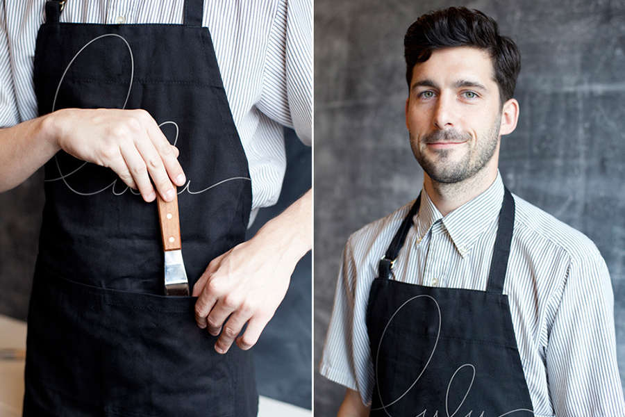
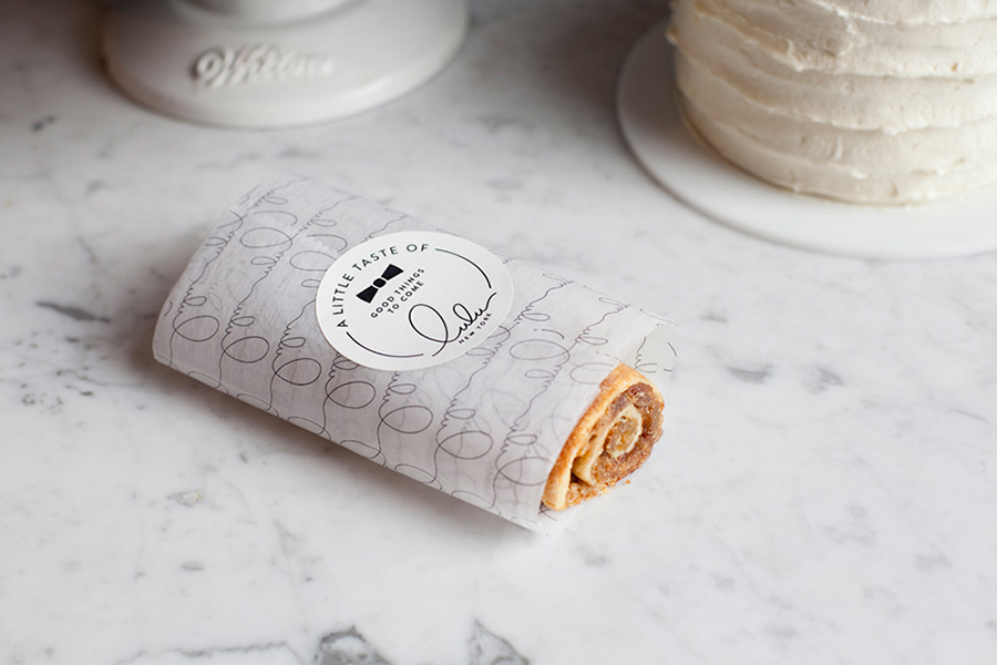
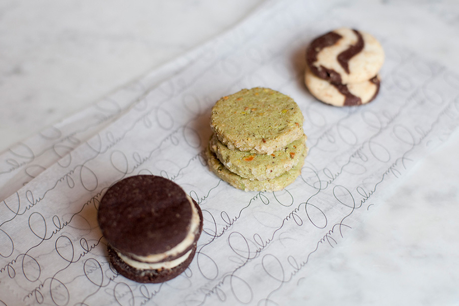
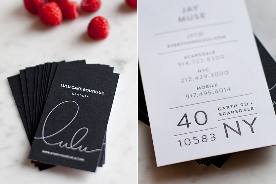
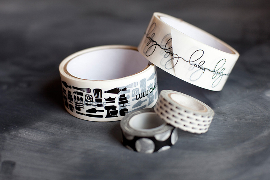
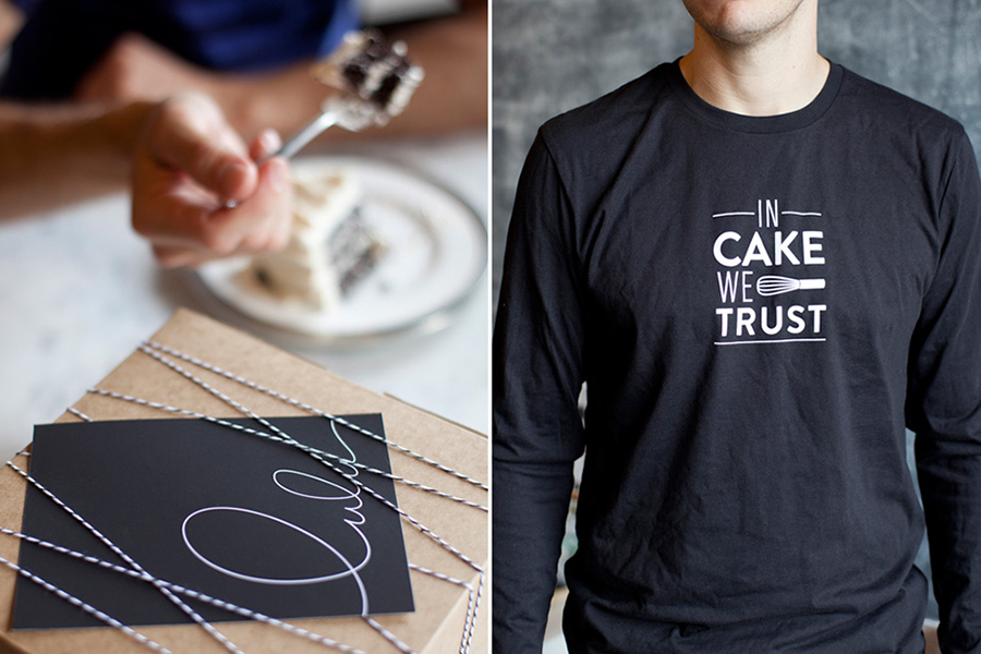
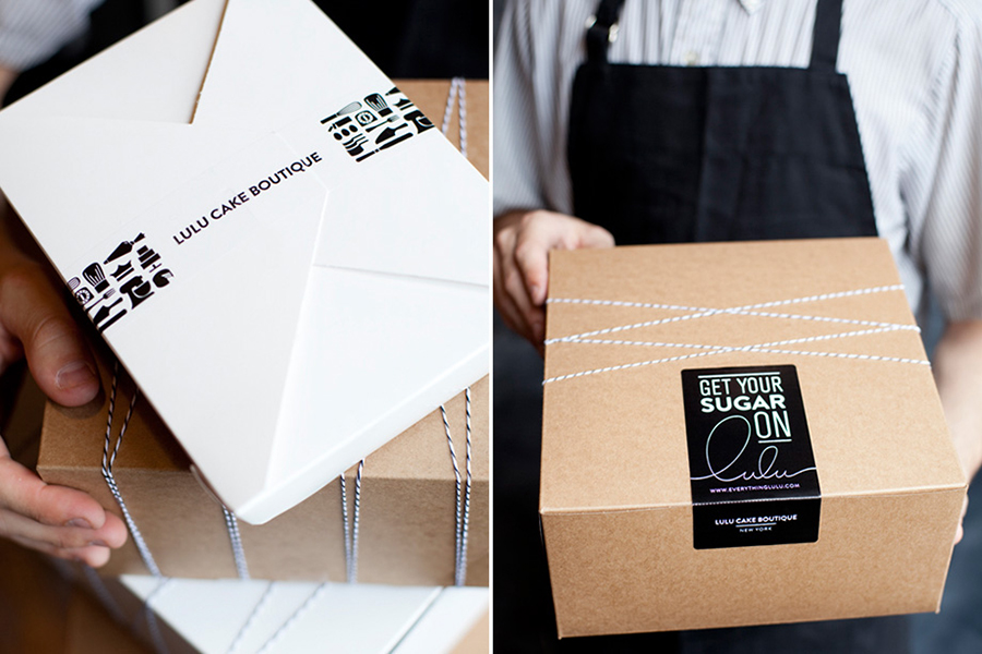
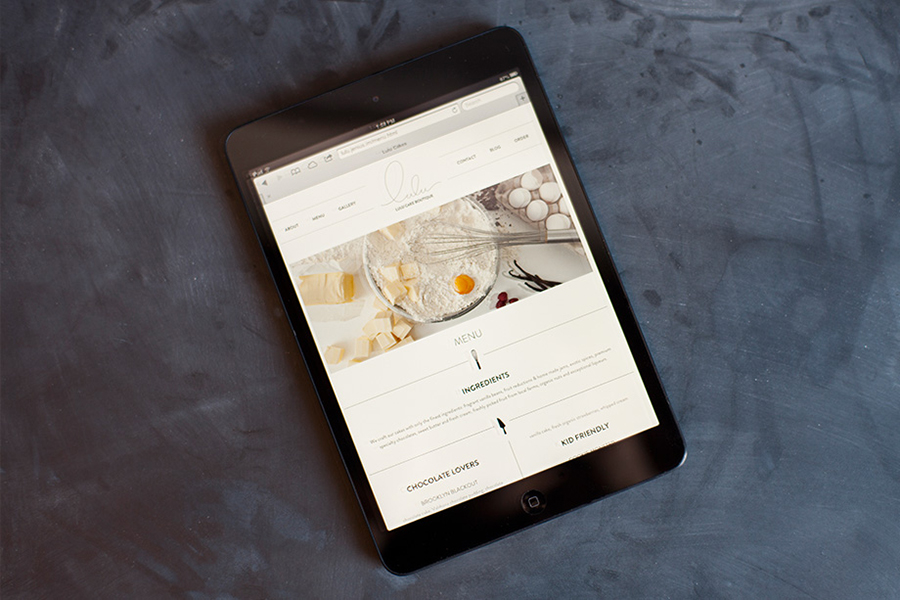
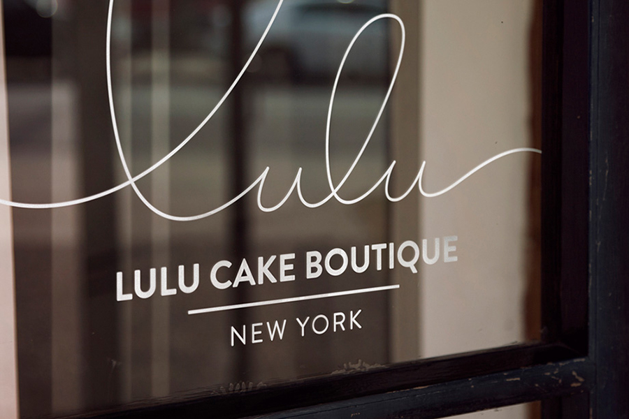
Based around a fine line script with large enthusiastic loops and a polished fluidity that neatly walks the line between personal signature and piped icing, contrasting uppercase sans-serif characters and a monochromatic colour palette, Lulu’s identity is a sharp juxtaposition of individuality and creative flourish alongside professional efficiency. While the illustrations and tone of voice (see ‘In Cake We Trust’, ‘Get Your Sugar On’ and ‘Life Is Better With A Cake’) feel a little generic and clunky next to the clear communicative duality and finish of the logotype the the use of unbleached, string-tied boxes, paper, stickers, tape and what looks like a letter-press finish work well to add a small-scale, traditional and custom sensibility to the project that really builds on the craft values of the brand.
