Odmé by Two Times Elliott
Opinion by Richard Baird Posted 16 October 2013
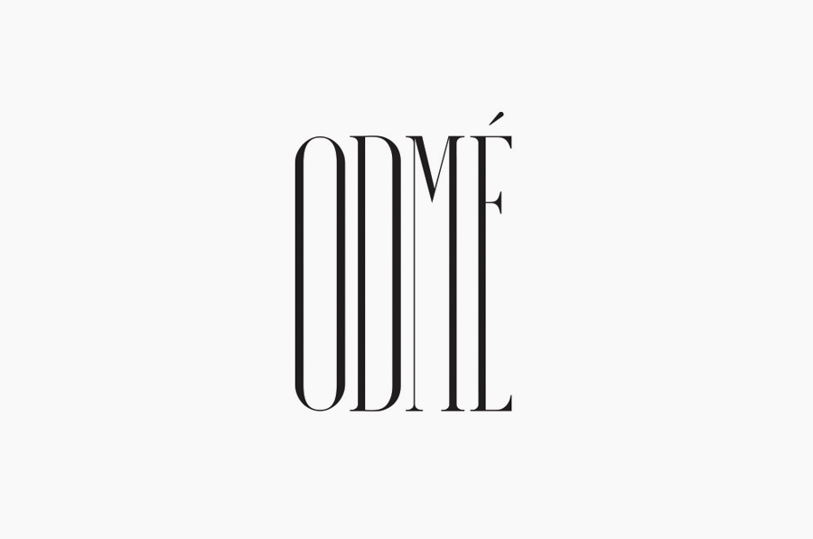
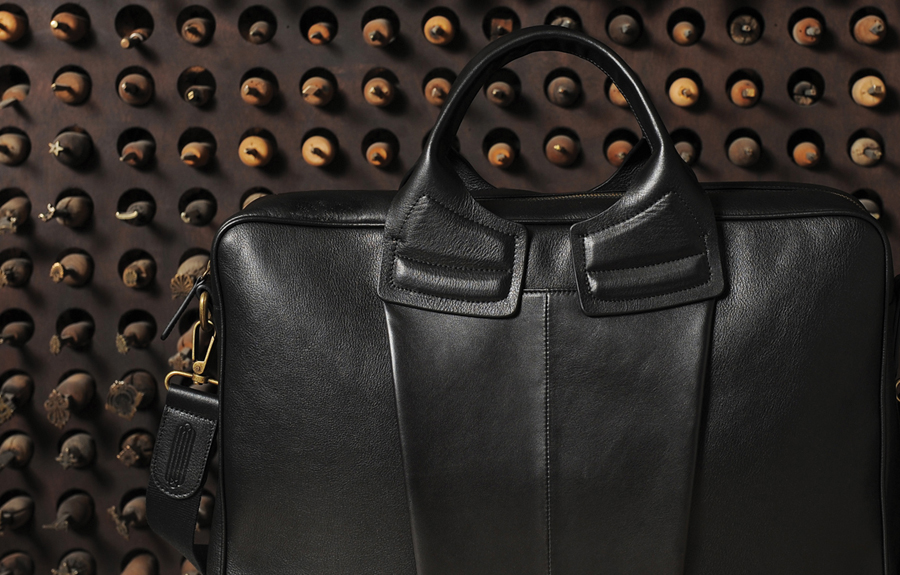
Design studio Two Times Elliott have just published their recent brand identity work for Odmé, a Paris fashion brand that creates handcrafted, elegant and timeless accessories with understated and urban sensibilities.
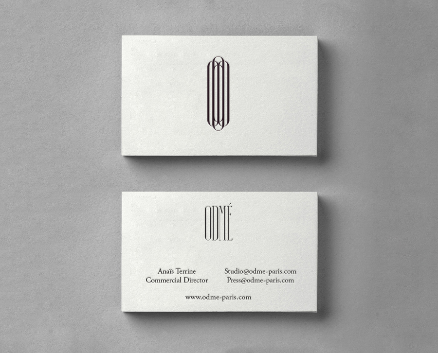
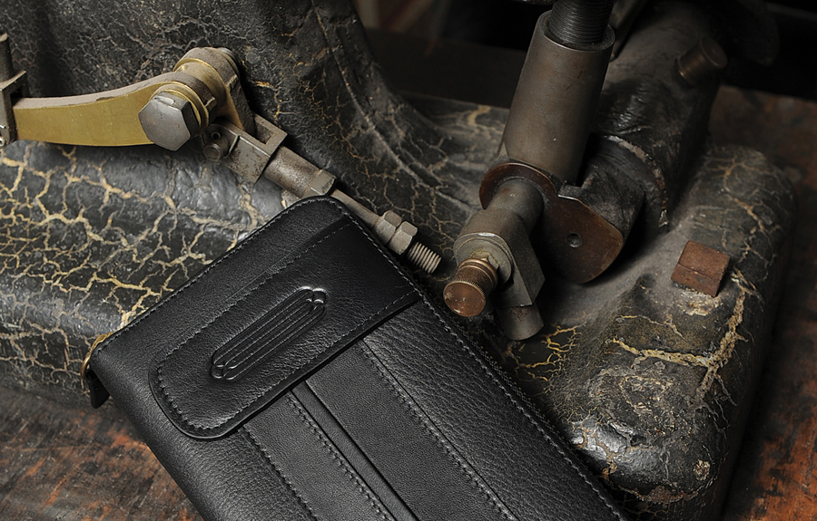
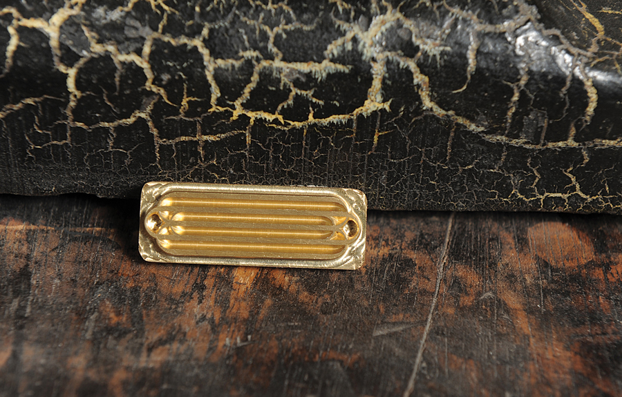
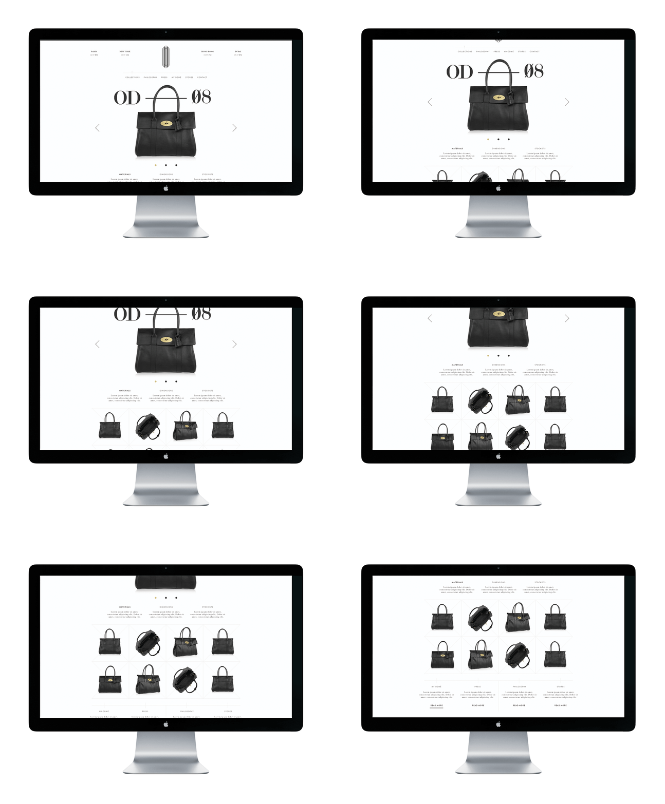
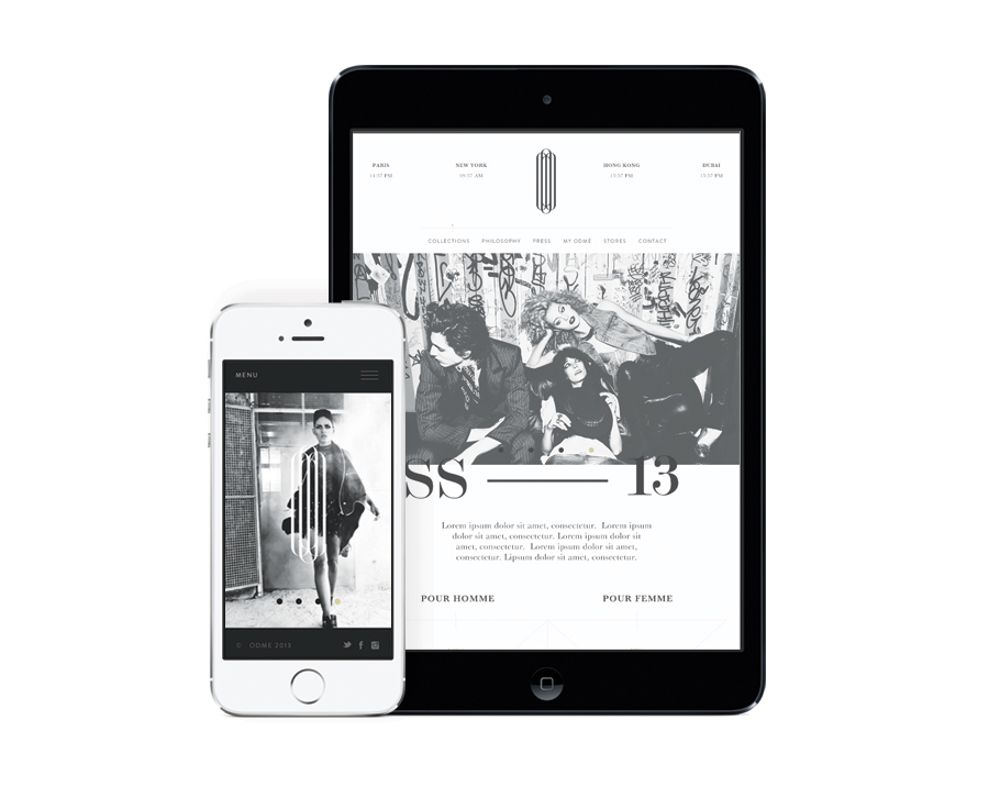
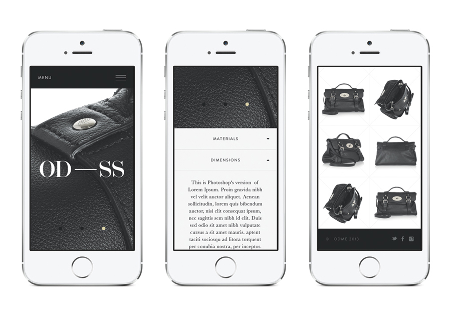
The studio’s solution—which includes a logo, logotype, website and collateral—plays very well to the luxury and crafted conventions of the industry and the urban qualities of the brand through the expense of what looks like a black foil letterpress business card, the responsivity of a website that mixes street photography with decay and graffiti, plenty of space and a bold secondary serif, and the restraint and perceived exclusivity of a blind deboss leather tag.
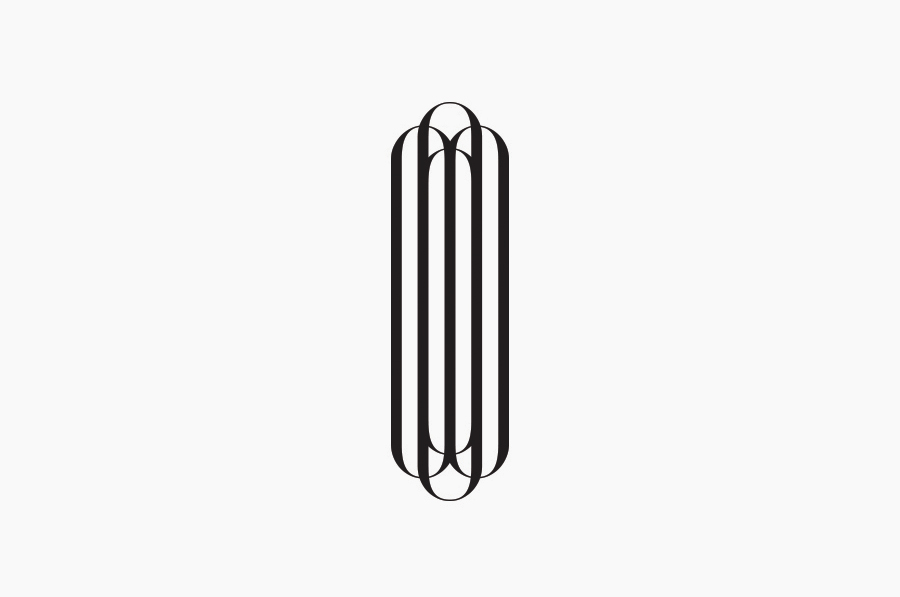
These finishes are given distinction and unique character through a logotype built from tightly spaced and condensed letterforms with a nice contrast of fine and heavy strokes, classic serif detail, a centre line that creates a nice sense of balance, and a very unusual height.
The result appropriately leverages familiar, high quality and classic high fashion cues and give these a very distinctive typographical twist that works well to convey bold style, fine detail, classic design influences but with a subtle contemporary creativity.
