Festningen by Uniform
Opinion by Richard Baird Posted 28 November 2013
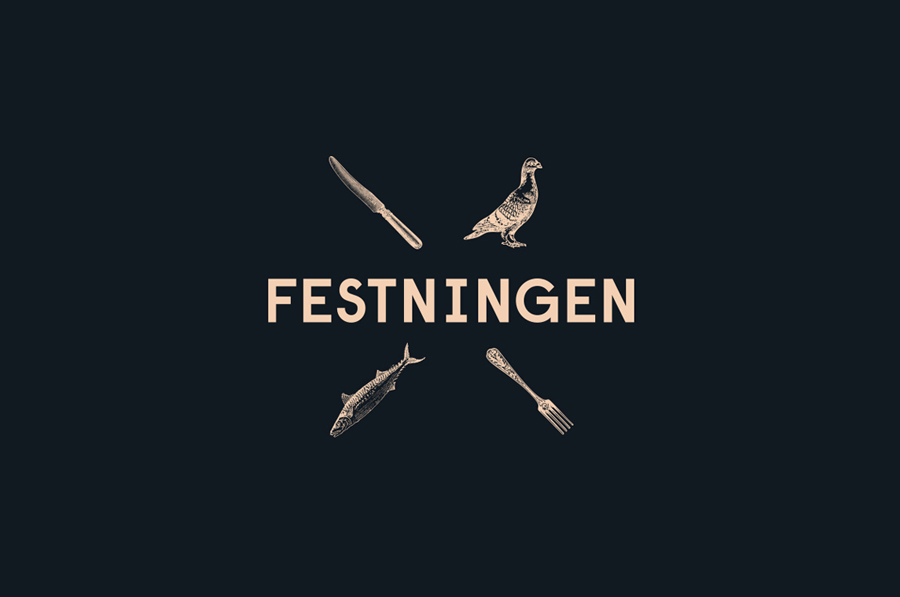
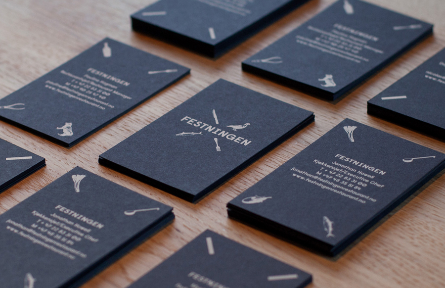
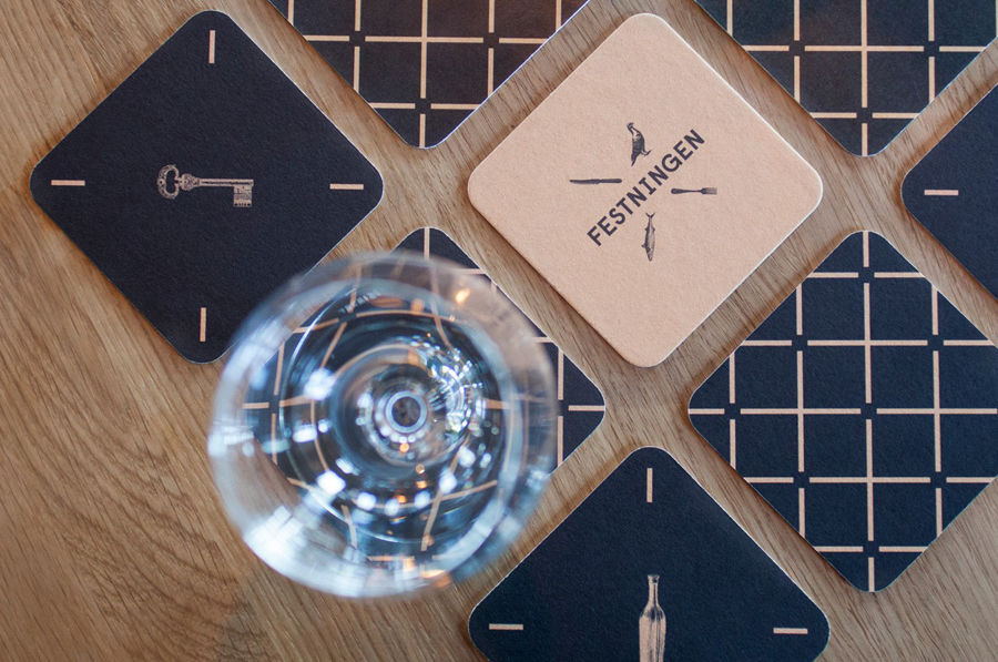
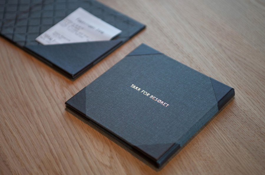
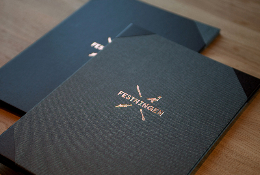
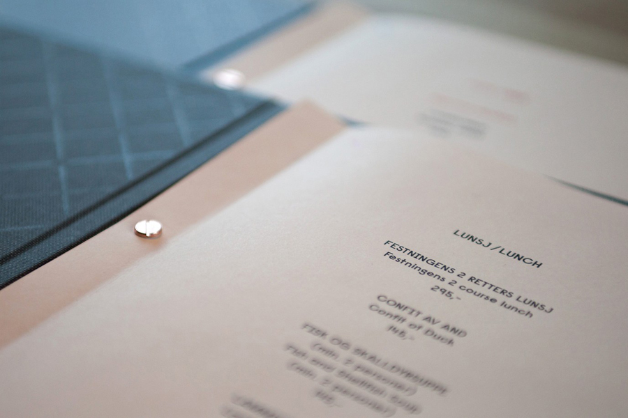
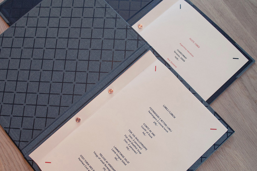
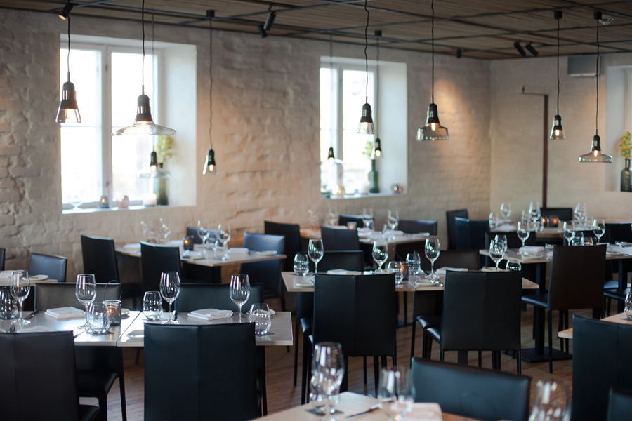
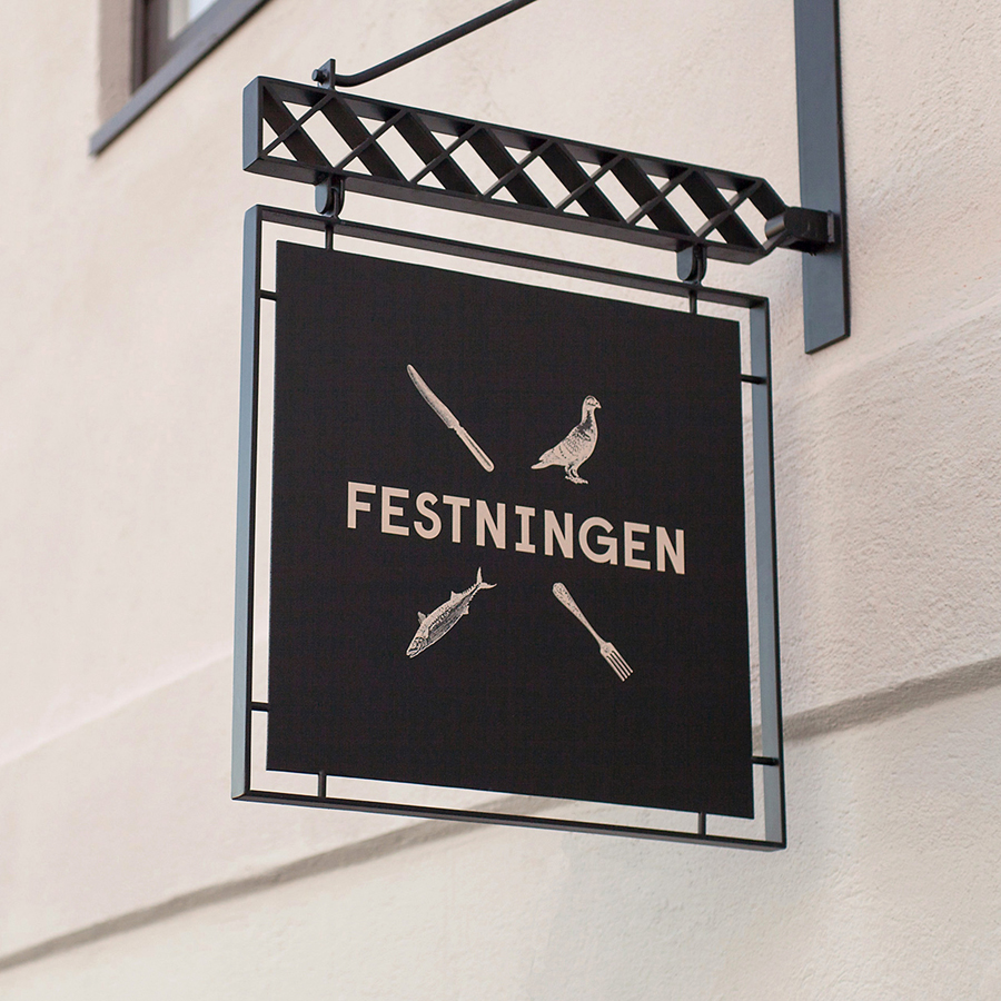
Festningen is a brasserie that serves a rustic French menu and is located in Oslo’s Akershus Fortress—a medieval castle and former prison. The brasserie’s brand identity, created by design studio Uniform, juxtaposes the traditional detail of etched illustration, a copper foil print finish and fabric texture, alongside a bold sans-serif, simple geometric pattern and light ink across dark papers and boards. This establishes what the agency described as a historical and contemporary guideline for Festningen.
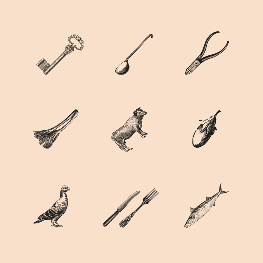
The direction Uniform have taken establishes a strong and quite literal contrast of past and present, utility and luxury.
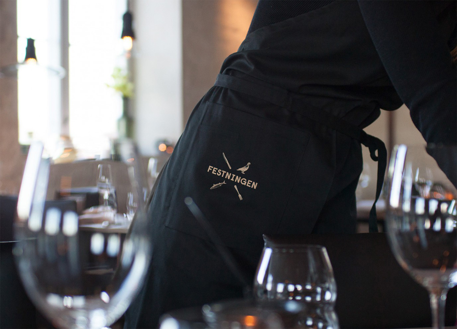
The illustrations appear authentic, likely drawn from historic stock, and have a solid combination of agriculture, livestock, cooking implements, cutlery and tools that draw together the quite disparate experiences of luxury dining and incarceration. Resolved with a strong diagonal consistency, the structure of these as an X just about side-steps hipster and while perhaps a little heavy handed across the business cards framing written content, they good at the centre of the coasters. The X of the illustrations is mirrored through a very elemental and contemporary interpretation of a classic diamond pattern detail – that may also draw its inspiration from a portcullis – that neatly tie the illustrations to the logotype.
The sans-serif logotype provides a far more rudimentary contrast to the detail of the images and introduces what could be described as institutional utility, something that also comes through in the salmon coloured paper and simplicity of the menu layouts. This utility provides a nice reflection of the history of the venue that, alongside the tactile and high quality combination of fabrics and uncoated boards, copper foil and screws, continues to deliver on the past and present uses of the venue with a sense of high quality.
