Föllinge by Amore
Opinion by Richard Baird Posted 10 June 2014
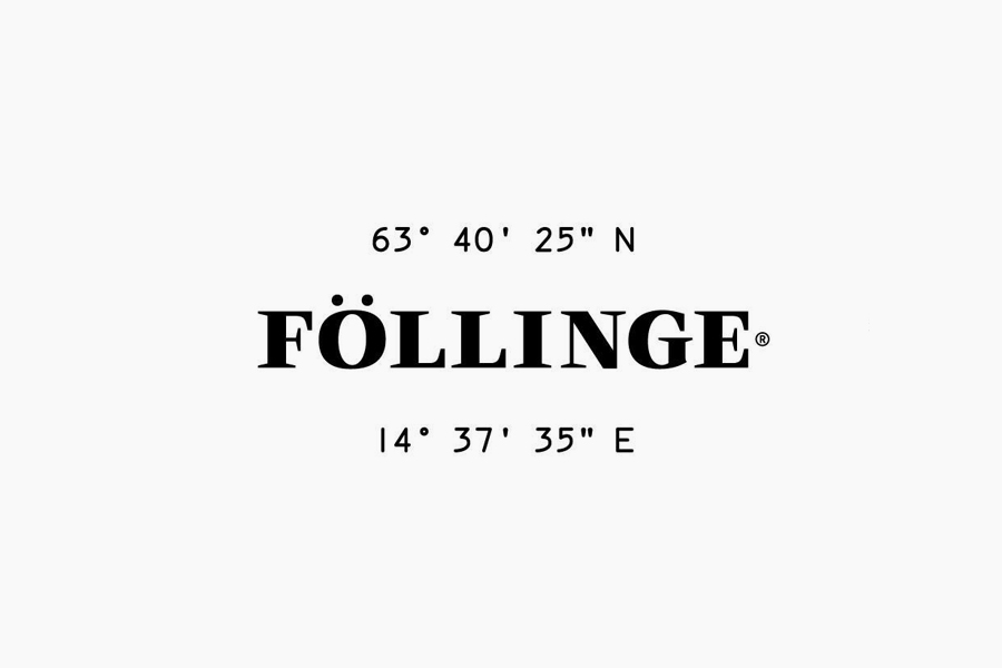
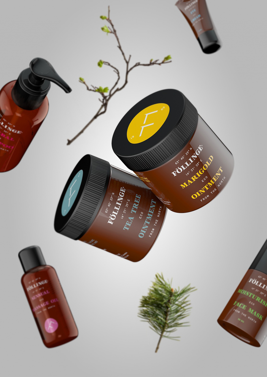
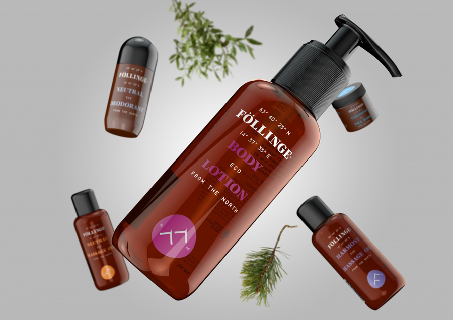
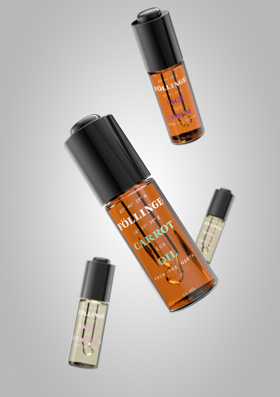
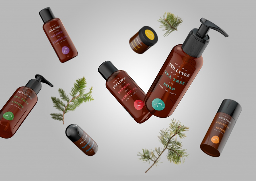
Föllinge is a natural and organic skincare brand named after the small village in the north of Sweden where each of its products are manufactured. Design studio Amore recently worked with Föllinge to develop a new brand identity and packaging solution for its diverse range of face creams, moisturisers, deodorants and ointments. Inspired by Nordic nature, Amore brought to the forefront Föllinge’s unique knowledge and expertise, handcrafted production processes, origin and authenticity, by juxtaposing the traditional amber glass tones and clinical effectiveness associated with a lab environment and the craft of a calligraphic past through a logotype based on Veljovic Black, alongside contemporary structural choices, bright highlights, a recent and utilitarian mono-spaced sans-serif, logo with an organic container and a longitude, latitude and date detail.
