Men’s Biz by ThoughtAssembly
Opinion by Richard Baird Posted 23 June 2014
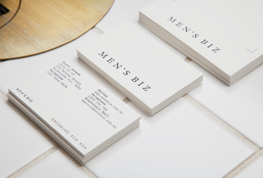
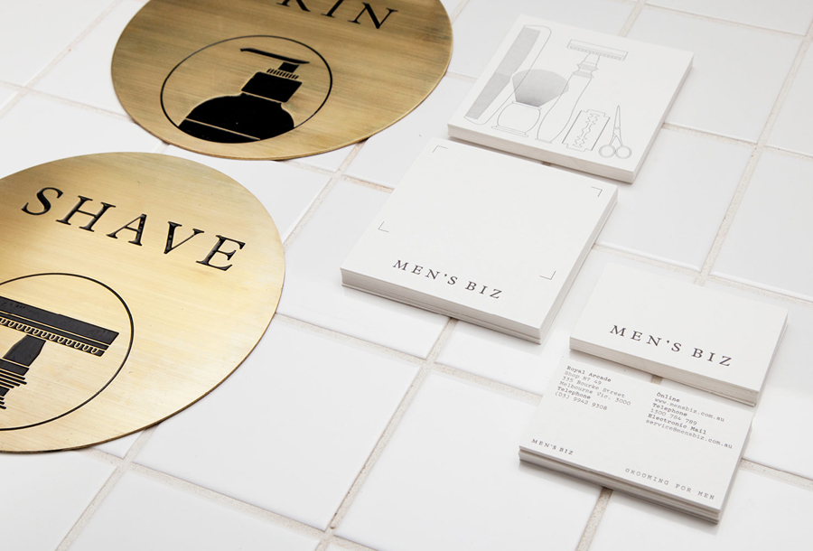
Men’s Biz is one of Australia’s leading online retailers of men’s grooming products. Following eight years of growth Men’s Biz decided to move into the world of high street retailing by opening their first physical store in Melbourne’s Royal Arcade. To coincide with this new venture Men’s Biz approached Melbourne based studio ThoughtAssembly to develop a new visual identity. This process went on to include a new logotype, letterpress stationery set, packaging, signage and soon to launch website.
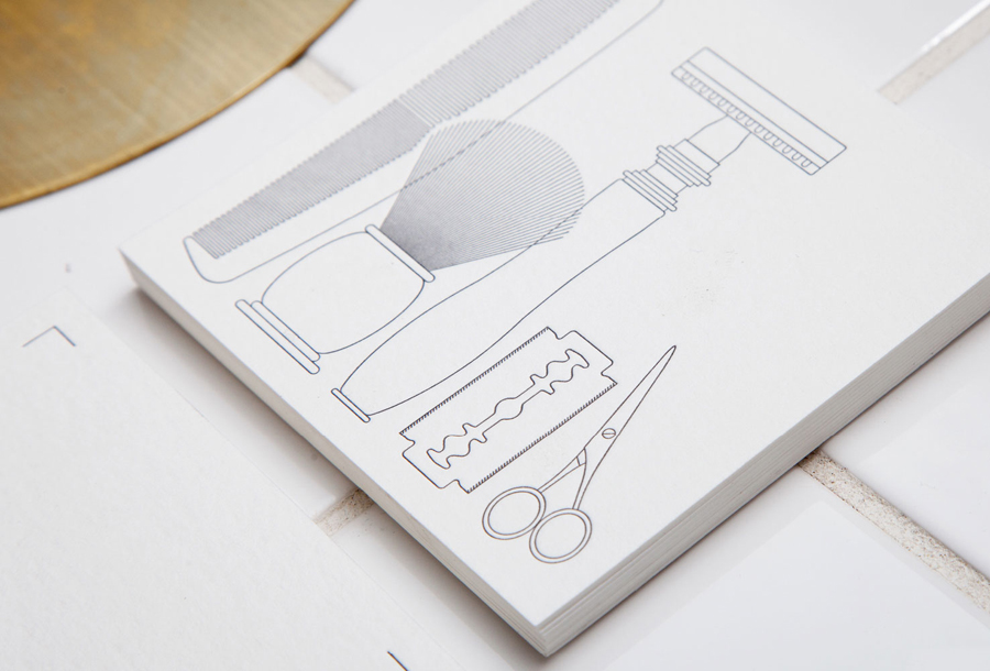
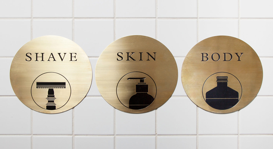
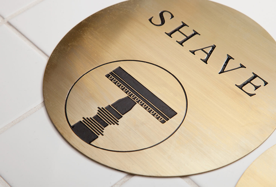
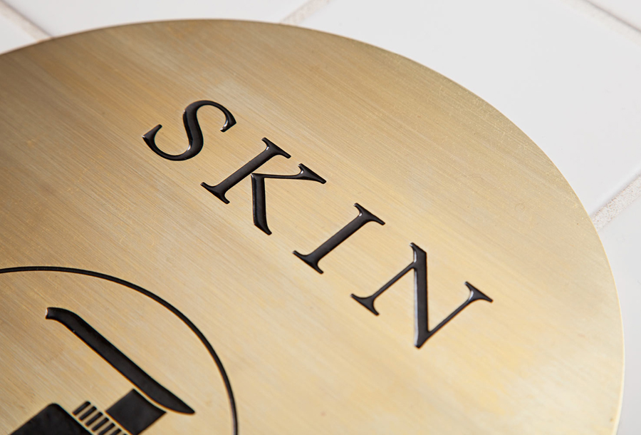
“Utilising the classic typeface Plantin, the logotype features a custom apostrophe as a subtle typographic touch while the tagline ‘Grooming for Men’ is set in the modern typewriter font Pitch — a combination of the classic and the industrial, where the details are everything. A series of illustrated icons were designed to depict the ranges of products stocked in Men’s Biz. These are used across the stationery, packaging and signage. With an emphasis on the physical and the tactile, the stationery was produced with letterpress, and signage elements include acid-etched brass plates.” – ThoughtAssembly
The solid fill and mono line weight illustrations — technical, geometric and literal rather than stylised in their depiction of the classic grooming tools, bottles and dispensers of the Men’s Biz range — set within the retrospective context of acid-etched brass signage, letterpress print finish and the gloss tiles of the interior, as well as a typographic contrast of typewriter ubiquity and the proprietary flourish of a customised serif logotype, provide Men’s Biz with an interesting aesthetic and communicative balance of the traditional, individualised and high quality craft associated with barbers of the past and a more recent on-trend reduction and utility.
Design: ThoughtAssembly
Photography: James Morgan
Print: Taylor’d Press
Opinion: Richard Baird
Fonts Used: Plantin
