Fatherly by Apartment One
Opinion by Richard Baird Posted 14 August 2014

Fatherly is a cross-media platform that publishes a mix of general-interest content, product and service recommendations aimed at dads and relevant to the age and stage of their child’s development. Founded by Simon Isaacs and Michael Rothman, Fatherly was developed in response to the abundance of parenting material available to mums but lack of content for dads.
Brooklyn based studio Apartment One worked with Simon to develop a comprehensive brand identity for Fatherly, which included logo, iconography, print, typography, stationery and user interface design, that would deliver an easy to browse, engaging and fun online experience for men who ‘happen to be dads’.
As a rare example of a species in which the male carries and births their offspring, the choice of a seahorse as a logo is well founded and uniquely suited to Fatherly. There is perhaps a slight vulnerability inherent to the animal due to its perceived size that may have not played well to the user, however, its rendering — a single weight line, square terminals, good contrast of vertical height and horizontal strokes and sense of geometry — does a good job to temper this with a stronger (and empowering) technological undertone fitting for such a platform.
This technological tone is expanded upon through a similarly styled icon set. The aesthetic is current and increasingly common place online but Apartment One have still managed to draw a proprietary quality from these by using a good amount of internal space, geometry, reduction, line breaks and compounding; the plaster and safety pin combination is particularly neat. They do appear largely under utilised, playing a small roll online and only as an aesthetic detail rather than one of functionality. It may have been interesting to use these as a shorthand on mobile devices.

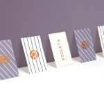
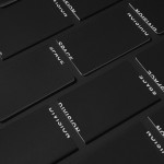
The serif flourishes, moderate stroke contrast, upturned tails and solid spacing of a custom logotype based on the font Miller, offers significant contrast to the logo, icon set and Benton Sans used online. It is a familiar and well executed piece of type work that effectively leverages traditional character detail to establish a high quality editorial tone. Across the stationery the visual identity is applied in straightforward fashion which, for a predominately digital platform, feels apt.
Logotype and iconography are bound by a limited colour palette of grey, black and red, an online responsive experience populated by well shot photography and good varied content, and a light hearted social media account. Together these manage to balance a contemporary warmth, editorial accessibility, personality and a current technological restraint, and effectively takes a lot of its cues from digital lifestyle brands.
Design: Apartment One
Opinion: Richard Baird
Fonts Used: Miller & Benton Sans