Nick & Johnny by Scandinavian Design Group
Opinion by Richard Baird Posted 15 October 2014

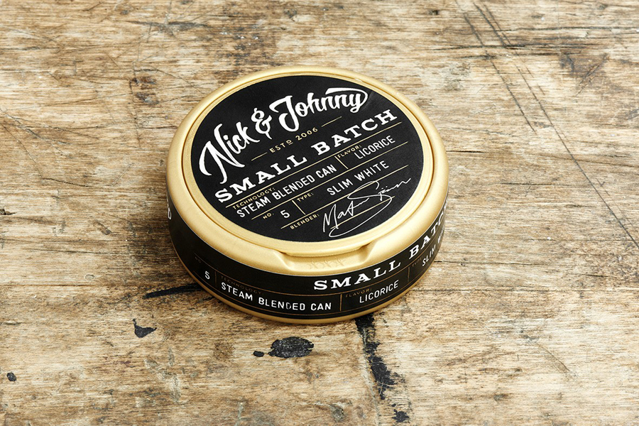
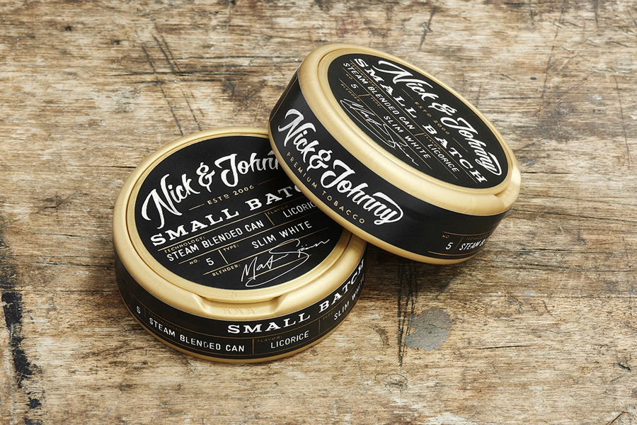
Nick & Johnny is a high quality, flavoured, moist powder tobacco known as snus. Launched in 2006 and produced by Stockholm based manufacturer Swedish Match Nick & Johnny has grown to become the fourth largest snus brand on the Norwegian market. Over this period the packaging has been through several iterations, the latest of which was created Scandinavian Design Group.
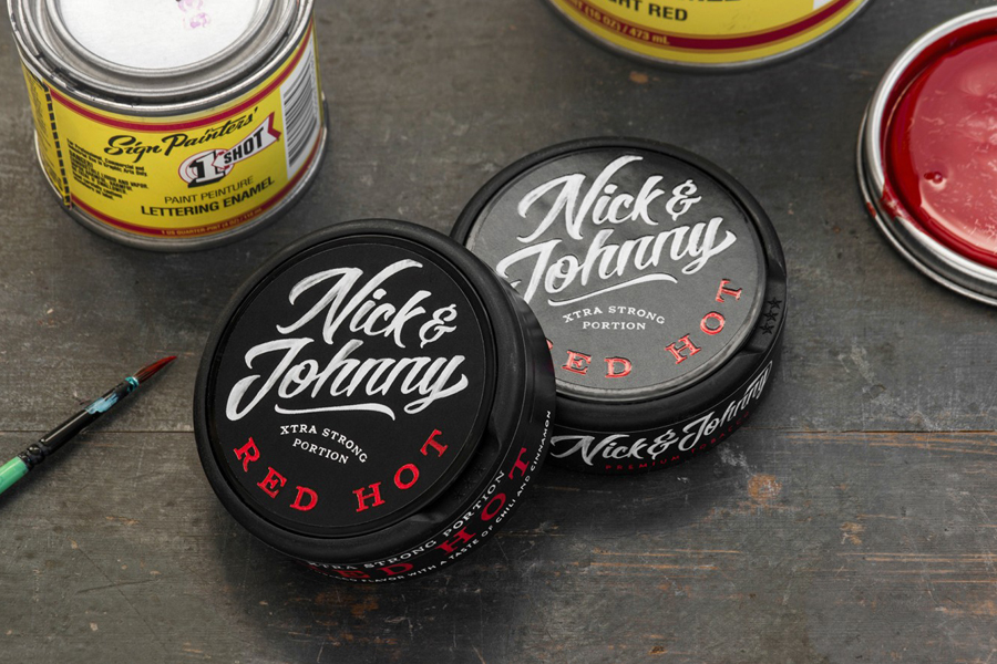
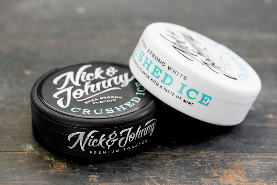
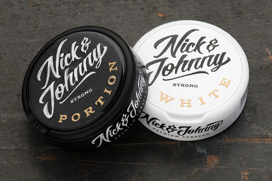
The group was commissioned to develop a new packaging treatment that would reinforce Nick & Johnny’s position as an alternative product among Norwegian and Swedish snus users, portray a knowledge and craftsmanship, and establish a more contemporary profile. This was achieved through a contrast of script, bold serif typography and a mix of white, coloured and metallic inks bound by the appearance of a hand painted print finish. Each product is described by Scandinavian Design Group as now carrying a unique expression that avoids cannibalizing the clarity of the brand.
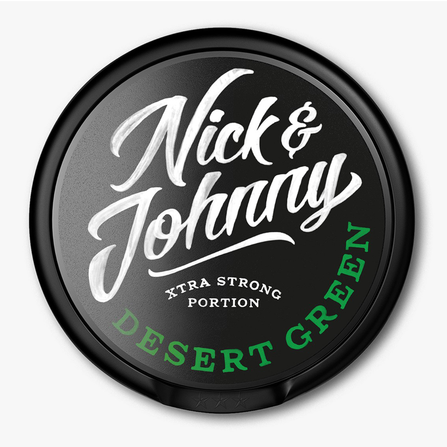
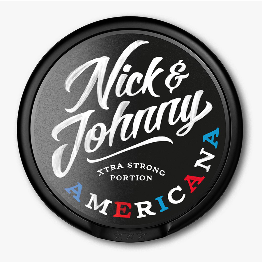
The logotype is well rendered with a great sense of motion through each of the characters delivered through curved vertical strokes and tapered lower terminals. Its loops and ligatures appear fluid and natural, and have a washed finish that gives it an authentic hand painted quality, a detail that resonates well with the theme of craft. Although it works as a black ink across a white surface, the use of a white ink across a black surface has come up particularly well. The uppercase serif of the product varieties, executed as coloured and metallic inks, introduce contrast, reinforce flavour profile, and alongside the script, divide brand and product to establish a consistent hierarchy.
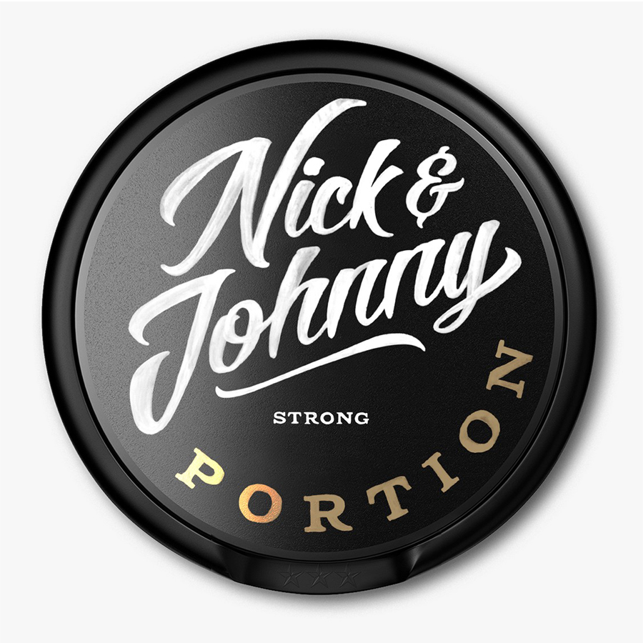
The curved baselines and the angled two line nature of the script make good use of the spherical space of the packaging while and a single line secondary version sits well around its circumference as a sticker. A structural design with raised and embossed details, textured and gloss surfaces and what looks like a slightly irregular structure, seen more clearly in the live photography further down the page, is perhaps the real highlight, appearing period yet benefitting from the consistency and quality of contemporary plastic manufacture. While drawing on a traditional crafted past Scandinavian Design Group’s approach is familiar, communicative and current.
Design: Scandinavian Design Group
Opinion: Richard Baird
