PizzaLuxe by The Touch Agency
Opinion by Richard Baird Posted 10 November 2014

PizzaLuxe began in 2011 as a single restaurant located on London’s Brick Lane hand making good-value, freshly baked pizzas using locally sourced, ‘deluxe’ ingredients. To coincide with an expansion into the Stratford’s Westfield Centre, the brand approached Edinburgh-based design studio The Touch Agency in 2013 to develop a new visual identity that would communicate their core values within a more ‘polished’ environment.
In 2014, The Touch Agency continued to expand on their original visual identity as PizzaLuxe opened its third location within the street-food themed space of Trinity Kitchen in Leeds, designing new menus, business cards, coasters, promotional cards and broadening illustration. To coincide with the launch of The Touch Agency’s new website, this post was updated August 2017 with brand new images.


The juxtaposition of precise, inline, custom sans-serif logotype alongside the loose, honest and local market qualities of Joanna Basford’s hand drawn illustrations—bound by a bright neon red—delivered a simple communicative duality and stylistic impact that was reflective of the modern restaurant environment and quality food experience of both PizzaLuxe’s Brick Lane and Stratford spaces.


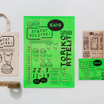
For PizzaLuxe’s third venue the illustration have been built upon, now taking their cues from Trinity Kitchen’s street food theme. Although illustrated by Damien Weighill these have a lot in common with Joanna Basford’s contribution and are equally well rendered, tying them in well with those of the original identity and linking premises without the repetition you might expect of a chain. However, rather than solely ingredient focused, these move in a more character driven and cartoon-based direction with a subtle sense of story and activity.
This approach introduces a layer of playful brand character, a youthful sense of energy without appearing childish, and a bustling, shared, street food community style experience alongside the more familiar message of simple good quality ingredients.

The single, economical, neon spot colour of the other venues makes way for a revised palette of two additional colours. While perhaps bordering on the synthetic their high contrast is eye-catching, establishes a bold distinction, and complement the sense of energy and contemporary creativity of the fluorescent red, and the tone set by the illustrations.
Design: Touch. Illustration: Damien Weighill & Joanna Basford. Opinion: Richard Baird Fonts: Carrosserie.