Léon Courville Vigneron by lg2 boutique
Opinion by Richard Baird Posted 20 January 2015
Léon Courville is a Canadian vintner growing grapes and producing wine from a 18 hector vineyard surrounding his home near Ville de Lac-Brome, Quebec. The uniquely rocky, chalky and clay soil, the region’s later farming seasons and the warmth from Lac-Brome gives Léon Courville’s wine a distinctive flavour profile, one that has secured international recognition. As well as being interested in the craft of viticulture, Léon Courville is also known for his large collection of antique corkscrews that are now on display at Domaine de Brome.
Léon Courville Vigneron’s brand identity was redesigned by Montréal based studio lg2 boutique. The studio looked to convey the history of the vineyard and the tradition it proudly upholds, the experience of grape growing and the craft of wine making, as well as family, passion and the pedigree of the region through a variety of assets. These included crest and custom typography, business cards, stationery set, postcards and wine labels that feature high quality material detail, die cut labels, foil, spot colour and illustration.
Like many of the identities reviewed here on BP&O lg2’s approach balances a variety of familiar and well-established industry conventions alongside more distinctive, brand specific details, creating a duality and leveraging contrast to secure an aesthetic impact founded on clear ideas. This is perhaps most explicitly seen within the logo.
The logo brings together the detail and high stroke contrast of a traditional serif, the more recent sensibilities of a sans-serif and the reduction and literal qualities of a symbol. Although both typographical choices share extended, uppercase letterforms and generous spacing, their disparity – which does, to some degree, feel a little uncomfortable locked-up in this manner but improves across the bottles and stationery – enhances their communicative intentions.
The shield and corkscrew are bold and confident appropriations of the ubiquitous iconography of the wine industry. The combination and reduction of form, the way the two shapes interact absent the stem, its monolinear quality in conjunction with type and what may well be a subtle V, is pleasant enough and sensibly underpinned by Léon Courville’s collection of corkscrews and the heritage associated with shields. This is done without disingenuously suggesting a significant history. Like any good brand identity project, the simplicity of the symbols provides a foundation from which to build on, expanding appropriately across the canvas of the wine labels in a more visually arresting manner through label shape and illustrative detail.


A font of extended uppercase sans-serif characters is unusual and presumably, through its limited character set, proprietary. It is geometric and robust, industrial in the cuts across the terminals, softened slightly by rounded corners and consistent in its stroke width. These details appear modern and industrial, perhaps drawn from the manufacturers plates of agricultural machinery, and distinctive within the category, it does, however, seem to be limited to just the logotype. The overprint treatment and finer lines of the crest, the way it holds symbol and serif, and the mechanical monospaced type below, again are a familiar but understandable union of batch production cues, heritage and modernity, that are largely well-balanced.
The contrast and brand values established by the logo continue across the stationery through the choice of cool, modern and slightly corporate grey and classic cream substrates. Uncoated surface texture, heavy boards, die cuts to the tags, the use of stickers, hand written elements and a hand finished blind emboss add a personal, individual and crafted layer to the identity that, while current and increasingly saturated across industries, benefit from a good eye for moderation.
Stationery layouts borrow a little from wine label backs with a good juxtaposition of fine and heavier lines and a retrospective appreciation. It continues to utilise the contrast of sans-serif reduction and serif detail as well as a centred alignment, established by the logotype. The stationery benefits from dyed and good quality paper choices that hold a deep blind emboss particularly well, and where the simplicity of the logo begins to work.
Black and white photography across the postcards, vintage in tone, mix vineyard, building and antique corkscrews, this time drawing out the heritage and experience implied by the logo using a bit more detail, and introduce provenance and a unique and brand specific story element. The corkscrew imagery, a nod to Léon Courville extensive collection, is a smart addition and is expanded upon further across the higher value wines through documentation and illustration. The unusual forms, mechanical nature and rusted surfaces of these makes for compelling and communicative assets, taking the reduced and generic element of the logo and giving it relevance beyond the obvious.


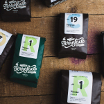
The two wine labels are a testament to the flexibility and cohesive nature of the identity, toning down or dialing up individual components depending on the market. The spot colours of the Cuvée are bright and contemporary and enhanced by plenty of white, and a black with a rougher stamp-like finish reinforces the crafted aspects of selection, growing and production and that also play out through the materials of the stationery.
The colour, die cut and standard labels effectively draw and expand upon the logo, extracting distinction from the ubiquitous iconography of a corkscrew and are clearly designed to deliver shelf impact in a supermarket rather than a specialist retail environment. The naming conventions, while not explicit in their origins, build on the family nature of the business, these, as far as I am aware are unusual and original manner, playful but well founded, working on story and establishing an element of character. Again, there are familiar elements such as the fleur de lis, but the result is a light and accessible aesthetic that still draws on the key communicative elements established by the visual identity.


The Pinot Noir and Baco leverage higher quality conventions. Gold foil, more frequent use of the serif, dark uncoated dyed paper – the tone of which appears to come from the stationery – all draw on established perceptions of experience, knowledge and craft. The label shapes tie in subtly with the Cuvée without undermining its proposition, while the corkscrew concept is delivered in a way that adds more detail through the traditional etched illustrative imagery of antique corkscrews, meticulously documented and illustrated by lg2 boutique. In conjunction with dark ink over dark board and a bright gold foil, these appear smart and contemporary their resolution of unique story, heritage and the passions of its founder, alongside long-serving industry conventions that also makes for a solid aesthetic. Like the Cuvée, it is sensitive to its particular market.
Design: lg2 boutique
Opinion: Richard Baird