Woodland Wine Merchant by Perky Bros
Opinion by Richard Baird Posted 22 January 2015
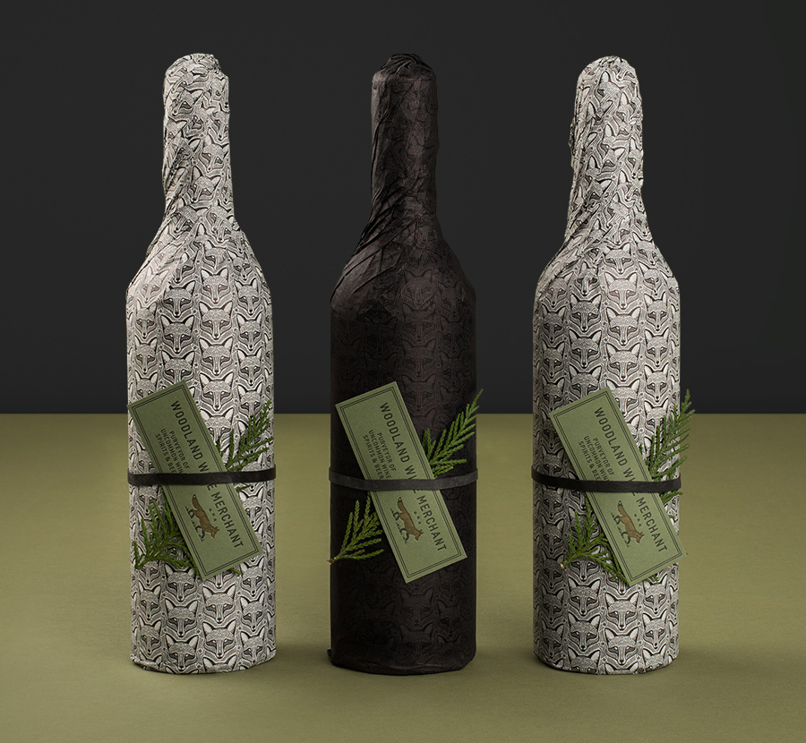
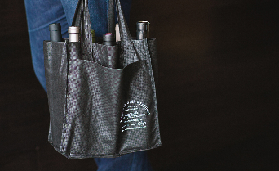
Woodland Wine Merchant is described by Perky Bros, the design studio behind its new visual identity, as a tidy and eclectic wine store in Nashville, Tennessee that carefully curates wines from artisan producers practicing natural and sustainable methods, and hunts for and gathers the best value wines from around the world.
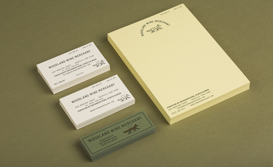
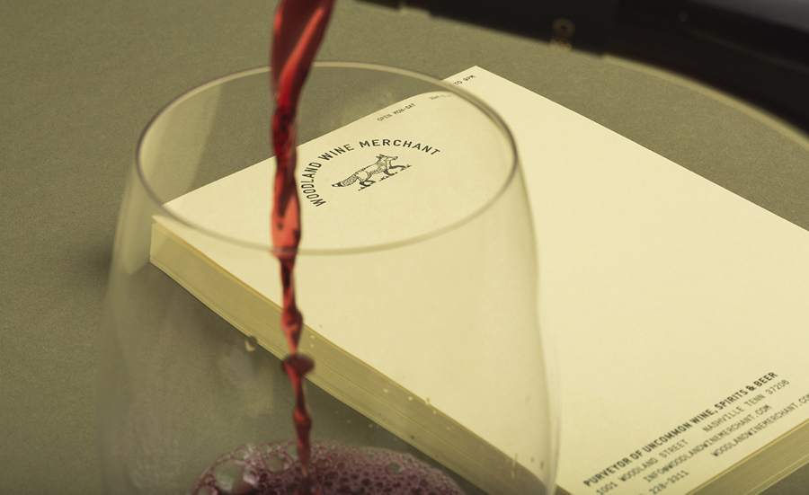
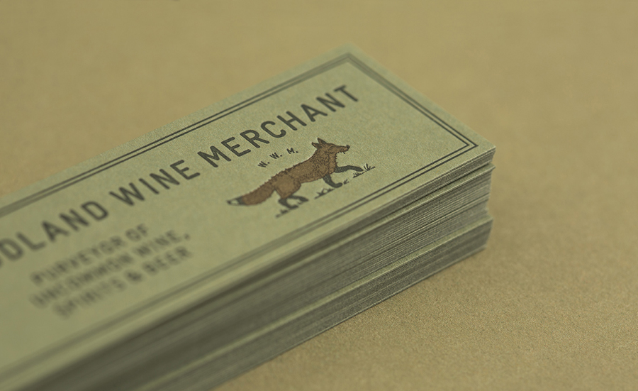
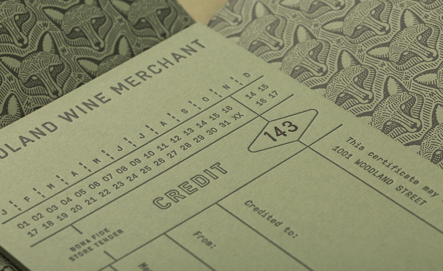
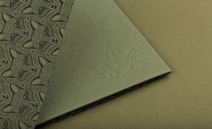
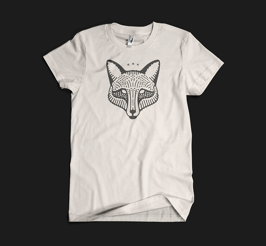
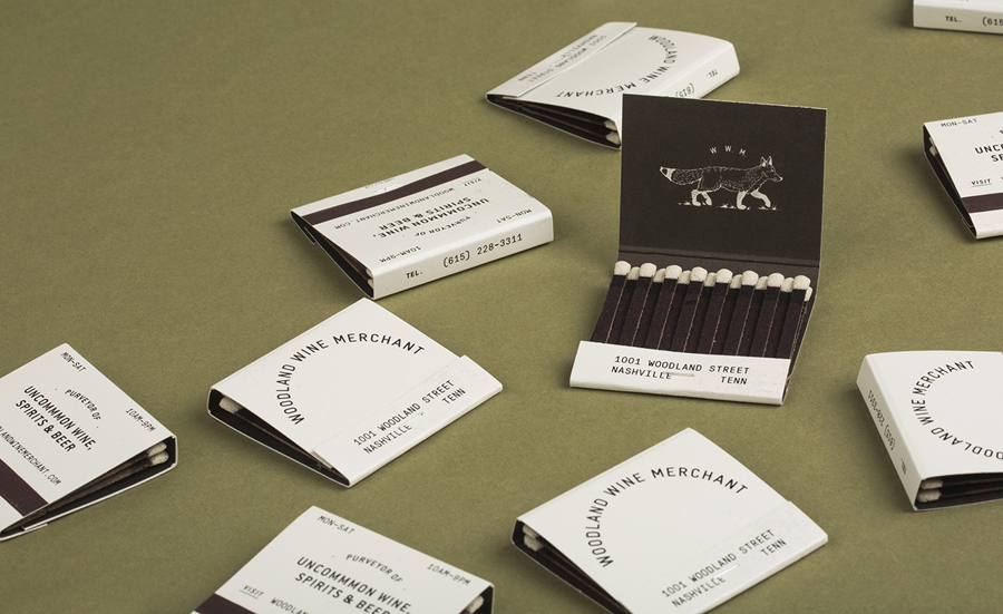
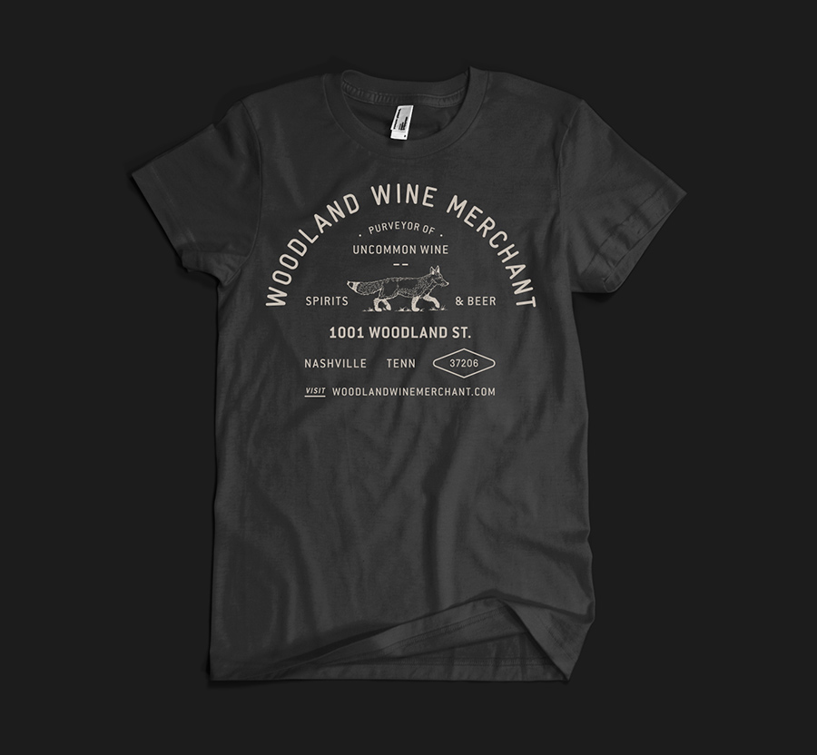
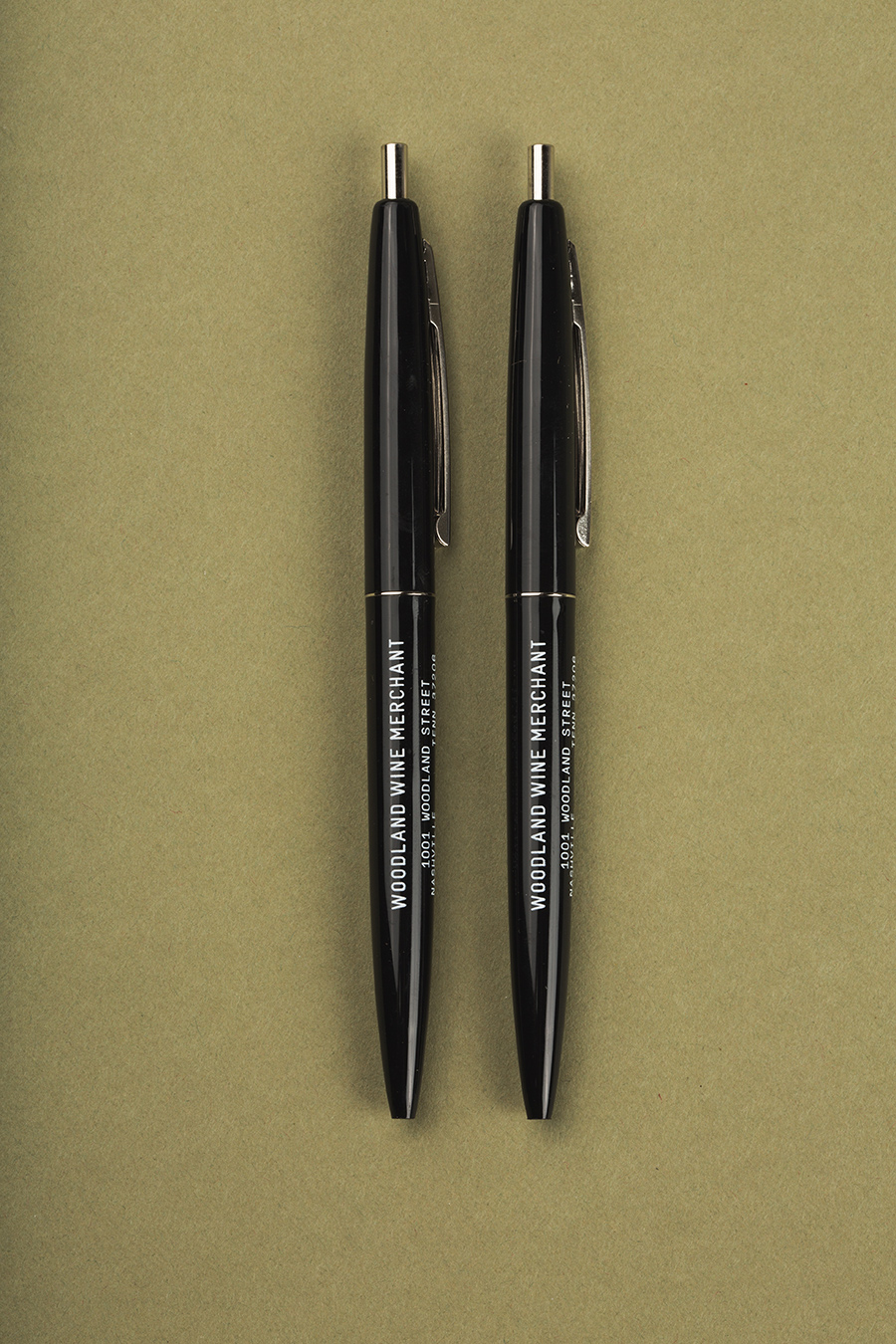
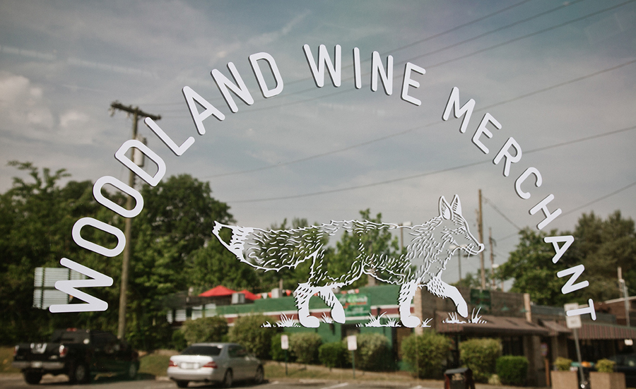
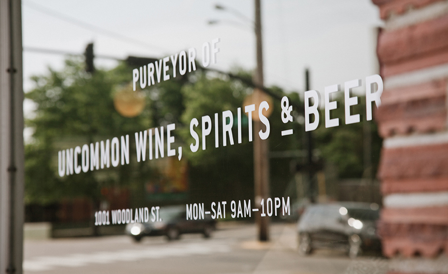
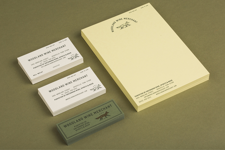
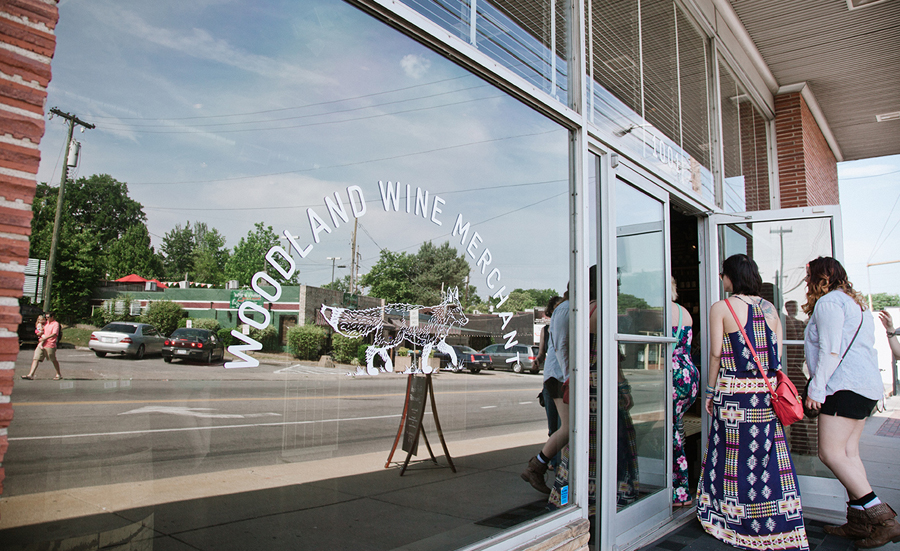
Perky Bros’ identity solution was inspired by the collision of two worlds—the natural, and the store’s unadorned and modern 1960’s qualities. This manifests itself as a red fox logo—an animal indigenous to the area—a woodland green paper choice, the utility of type selection and its typesetting, gridless mid-century layouts and the robust and practical wood of the interior. The project went on to include signage, labels, business cards and packaging.
Utility and nature make for a stark and disparate contrast, but one that has been effectively brought together in perhaps the same way as personal and regional iconography might start to encroach upon military hardware or battledress. Perky Bros’ treatment recognises and takes ownership of the building’s functional origins and the irony of it now being a place for retailing individuality, craft and luxury.
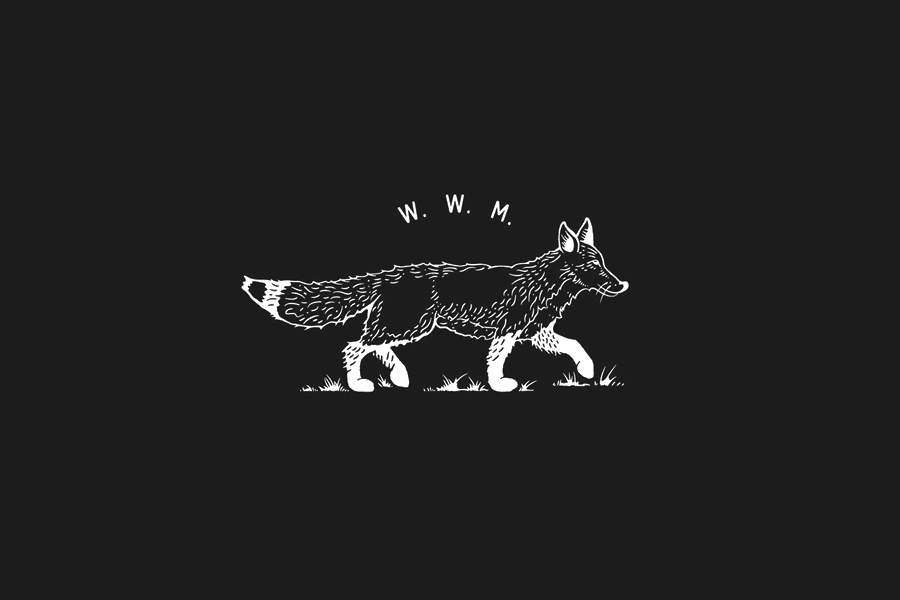
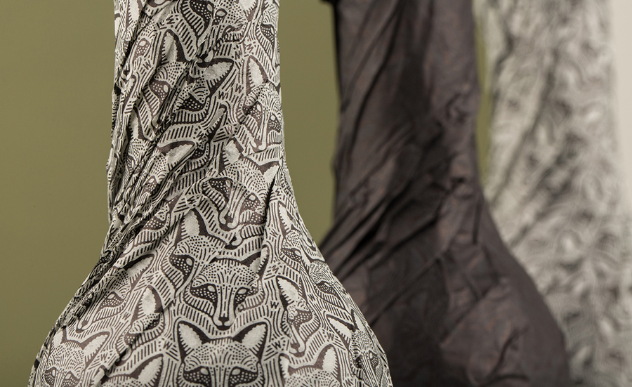
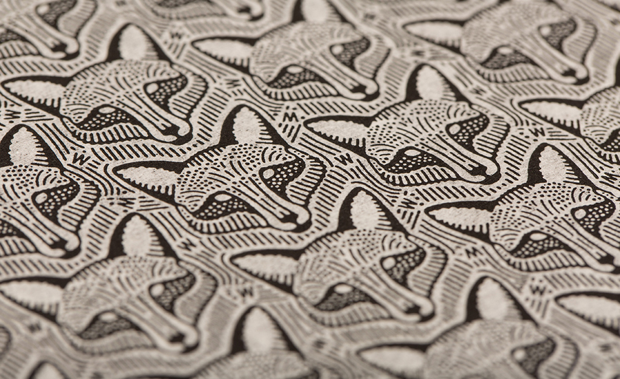
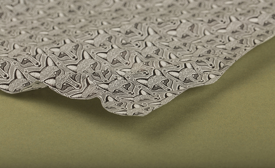
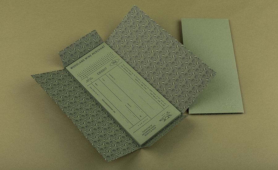
The finely detailed and hand drawn fox illustrations, the way that these have been expanded into patterns, set across tissue paper, wrapped around bottle and covering the inside walls of printed assets, as well as the use of uncoated dyed boards, earthy colour palette and what looks like a letterpress and blind embossed print finish all speak of good natural quality, traditional and individual craft values. The fox also adds a smart regional touch and a connection to nature.
These are current brand values to have and popular aesthetics to leverage but each is well executed, appropriate within the context of the wine industry and reflective of the store’s focus on products that are natural and sustainable and the careful curation of these. However, where the project really gets it character from is the addition of, and juxtaposition alongside, a utilitarian layer inspired by the store’s 1960s building.
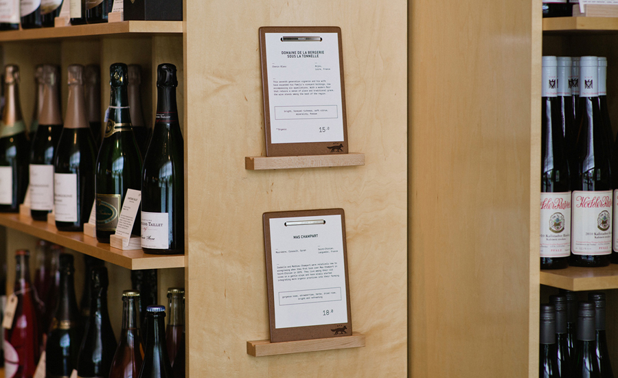
This utilitarian layer comes through most acutely in the absence of interior flourish in favour of plywood furniture, chipboard clipboards and the uniformity and dense typographical nature of the labels ahead of each bottle. Like the building itself, this is in opposition to the diversity, individuality and ornamental detail and print finish of the wine labels, and while the layout of the store is not far from convention, the choice of materials is, borrowing a little from modern coffee shops, and very much product focused.
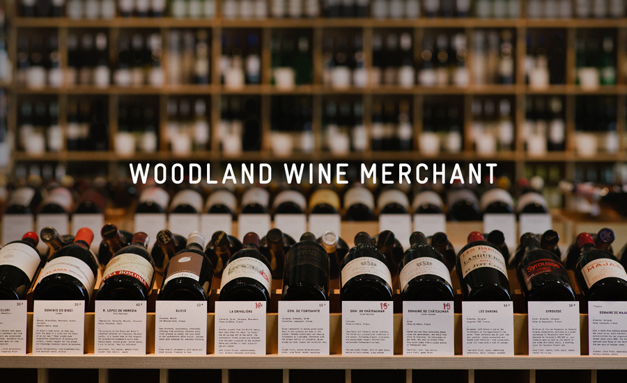
The stripped down retail experience makes its way into the identity. The uppercase sans-serif characters and straightforward layouts have a considered nonchalance, that is to say that there is intention behind the appearance of indifference that goes beyond basic functionality and practicality. This works well to elevate the detail and care of the illustrative work and the wrapping of the wine bottles, which are surprising elements to encounter towards the end of the retail experience, and, using a typographic uniformity, sets an egalitarian tone where wines are treated and measured equally through descriptions.
Design: Perky Bros
Photography: Brett Warren
Opinion: Richard Baird
Fonts Used: Gravur Condensed, ITC Conduit & GT Pressura Mono
Tip Credit: Brent Couchman
