Monster by The Metric System
Opinion by Richard Baird Posted 10 March 2015

Monster is Norway’s biggest production company. It specialises in original format entertainment, drama, feature film and scripted program development for national and international markets and within the public and private sectors. Monster’s brand identity, developed by Scandinavian graphic design studio Metric Design, takes its cues from the company’s mascots, a set of loosely drawn monster personalities, and replaces these with those created by British illustrator Drew Millward.

Drew Millward’s illustrations have plenty of character, and draw on some of the personalities roughly established by Monster’s previous identity. There is a page dedicated to these on their website, but absent copy there is little to connect them to specific company values, propositions or intentions. The homespun style of these original images, similar to those that might crop up in late-night low-brow adult cartoon series, are at best niche and at worst, bizarre.
In contrast, the new characters offer a little more in the way of a polished visual impact and communicate value. These are still quirky in their tone, form and proportion, yet far more accessible, less polarising, with the the qualities you might associate with an t-shirt brand or skateboard graphics, appearing urban and youthful but not childish, and emphasising a youthful creativity, enthusiasm and diversity.


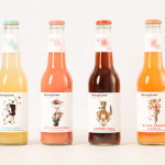
The characters are individually unique but work as a cohesive whole, are well-drawn with a slightly desaturated colour palette and grey line work that keeps them from appearing cartoony in a Nickoldean way. Plenty of texture, a mix of angles, isolated heads used as social media avatars and full bodied versions as well as full illustrative panels introduce variety without any additional expense. There is enough detail in these to look good as full and single colour versions across a variety of assets, from small stickers to mugs to postcards to large vinyl stickers.

Where the characters appear strong and individual the typography across the stationery appears haphazard. Fine lines alongside those that are heavy and robust, regular alongside those that are condensed, a mix of uppercase, lowercase and sentence case, as well as two colours, effectively utilise contrast to divide information but in conjunction with the layouts, are stylistically awkward.
The monster logotype across the t-shirts, a very well-rendered set of furry letterforms, is under-utilised and clearly should have been a primary asset across the stationery. Howeever, within the context of the characters, the simple, bold sans-serif letterforms of the primary logotype offer a contrasting simplicity, drawing attention to illustrative detail, while the furry logotype holds its own. More from The Metric System on BP&O.
Design: The Metric System. Illustration: Drew Millward. Opinion: Richard Baird.