Norwegian Design
OlssønBarbieri rewrites the rulebook on ‘formality’ in its melodrama-infused Theaterbaren identity
Oslo’s Nationaltheatret (simply translated to English as National Theatre) first opened its doors more than a century ago in 1899, and has since come to not only reflect, but actively shape cultural identity in Norway. Having staged everything from more traditional Norwegian dramas from the likes of Henrik Ibsen to experimental contemporary works, the building itself is also a marriage...
Ambassaden by Bleed
Designed by Finnish-American architect Eero Saarinen, the Ambassaden’s angular modernist stature holds a striking presence in the heart of Oslo. When it opened in 1959, it functioned as the US embassy until its closure in the early 2000s. Fast-forward to today – the building has been reopened and its programming altered. It now operates as a multi-functional space that includes...
Chelan Beauty by Olssøn Barbieri
Olssøn Barbieri certainly seems to be on form this year: we recently reviewed the Oslo-based multi-disciplinary design studio’s work for Stereoscope coffee, and now, we’re delving into its smart designs for Chelan Beauty. Marrying clarity, functionality and a decent smattering of the unexpected, the surprises land early with this one: Chelan Beauty isn’t actually a ‘beauty brand’ – as in...
Stereoscope by Olssøn Barbieri
Oslo-based multi-disciplinary design studio Olssøn Barbieri has created the brand identity for Los Angeles-based speciality coffee roastery Stereoscope, working across its packaging design and printed materials with a typography-led approach that celebrates tactility. According to Olssøn Barbieri, Stereoscope is underpinned by a philosophy that sees coffee as a living organism rather than a commodity, and which takes its responsibility to...
Forskningsrådet by ANTI
2022 was, let’s say, an interesting year for Forskningsrådet (The Norwegian Research Council). The public institution, which provides public funding for research and innovation across a wide range of fields, usually operates without controversy or intense public scrutiny. This changed in September 2021 when Norway held its national elections and got itself a change of government. And along with that,...
Future Circular Collider by Bleed
After the scientific successes of CERN’s Large Hadron Collider (and its blessed failure to create any world-destroying black holes), the research organisation has an even greater need for speed. The team of scientists over in Geneva has been illuminating the nature of our universe since 2009: accelerating and smashing particles together, then snatching glimpses of their tiny collisions. Their appetite...
Pursue Hard Seltzer by OlssønBarbieri
New products, new markets and new consumer groups generate new aesthetics – or, at least, you would hope so. Too often, style migrates from one category to another, or the identity of a sub-culture (visually speaking), is exploited in a commercial context. This is where ‘authenticity’ emerges, to support genuine origin credentials, or to mask the appropriation with narrative context....
Avo Consulting by Bleed
Avo is a Nordic technology and management consultancy with offices in Norway and Sweden. Since its founding in 2016 it has seen rapid growth, expanding from 5 to 85 employees in three years. It has done this through a strategic rethinking of the way in which consultancy services are delivered, removing the buzz words associated with the industry, solving business problems...
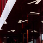
Vega Scene by Metric
Vega Scene is space for food and culture located on the river Akerselva in the centre of Oslo. It features three film screens, a theatre, debate lounge, an organic and sustainable cafe and a wine and cocktail bar. Vega Scene sits within an area of urban culture, features a distinctive exterior of burgundy concave panelling and vertical slats, and a...
Den Norske Filmskolen by Neue
Den Norske Filmskolen (The Norwegian Film School) provides a broad range of practical film courses taught by a full-time teaching staff and guest lecturers and instructors with active careers in the national and international film industries. It is the only one of its kind in Norway, developed as a separate department at Lillehammer University College in 1997 and now part of Inland Norway University of...
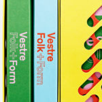
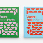
Folk+Form by Snøhetta
Vestre is a Norwegian, family owned and run, urban furniture design and manufacturing business founded in 1947 by Johs. Vestre. Although Vestre’s catalogue is extensive and diverse, it typically features colourful detailing and modern forms, holds true to the founder’s vision of designing and manufacturing for longevity, and has a social and sustainable-dimension. Snøhetta, who previously worked with Vestre on the development of a...
Vestre Anniversary Book by Snøhetta
Vestre is a Norwegian, family-owned and run, furniture design and manufacturing business celebrating its 70th anniversary this year. Vestre’s extensive catalogue is characterised by an intersection between convivial colour detail, modern forms and long-lasting build. Snøhetta, who previously worked with Vestre on the development of a production facility in 2013, and the refurbishment of the company’s headquarters and showroom in 2017, continue to work...