LittlePod Shortbread by Believe In
Opinion by Richard Baird Posted 3 July 2015

Graphic design studio Believe In worked with LittlePod—a high quality all natural vanilla paste business that has secured favour with both keen home cooks and professional chefs—and LittlePod’s Scottish shortbread partner Reids of Caithness, to develop packaging for a new, luxury, real vanilla range of traditional handmade butter shortbread biscuits.
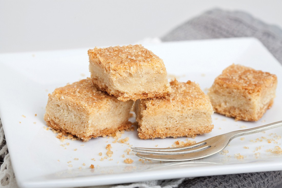
Keen to avoid category convention and saturated regional patterns (read: tartan), Believe In’s treatment effectively leverages the texture, colour and compact 3×3 shape of LittlePod’s shortbread, drawing it right into the packaging, using a simple die cut window. The studio have done a good job of emphasising and referencing these qualities through panels of a grey ink and plenty of space—in contrast to the warm buttery tone and texture of the biscuits—grid based layouts, geometric type and a simple, light geometric pattern along the edges. This pattern, although not particularly unique, draws its value from this new context and a relevance from the shape of the biscuits.


The LittlePod logotype and its silver foil print finish firmly anchors the packaging within the Littlepod identity system and makes good use of a familiar high quality luxury cue. This is expanded upon with silver spot colour finish and the unusual detail of printed internal walls. A small copywriting component, generated by customers via the LittlePod website, is a small, personal flourish, presumably designed to foster engagement that, while perhaps a little optimistic, is well-intentioned and unexpected.

Where often you see script, a lot of visual texture, bold and familiar patterns, photography, warm colour and a favour for the retrospective, here there is a modern typographic restraint, few inks, a good use of contrast and space, a clear product connection and finer detail all in service of distinction and quality, while concise copy addresses provenance and tradition. More from Believe In on BP&O.
Design: Believe In. Opinion: Richard Baird