f32 by Blok Design
Opinion by Richard Baird Posted 20 January 2016
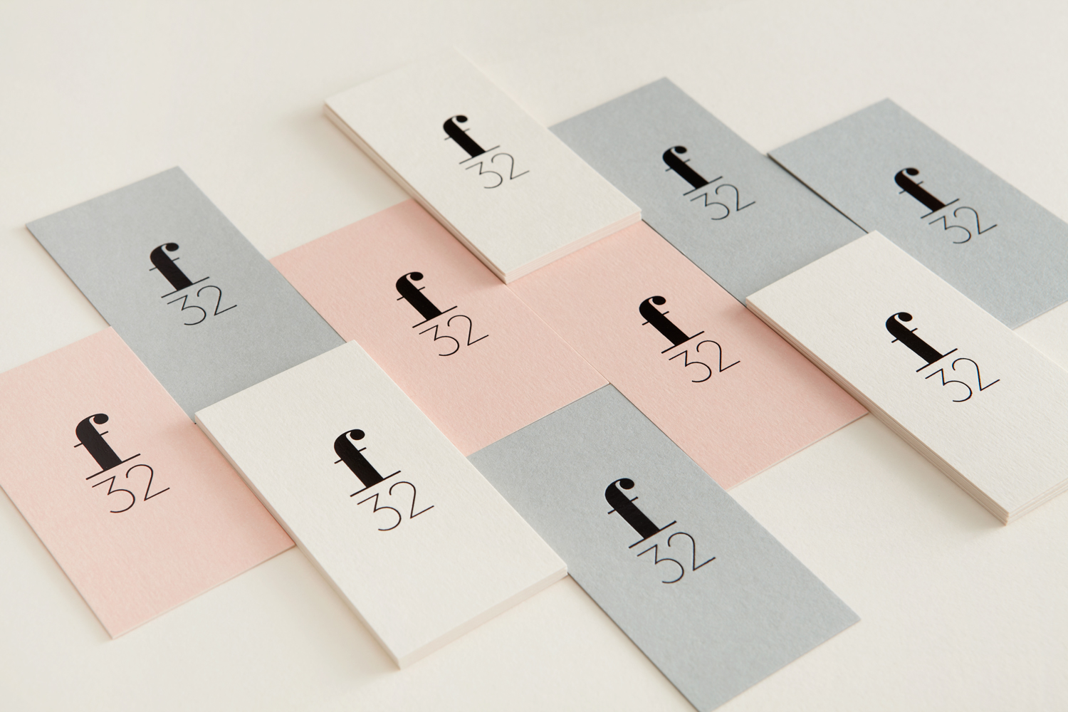
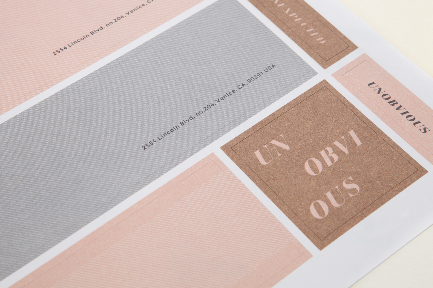
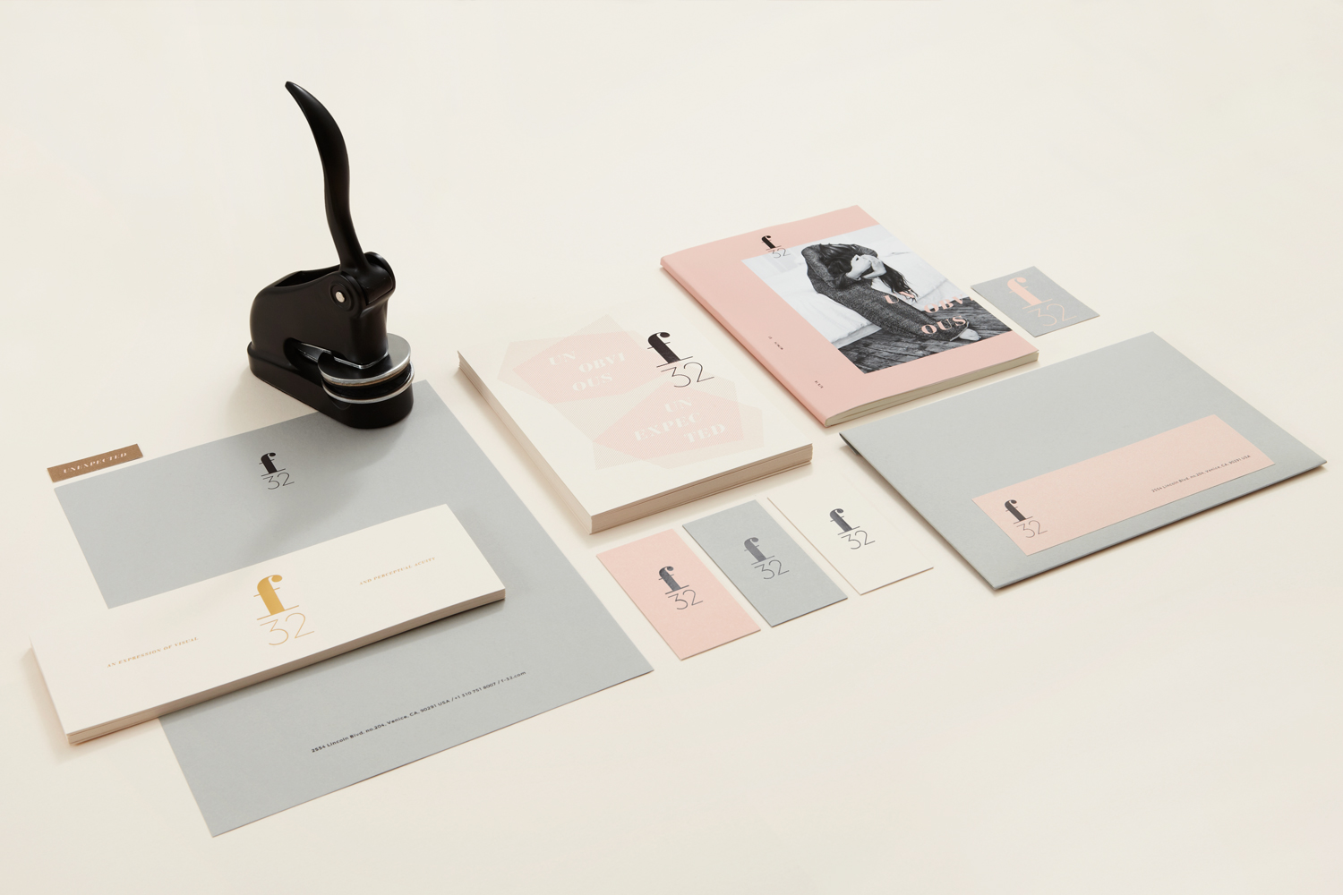
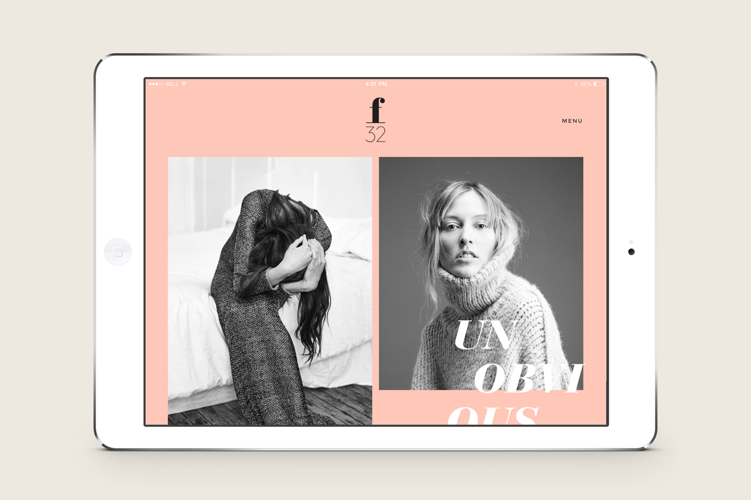
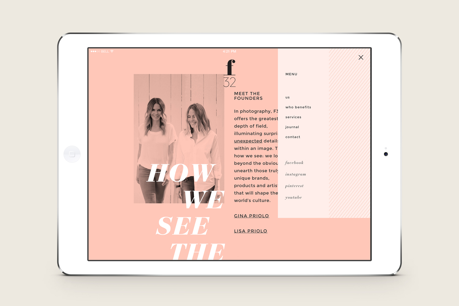
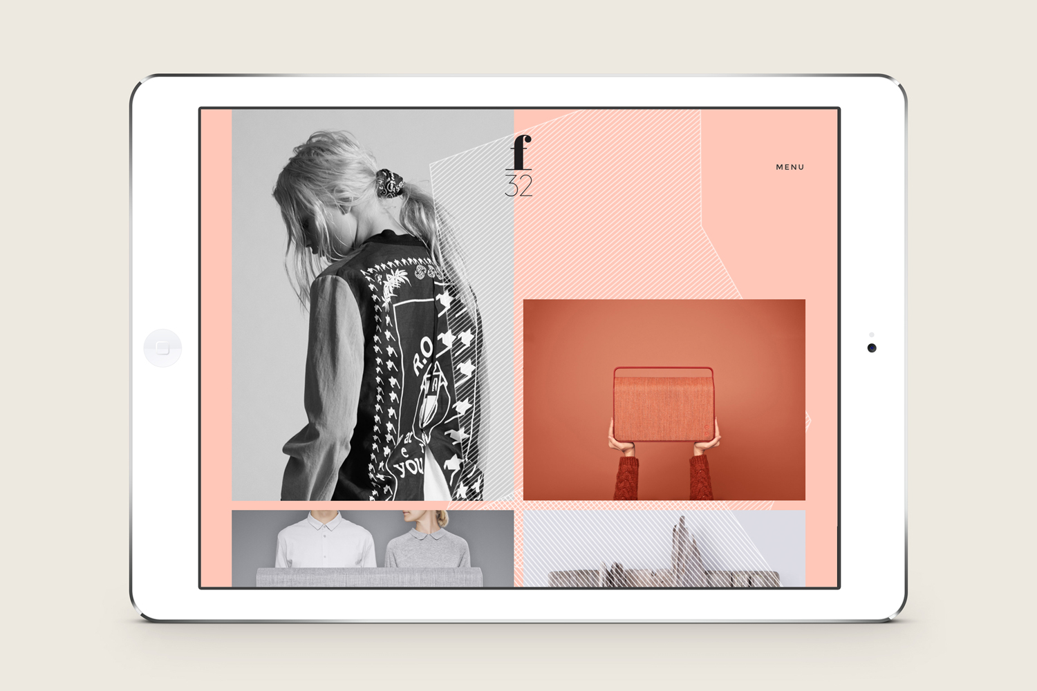
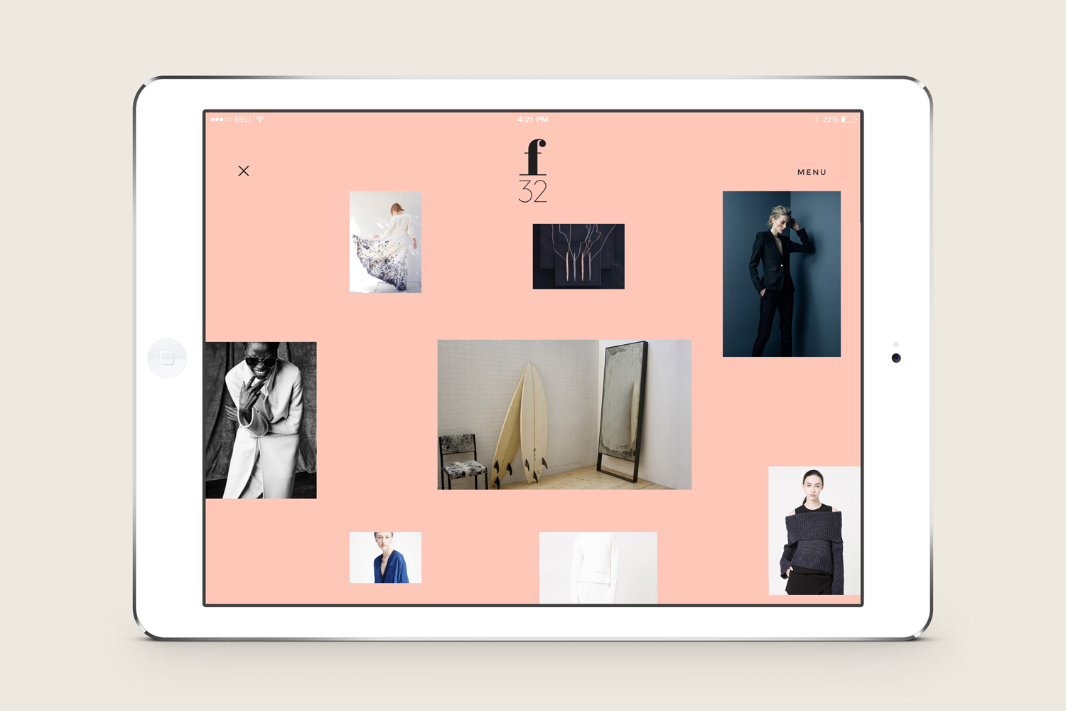
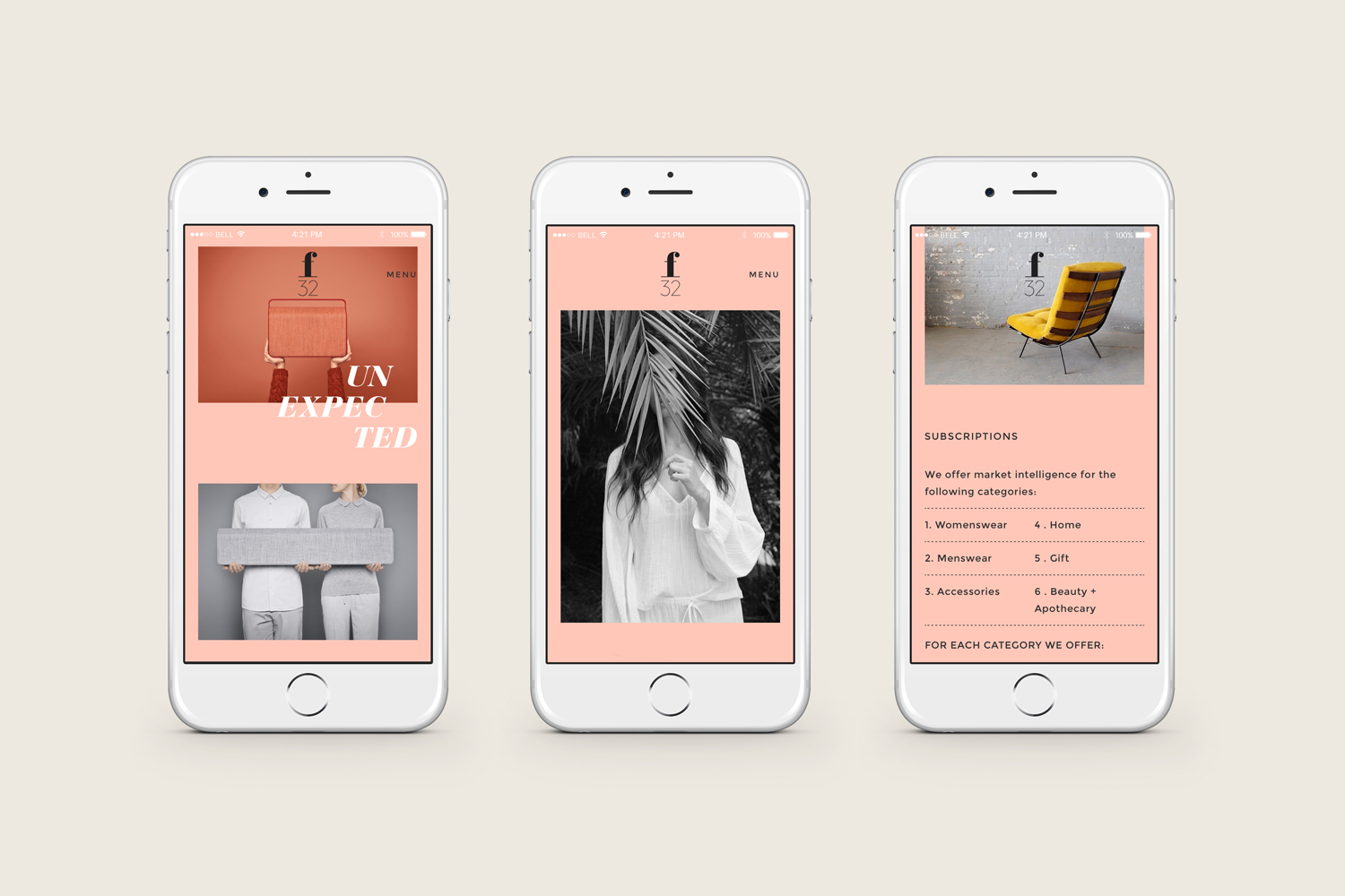
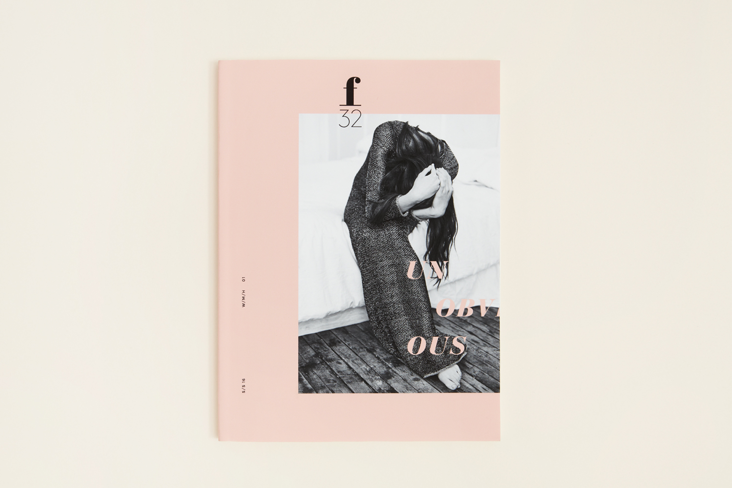
f32 is an American trend-watching company, founded by Gina and Lisa Priolo, with an office in LA and a commitment to finding and championing artists and brands that will go on to shape global culture. f32 worked with graphic design studio Blok Design to better express this vision, and their refined and highly contemporary aesthetic sensitivities. This was achieved through naming and visual identity in print across business cards, stickers, stationery and trend report, and online with a new responsive website.
“Whether we’re finding and fostering a new line, bringing new products to galvanize an existing one or connecting brands to buyers, the team’s deep experience, insider knowledge and instinct for what’s next helps brands, retailers, showrooms, editors and distributors navigate the highly changeable world of fashion to stay fresh, relevant, inspiring and original, season after season.” – f32
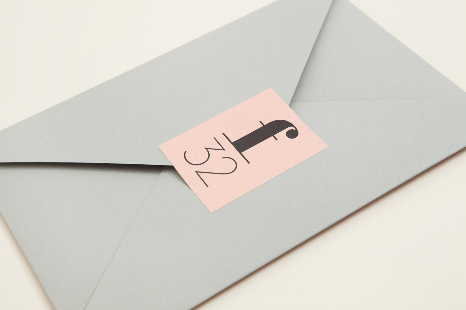
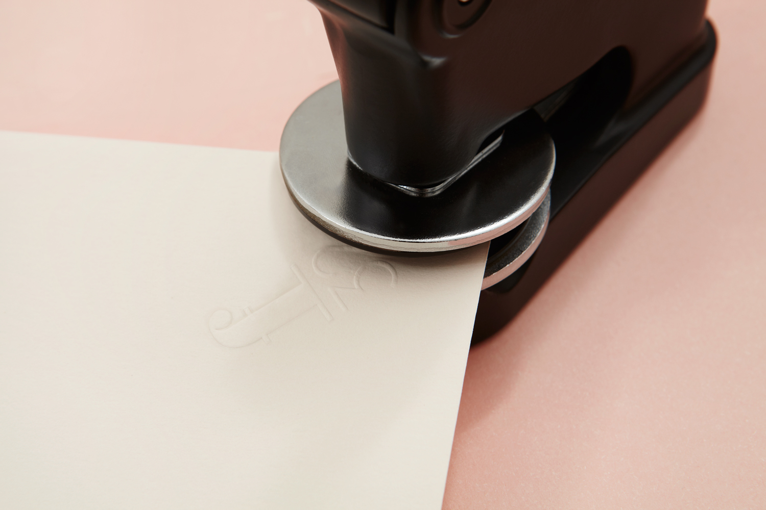
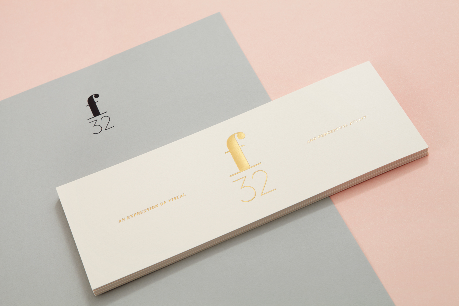
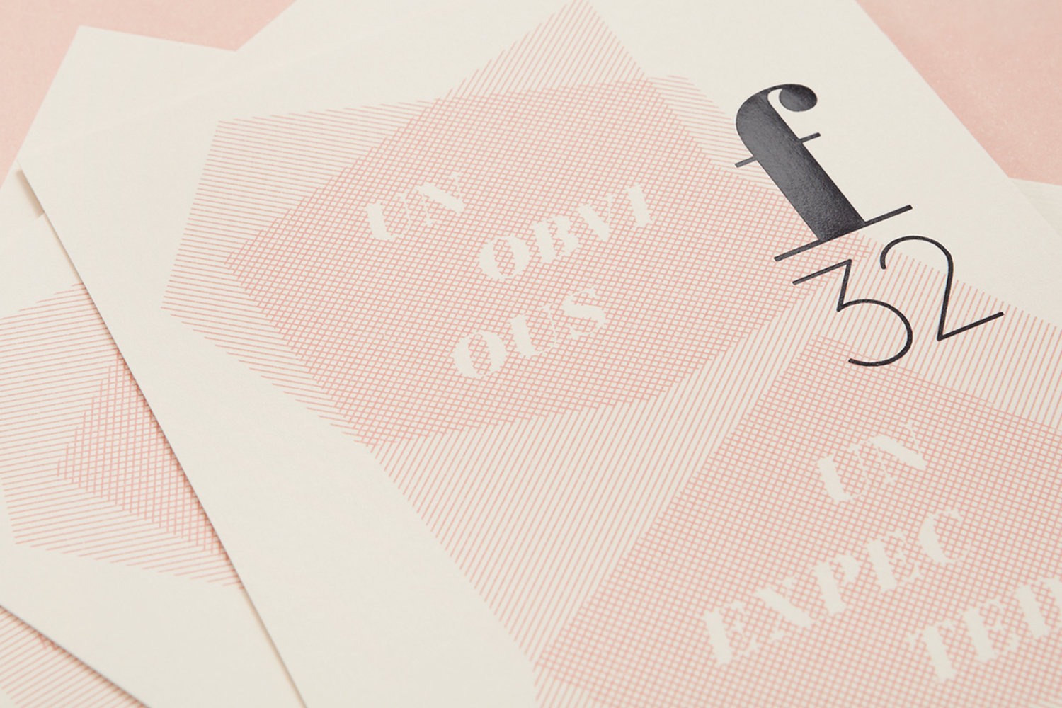
Blok drew the f32 name from photographic lexicon, and in particular, a setting that provides the greatest depth of field. In many ways visual identity does much the same. It goes back in time and reaches across water for European slab-serif flourish, and forward and internationally for the reductive and monolinear. It pairs the very polished and perceived value of a block foil print finish with the more personal qualities of a hand stamp and stickers. And mixes the femininity of pink with a classic cream and the urban qualities of a cool grey.
Contrast plays a significant role in emphasising this breadth of experience. Where the above is pronounced, others are more nuanced. Highlights include the glossy surface of a block foil and the texture of uncoated boards, ink and the raised surface of blind emboss, fine visual texture, the heavy stroke of the f and areas of space. Online this extends to the high-contrast strokes of Bauer Bodoni alongside the sans-serif forms of Montserrat.
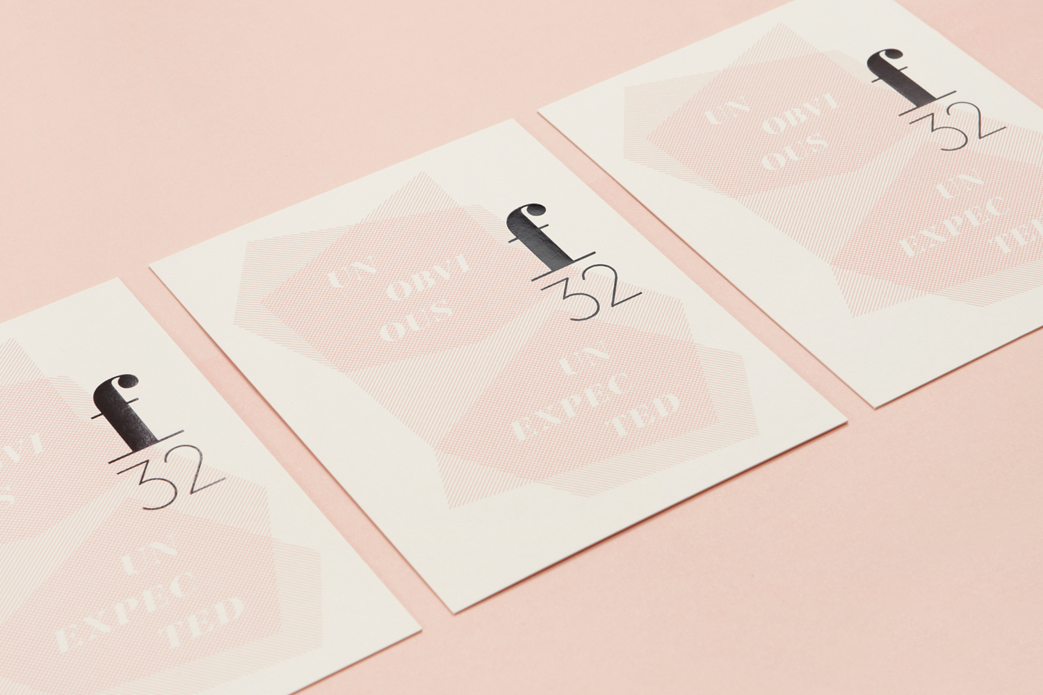
This mix of past and present, the polished and personal, individual craft and a broader professionalism feels well-resolved. It leans towards the aesthetics of slow-life style publications and independent fashion brands, particularly in the layout and content of the report and website. For a trend-watching business it is thoroughly and appropriately current, it works well to convey a refined and contemporary positioning, and has a lightness and femininity that feels like a reflection of the personal sensitivities of its founders. More from Blok Design on BP&O.
Design: Blok. Opinion: Richard Baird. Fonts Used: Bauer Bodoni & Montserrat.
