Assembly by Blast
Opinion by Richard Baird Posted 15 February 2016

Assembly is a new 250,000 sq ft. development project managed by Axa Real Estate, located in London’s Hammersmith, and comprised of 4 office buildings, 3 public squares, bars, restaurants and estate wide amenities. As a business hub the development is strategically positioned between Central London and Heathrow, with easy access to the Underground, road and river networks.
Working with Axa Real Estate, Bell Hammer, CBRE and Knight Frank, graphic design studio Blast, alongside naming, developed a cohesive visual identity system for the entire estate, its offices, retail spaces and public facilities with the intention of creating a sense of place. This was achieved through a stencil cut typographical direction that extends across brochures for the site but also individual buildings, as well as marketing campaign, film and responsive website.

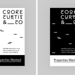
Blast’s visual identity for Assembly is built around an uppercase typographical treatment, based on a custom version of Brown, and monogram, but also encompasses colour palette, brochure and website design, material choices and print finish.
Aesthetically, the build of the logotype is fairly straightforward. Cuts are in the usual places but add interest and a little movement to Brown. As an extended custom typeface, this effectively and clearly links buildings within the development.
Although stylistically familiar, type feels informed and well-intentioned. The cuts, geometry and monolinear line weight manage to balance the current and utilitarian with a historical component tied to the visual language of 20th century London Underground, characterised by Edward Johnston typographical system.
It is perhaps worth acknowledging that these two aesthetics (geometric sans-serif and stencil cuts) continue to proliferate, at least individually, the property market and its brand landscape, however, their combination here appears as a neat intersection of city heritage and infrastructure, appropriately rooted in the development’s broad use and strategic location.

The monogram, built from the A of the logotype, duplicated, rotated and set with a circle, is a particularly neat detail, drawing something proprietary from the utilitarian but still grounded by concept. It is animated well, distinctive but clearly tied to the system, with the qualities of a Phillips head screw linking it to the name and the construction of property.

In print, as you might expect, the utility of type is tempered by the a high quality of its implementation across tactile materials using foil. This mix of practical type and quality of finish is, although familiar and often used within the property market, well-suited to a development that balances robust contemporary exterior build and interior flourish.


Constrast is effectively used throughout the brochure. This includes, but is certainly not limited to, the gloss of a foil over uncoated boards, white space and coloured paper, large images with white borders and smaller images that run off the page, uppercase monolinear sans-serif and sentence case serif, and layouts that exist somewhere between lifestyle and architecture.

Although this extensive use contrast is not unusual, distinctive brand character really comes through in the juxtaposition of bold reductive type and fine illustrative detail. Patterns add visual texture, and, much like type, function to divide sections, satisfy the a sense of detail and utility, and bound by shared sense of geometry.


The tension between detail and reduction, the practical and ornamental, is consistent, visually interesting and rooted in some universal communicative intentions. Although the layouts of the brochure do not quite make the transition online, there is a clear continuity, and a acknowledgement of digital demands, with a responsive and functional structure.
Design: Blast. Opinion: Richard Baird. Fonts Used: Brown & Freight.