Playground by Character
Opinion by Richard Baird Posted 22 March 2016
Playground is an American venture fund and start-up studio that takes a hands-on approach to mentoring the next generation of entrepreneurs. It was established with the intention of removing typical operational burdens associated with product development, drawing on the first-hand experiences of its four founders, freeing entrepreneurs to focus on what makes their idea great. Playground not only funds new ventures but offers time, expertise and a space designed to foster creativity and to help ideas flourish, with both machine shops and labs furnished with the latest technologies.
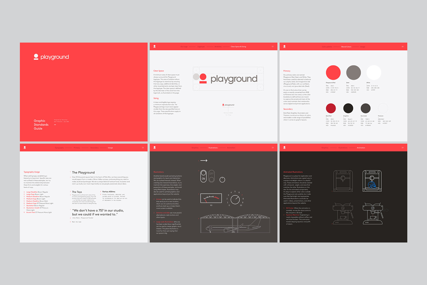
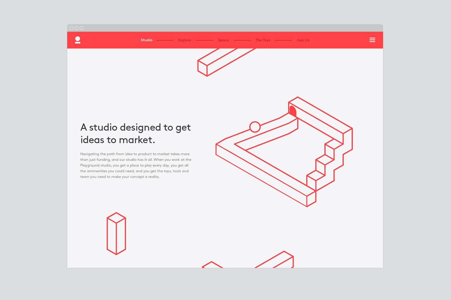
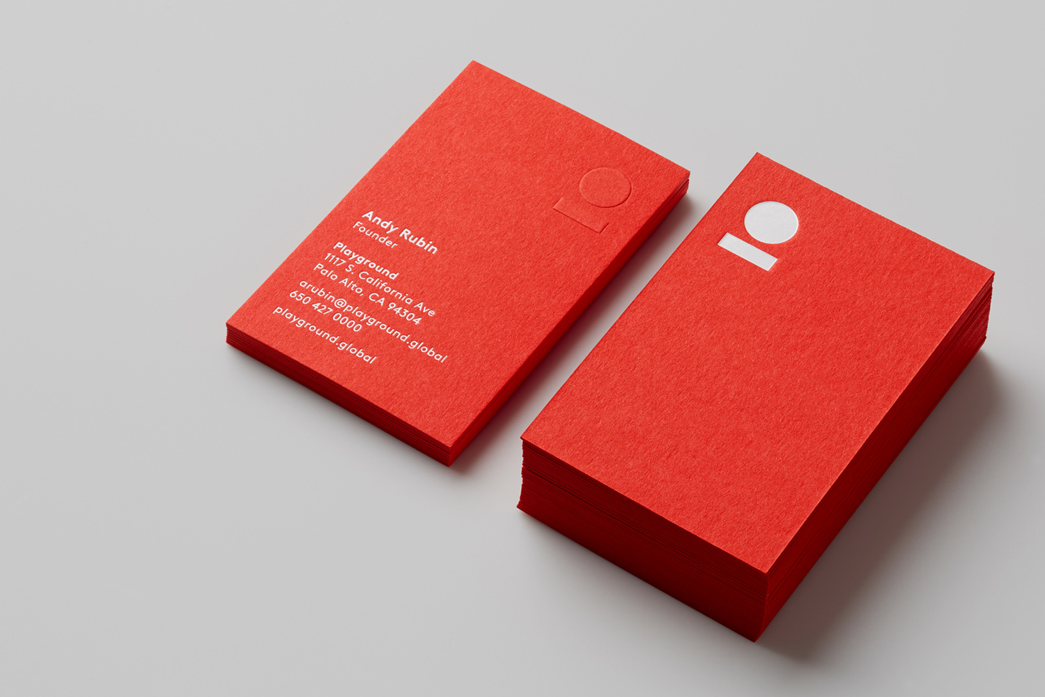
Drawing on the name and the company’s belief that play is integral to the process of new product development, alongside expertise, and with a desire to avoid the visual conventions of the venture capital industry, San Francisco based studio Character developed a brand identity for Playground that mixes the conviviality of a bright red colour palette with contemporary type choices, high-quality materials and print finishes, and plenty of motion online.
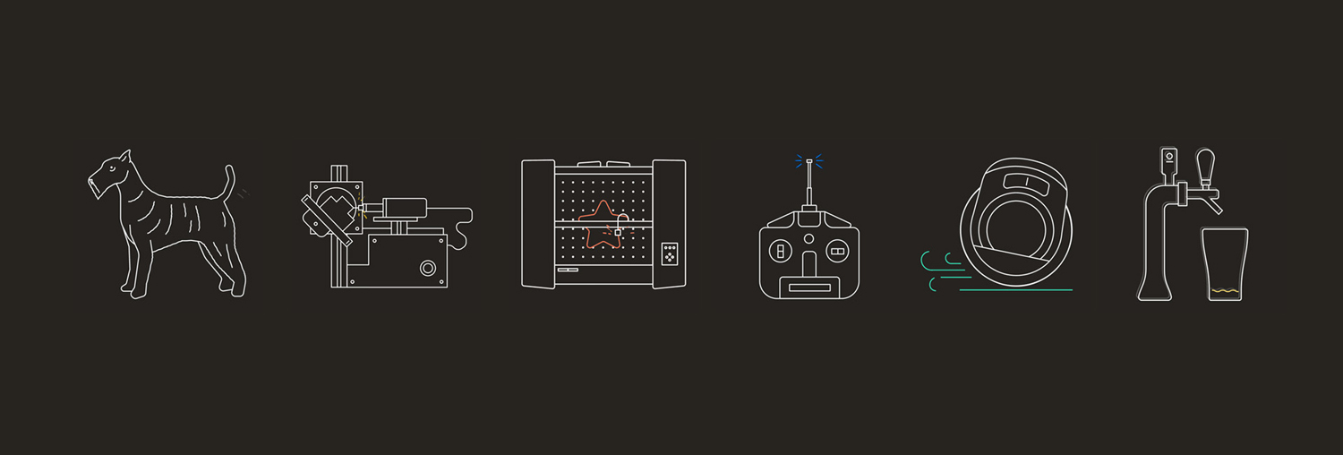
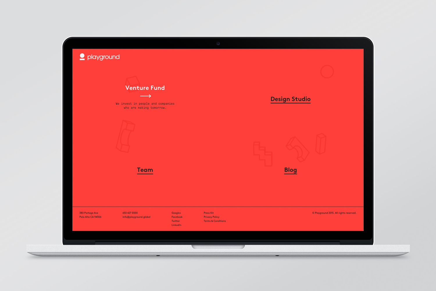
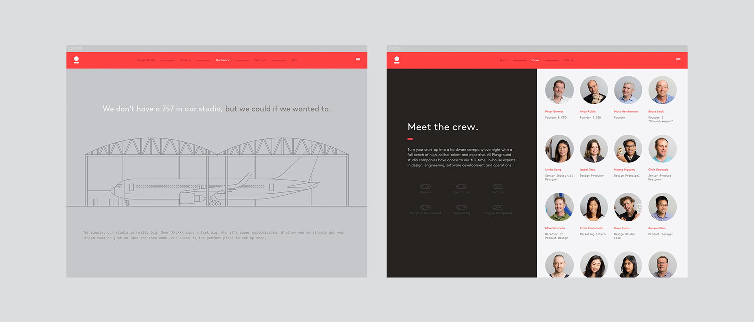
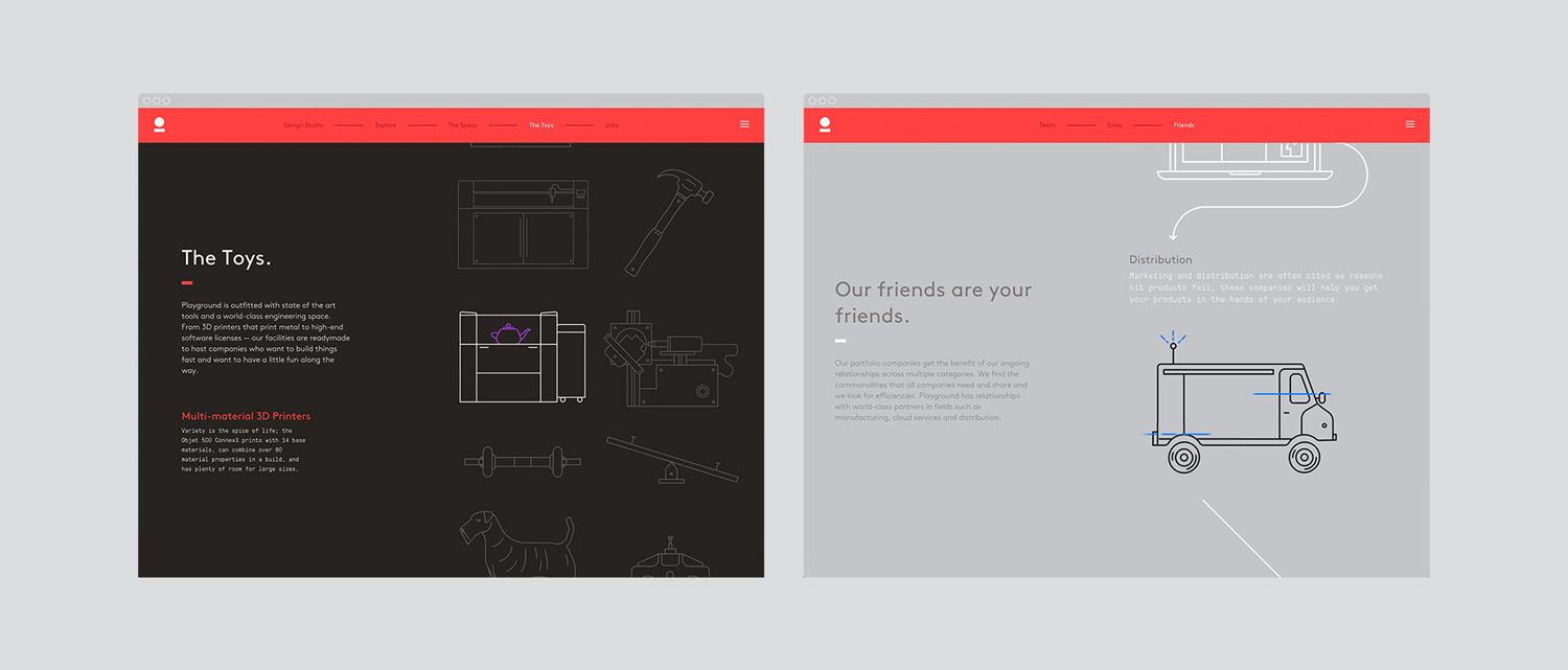
Character’s strategy focused on the promise of making tomorrow happen and having a little fun along the way. This is effectively expressed through the very current choices of Lineto’s Brown and Grilli Type’s Pressura, the contemporary build of Playground’s website, the use of uncoated and brightly coloured boards and white ink in print, and a variety of movement online. This extends to transitions, videos, dynamic pictograms and really well animated logo.

“The identity was inspired by the name and their unique blend of play and grounded expertise. The ball represented their playful spirit while the line keeps it grounded. These two simple shapes transform to represent a range of icons and concepts that reinforce Playground’s differentiation.” – Character
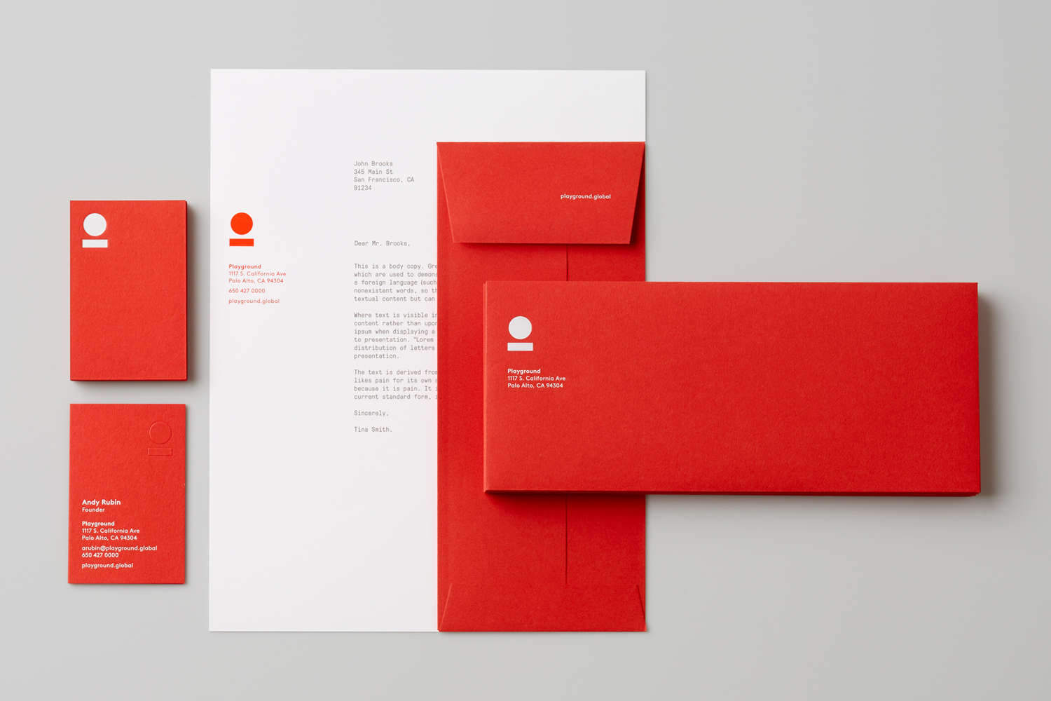

Character find a comfortable meeting point between play and professionalism. There is cheerfulness in the bouncing ball logo whilst also playing a little with a corporate modernism in the use of reductive geometric form and abstract concept, while the line art and dynamism of the pictograms move successfully between the convivial, technological and industrial. This industrial quality is also reflected in the mechanical monospaced nature of GT Pressure Mono, neatly emphasising the utility of on site labs and workshops.
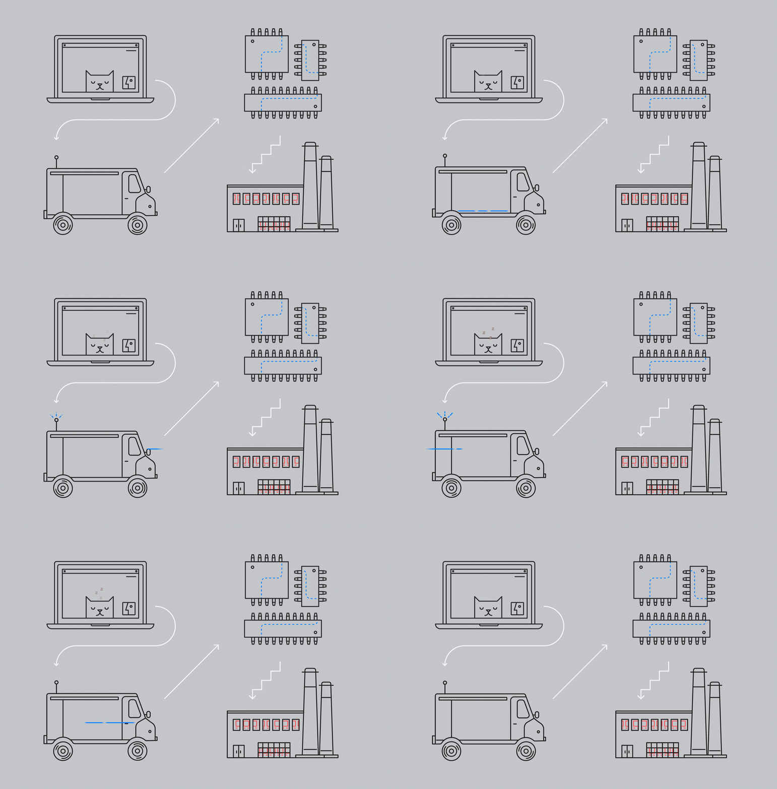
Collectively, these assets lean towards what might be described as the start-up rather than venture capital aesthetic, and, as such, has a reassuring quality, particularly for young entrepreneurs looking for investment and resources but not at the expense of agility, freedom and play.
Design: Character. Opinion: Richard Baird. Fonts Used: Brown & GT Pressura Mono.
