Designed in San Francisco
Recchiuti by Manual
Recchiuti Confections is a San Francisco-based gourmet chocolatier that creates chocolates with unique flavour combinations. Using traditional European techniques, with locally sourced ingredients from Northern Californian farms and markets, Recchiuti’s chocolates have earned a loyal customer base and several accolades. After 25 years in business, Recchiuti sought the expertise of Manual – a local design studio – for a brand...
Ostro by Mucho
Ostro isn’t the easiest of companies to make sense of. Billed as a ‘life science software company’, it straddles a number of different services that are both consumer and clinician-facing. In simple terms, though, it looks to help consumers and healthcare providers alike to navigate the complex, labyrinthine ins and outs of the complex US healthcare system; using software to...
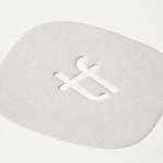
Mill by Manual
There’s a lot to be said for the Instagram-worthiness of, say, a faux-futuristic beauty brand identity that’s all gloopy, metallic, kinetic typography, ‘terminal green’, and unabashedly Gen Z-baiting ‘y2k’ art direction. It’s easy to assume that projects that allow designers the creative freedom for unabashed experimentation – playing fast and loose with legibility and lofty conceptual thinking – are the...
BrewBird by Mucho
Global strategy, branding, packaging, and graphic design studio Mucho created this colourful new identity for coffee tech startup BrewBird, working with Scottish artist Craig Black. Mucho was appointed to create a new brand identity and ‘memorable’ packaging system to help BrewBird communicate its story around uniting cutting-edge tech, taste, and ‘the artisanal craft of coffee roasters’. According to Mucho, drip...
Big C Charters by Mucho
Big C Charters is a premier charter service located in the San Francisco Bay Area, offering hands-on fishing trips and excursions. The company gets its name from Christian Cavanaugh, captain, founder and former professional basketball player. With a growing fanbase and fleet, Mucho was commissioned to create a new logo, colour palette and custom typeface for the brand, as well...
Self, Made by Collins
Exploratorium is a “public learning laboratory” and San Francisco based museum that enables visitors to question and make sense of the world around them through hands-on exhibits that touch upon science, art and human perception. Its summer 2019 exhibition, Self, Made, continues in the spirit of exploration but turns this inward, tackling the theme of human identity. It did this...
Exploratorium After Dark by Collins
Exploratorium is a “public learning laboratory” and San Francisco based museum that enables visitors to question and make sense of the world around them through hands-on exhibits that touch upon science, art and human perception. These include a pitch-black dome, fog bridge, large-scale kaleidoscope, light displays and array of image bending mirrors. Every Thursday the museum hosts After Dark, an...
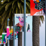
Frameline 41 by Mucho
Frameline is an American nonprofit arts organisation and the world’s longest running LGBTQ film festival. Frameline continues its mission, since its founding in 1977, to change the world through the power of gay cinema, and to connect filmmakers with audiences locally and internationally. Graphic design studio Mucho worked with Frameline on its visual identity and campaigns for its 40th and 41st LGBTQ...
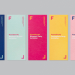
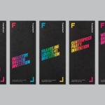
Frameline 40 by Mucho
Frameline is a San Francisco-based nonprofit arts organisation and LGBTQ film festival that intends to change the world through the power of gay cinema, and to connect filmmakers with audiences locally and internationally. Graphic design studio Mucho worked with Frameline on its brand identity and campaign for its 40th LGBTQ film festival, delivering a system based around a framing device, a bright and diverse colour palette and...
Playground by Character
Playground is an American venture fund and start-up studio that takes a hands-on approach to mentoring the next generation of entrepreneurs. It was established with the intention of removing typical operational burdens associated with product development, drawing on the first-hand experiences of its four founders, freeing entrepreneurs to focus on what makes their idea great. Playground not only funds new ventures but offers...
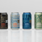
Fort Point Beer Co. by Manual
Fort Point is a San Francisco-based small batch craft beer company that references traditional styles yet is firmly rooted in the present, and has a philosophy that values craftsmanship and innovation, creativity and technique. In 2015, working with local graphic design studio Manual, Fort Point launched a new graphic identity and packaging system to unite its expanding range. Fort Point’s forward-thinking, fast-growing...
Tina Frey Designs by Mucho
Tina Frey is an American homeware designer with a studio in San Francisco. She is inspired by the fluid lines of the sea, the curves and contours of nature, objects picked up while traveling, and the translucent colour of ice lollies and jelly beans. The design of each of her products—which include plates, bowls and utensils—is rooted in simplicity and functionality. These are sculpted...