Happy Maple by Garbett
Opinion by Richard Baird Posted 26 July 2016
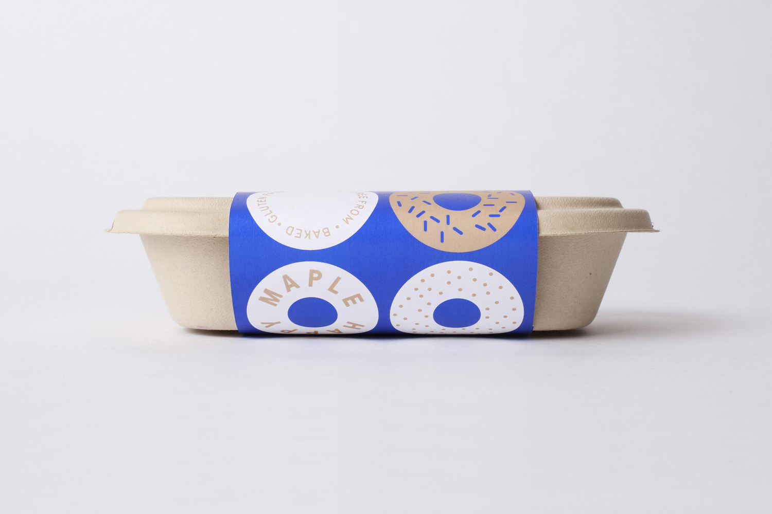
Happy Maple is a Adelaide-based bakery dedicated to producing small batch 100% vegan donuts, baked not fried, made from gluten, tree nut and peanut free recipes. Orders are by phone, e-mail or through their pop-up stores. There is no website, just a social media presence with lots of donut images, a personable approach to communication, and a cheerful brand identity created by local graphic design studio Garbett.
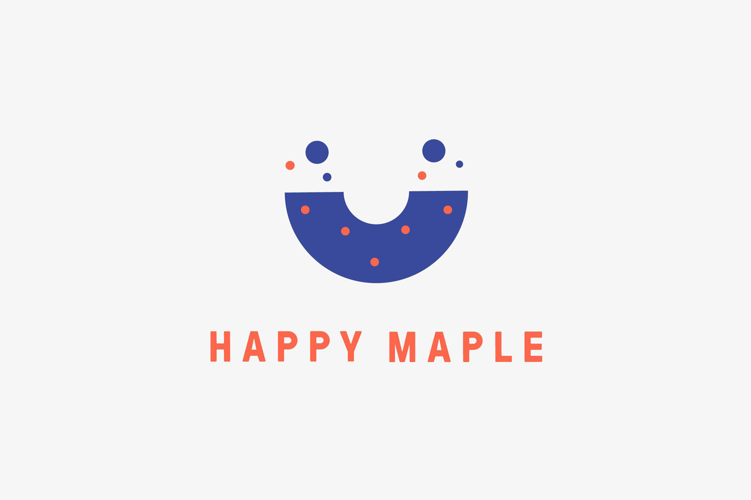
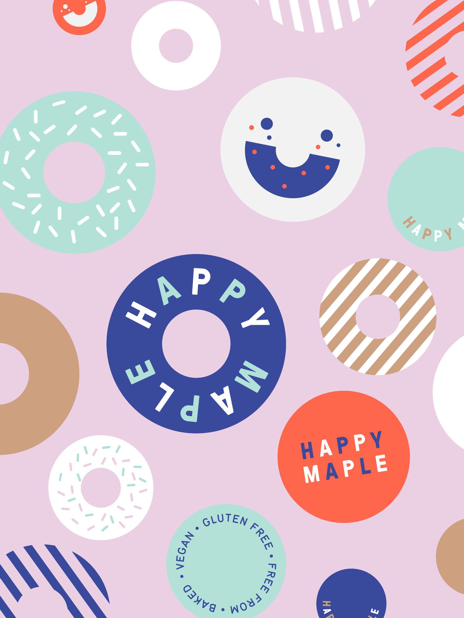
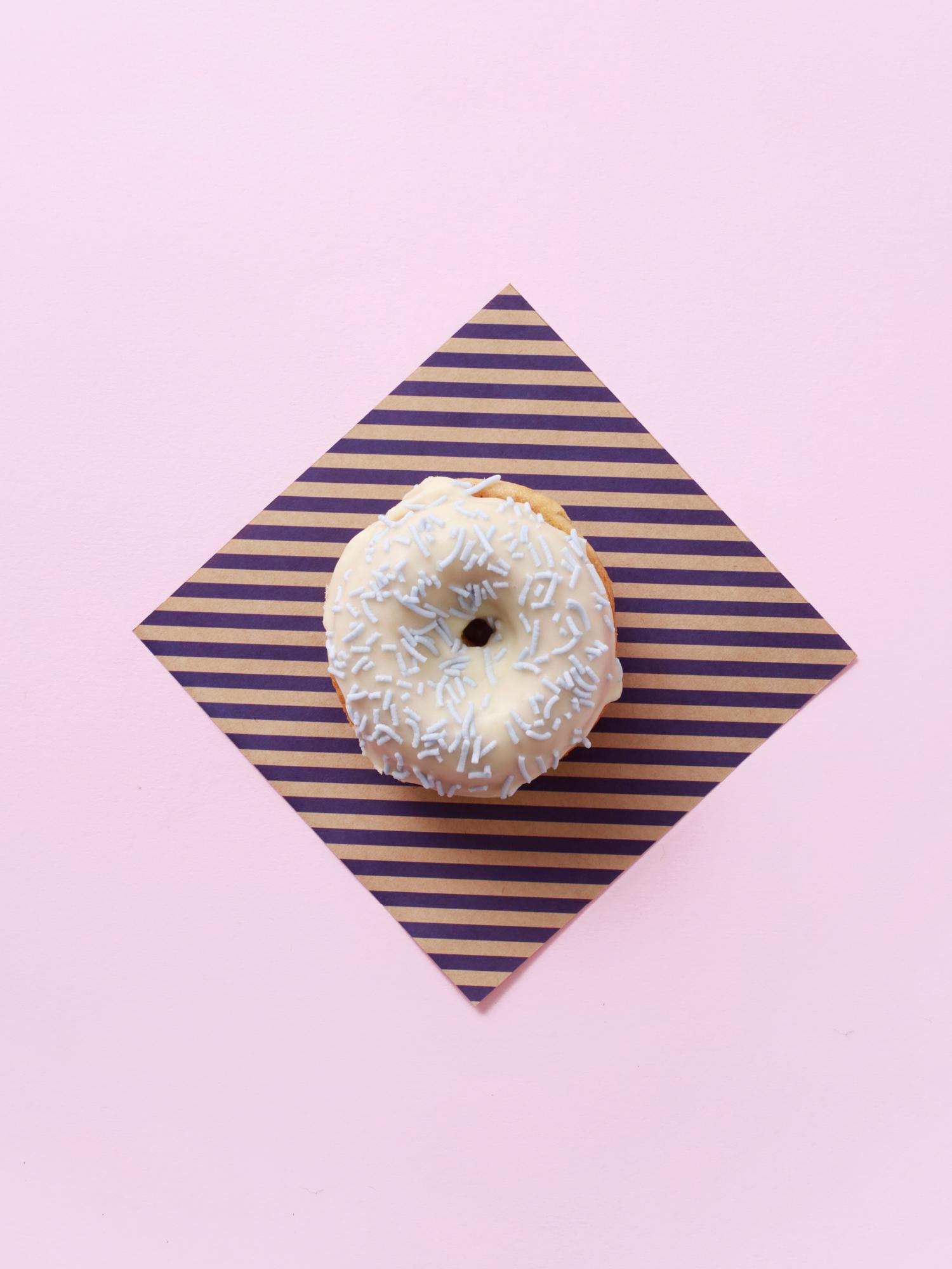
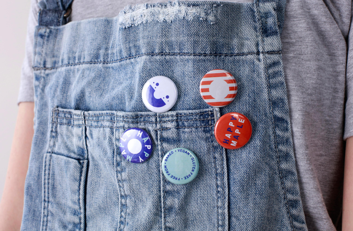
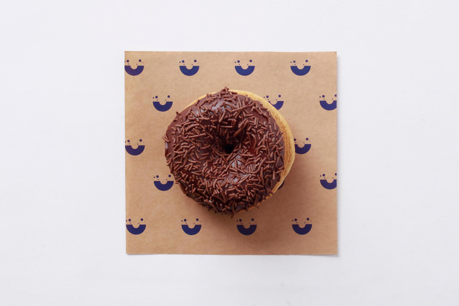
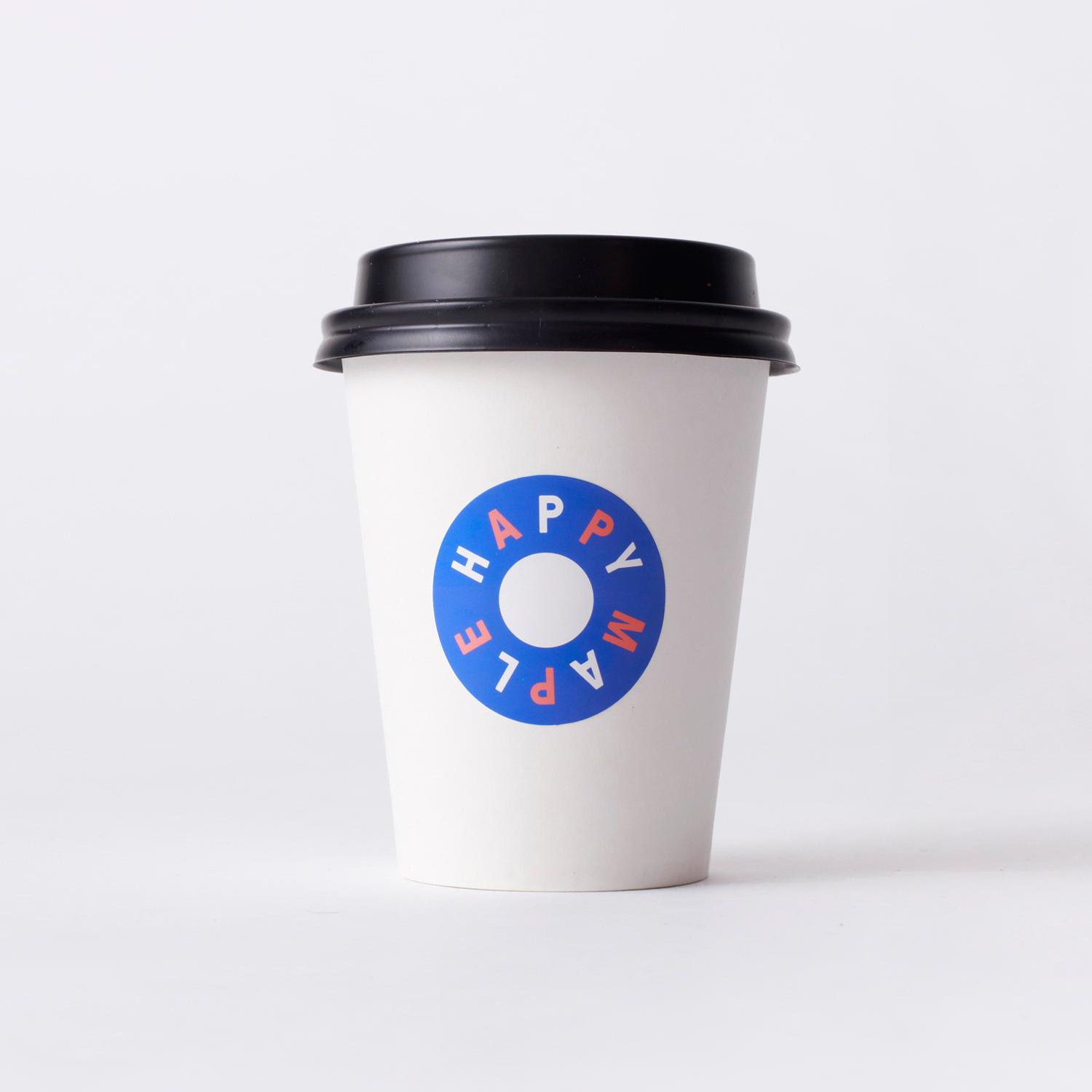
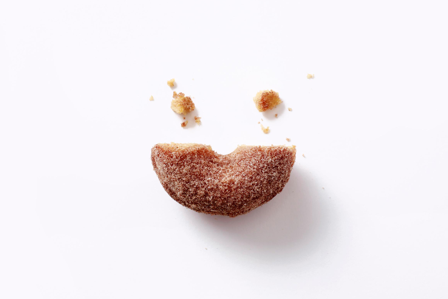
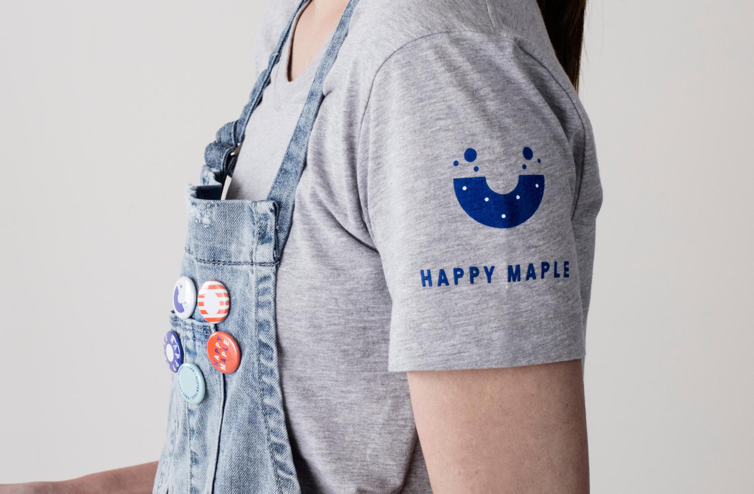
Garbett have managed to get a lot out of the ubiquitous form of a donut and the familiarity of its toppings, and visually articulate the cheerful and personable tone of voice that proliferates Happy Maple’s social media presence and the inclusivity and modernity of a completely “free-from” concept. This is achieved through a simple logo; a half eaten donut and crumbs that form a smiling face, some straightforward but attractive illustration and photography, and a contemporary colour palette.
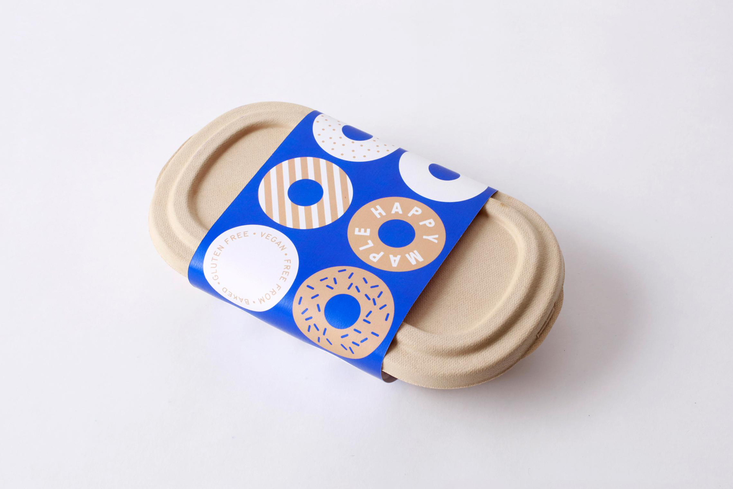
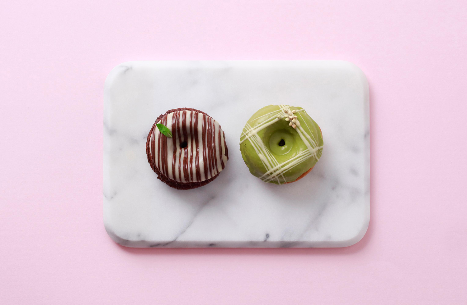
A broad colour palette, stacked and curved baselines for type, a mix of striped and sprinkled toppings, and the texture within photography and across the surface of t-shirts, packaging and napkins, work well to break up the repetition of form, convey an abundance of choice and bring variety and distinction to a familiar but compelling approach. More from Garbett on BP&O.
Design: Garbett. Opinion: Richard Baird.
