The True Honey Co. by Marx Design
Opinion by Richard Baird Posted 2 August 2016

The True Honey Company (TTHC) dedicates itself to the production of mānuka honey, a monofloral variety produced in Australia and New Zealand from the nectar of the mānuka tree. It has a unique colour and texture, and a high level of Dietary Methyglyoxal, an organic compound with antibacterial and antiviral properties.
With a price range starting at 60.00AUD and rising to 230.00AUD per jar, and working in a market flooded with sub-standard honey and dishonest marketing, communicating the value of product and the commitment of TTHC to quality and ethical production through an impactful and engaging brand identity and packaging design was paramount. This task was given to Auckland-based graphic design studio and packaging specialists Marx Design who collaborated with Think Packaging and writer Kate Phillips.

Marx’s brand identity and packaging design work for TTHC finds a comfortable meeting point between characterful flourishes, communicative clarity and premium cues. Where you often find an unwavering consistency in visual language, or a modest graphic expression—the new shorthand for authenticity in the modern luxury landscape—Marx embraces variety but continuity, effectively utilising illustration, newsprint, editorial design, copywriting, tone of voice, structural and graphic design to build out a visually and information rich brand language.


There is a lot that makes up the TTHC brand. Colour, type, layout, materiality, structure and image are all used, are communicatively clear, well-intentioned and for the most part, balanced.
Colour palette inverts the industry favour for the light and instead embraces the dark. This works particularly well to draw out the honey, to quickly mark out product as different, and in conjunction with gold block foil, dyed papers, surface texture and varnish, makes the most of some well-established premium cues without appearing excessive. This also extends to an incredibly robust structural design.
Developed with cardboard engineers Think Packaging, boxes not only function to protect during shipping, but also avoids the ubiquity and not so eco-friendly nature of bubble wrap or polystyrene pellets, emphasise value of product and ethical integrity. These boxes also have a fold out presentation style you might associate with other luxury products, drawing sophistication from a conventional material through form and creative thinking.

Visual language plays with a contrast of bold type, clear MGO numbers and simplicity front of pack, and the copy and illustrative detail of the reverse and sides. The use and style of image and the formatting and extent of text, one that takes an almost storybook-like approach where often minimal luxury can be austere, is impactful, layered and full of personality.
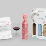
There are a few different channels from which to express product insight and brand story, preliminarily through website (sales are exclusively through TTHC’s site), but also through postcards and newspaper/editorial design. This should free packaging up a little, a chance to hit key propositions and follow up with a deeper level of insight through other channels. So while copy and image is great, placing all of these onto a small canvas, when there are other channels, makes packaging appear busy and text rather small.

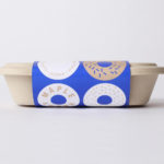
Illustrations are distinctive and well-drawn, convivial, contemporary and personable with some interesting combinations that make a connection between people and the natural world. Although “Friends With Benefits” seems less clear, the rest are thoughtful and original in their design, and grounded by good communicative intentions, also articulated through some simple but effective copywriting by Kate Phillips. The hand and heart makes for a strong mark and is well-placed on the jar.


The logo is a departure from the geometry, utility and technicality of Aperçu, leaning more towards the personable qualities of illustration. Isolated the hand drawn irregular lines of logotype feel a little trite and slightly disconnected, however, as part of system of broader system of assets reinforces and does not detract from what is already communicated in more compelling ways. There is equity brought over from the original logo in structure although the beehive is very nearly lost in the process.

The use of newsprint is a highlight, leveraging the factual expectations of daily newspapers to emphasises the truthful nature of brand. Type and layouts feel modern and impactful, and the language enthusiastic and personable, picking out what Marx describes as 6 truths. It brings further physical qualities to what is initially a digital-first experience outside of packaging, and contributes a lot more depth and insight to brand and product. More by Marx Design on BP&O.
Design: Marx Design. Structural Design: Think Packaging. Copywriter: Kate Phillips. Opinion: Richard Baird. Fonts In Use: Aperçu.