Common Lot by Perky Bros
Opinion by Richard Baird Posted 24 October 2016
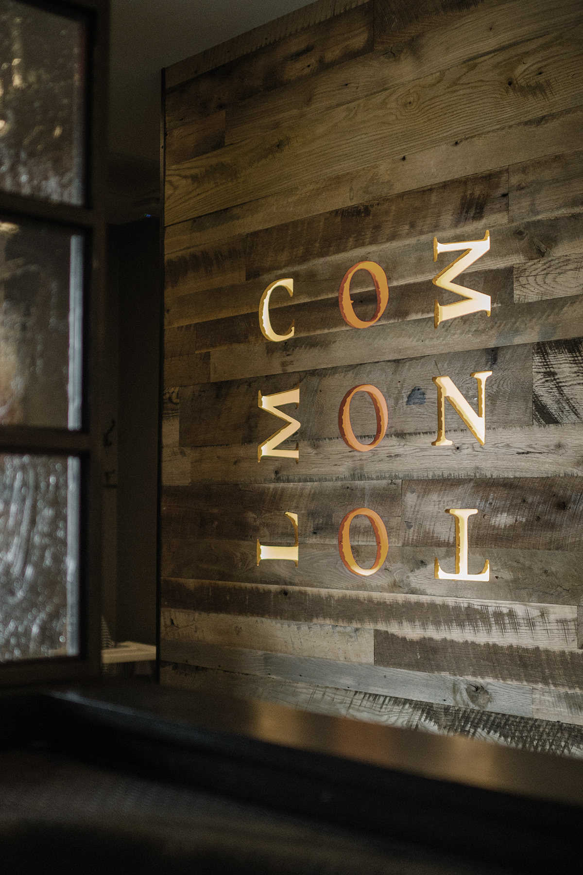
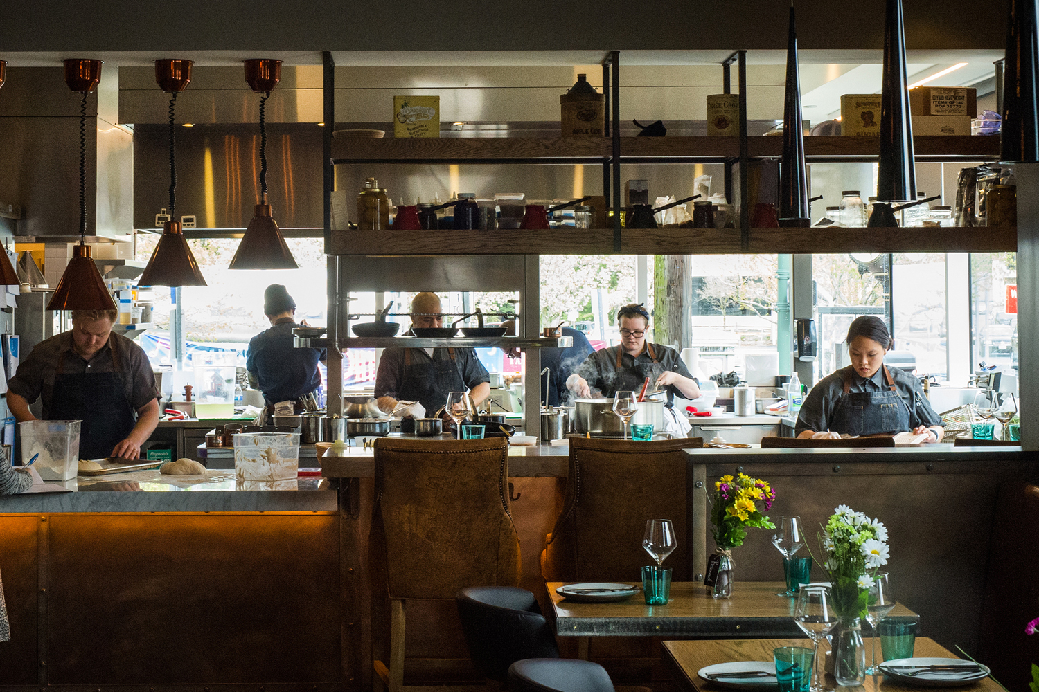
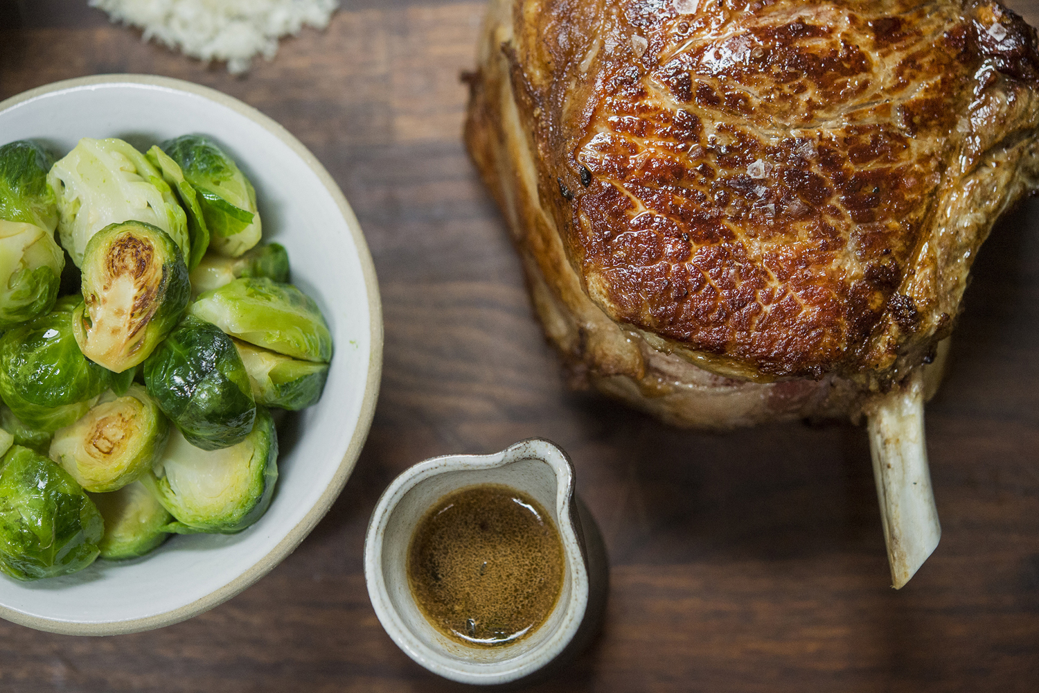
Common Lot is restaurant located near the Papermill Playhouse in Millburn, New Jersey. It has a menu of seasonal dishes made from locally foraged produce and fresh ingredients, and features an interior design described as being minimalist with unexpected finishes, natural materials, texture and light.
The restaurant was created by Australian chef Ehren Ryan and draws upon his globally diverse culinary background and free spirit. This is seen in the communal dining experience, open kitchen and shared tables which contribute to a relaxed and convivial atmosphere.
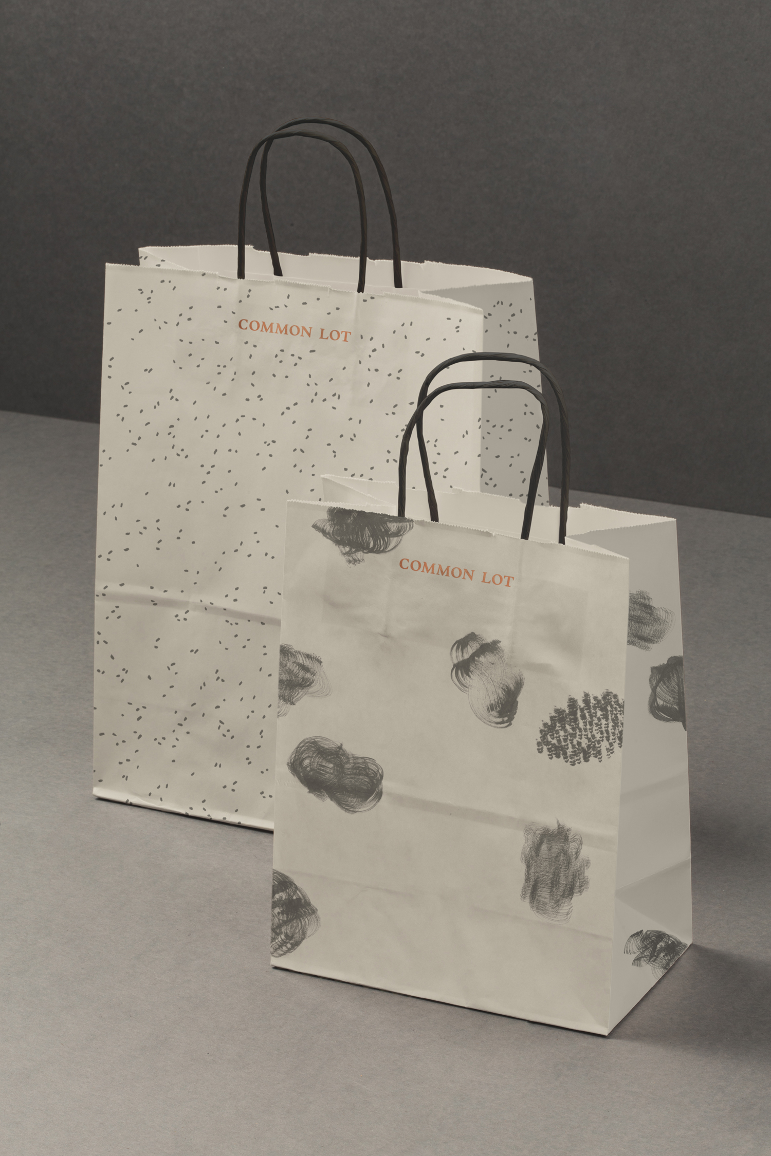
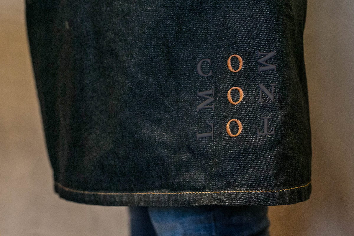
Chef Ehren Ryan is described as being serious about food and jocular about life, and it is this that informed the visual identity design for Common Lot, created by graphic design studio Perky Bros. This runs across and links a variety of assets that included menus, stationery, bags, thank you cards, signage and branded aprons.

The dual notion of seriousness and playfulness manifests itself well throughout identity, although it is earthy colour palette and materiality that really dominates, and holds a few quite different elements together. These elements include serif logotype, monolinear and geometric logo, loose organic patterns and consistent and structured layouts.
The uniform sits alongside the irregular, the busy by the sparse, the traditional next to the more modern and the formal existing within the context of the informal. These feel like fair expressions of the character of chef and the environment of the restaurant, and are visually interesting in their juxtaposition.
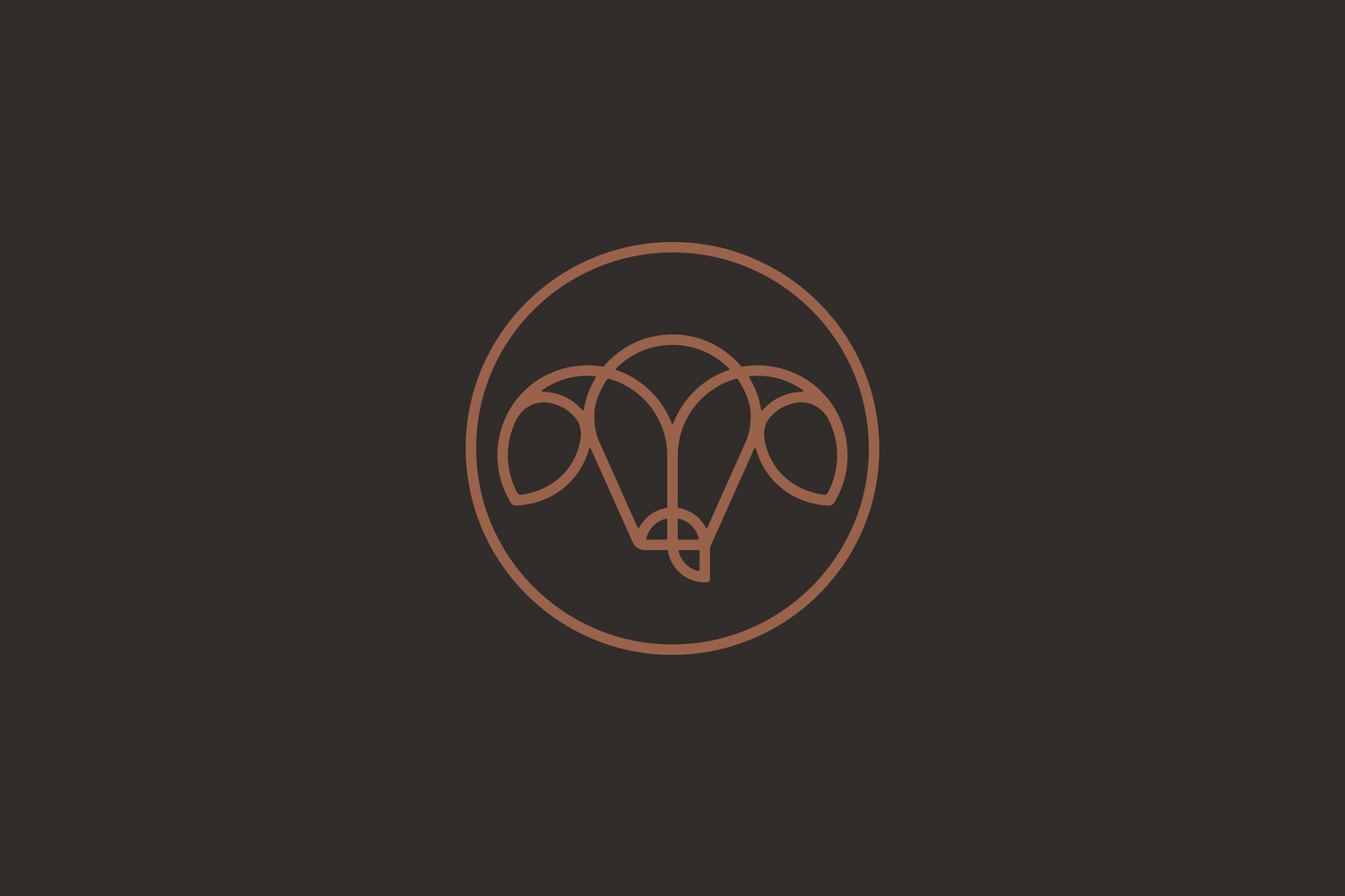
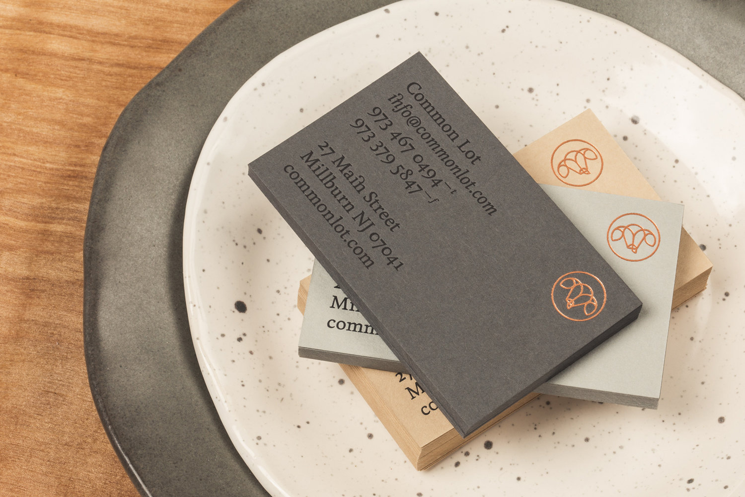
Type and mark are perhaps the most literal articulation of play and seriousness, modernity and tradition. The logo is well drawn with a current monolinear and geometric quality. The large ears, the motion from ear to brow and nose to tongue draw distinction from a paired back and current illustrative style, lending it a bit of a quirky character and remaining in line with the minimalist quality that proliferates interior.
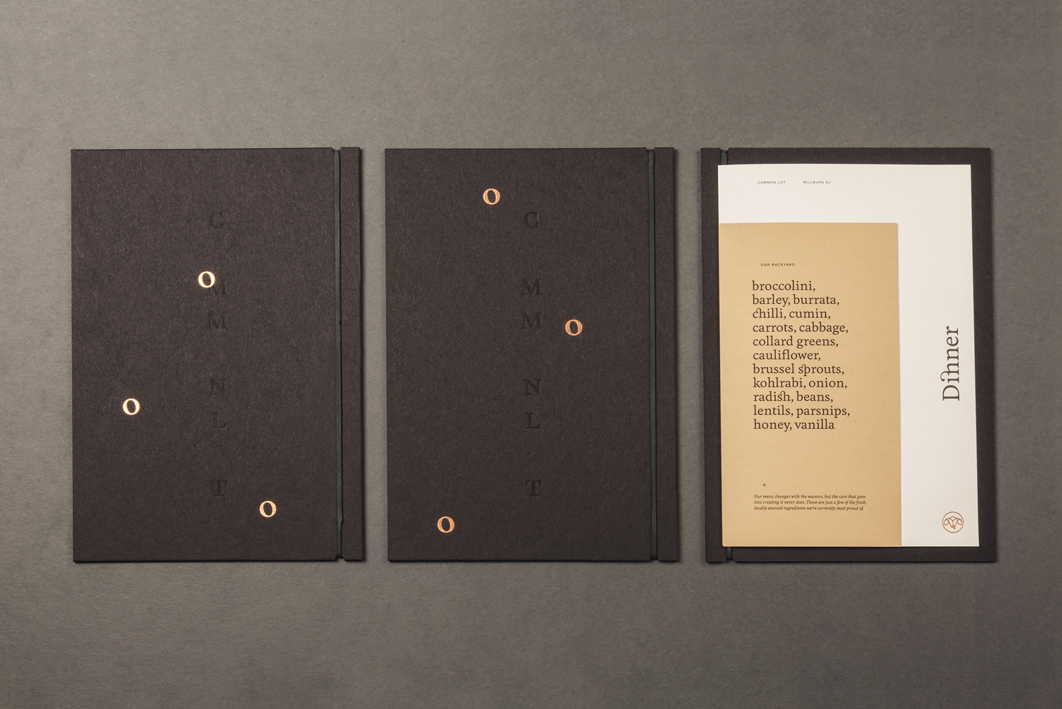
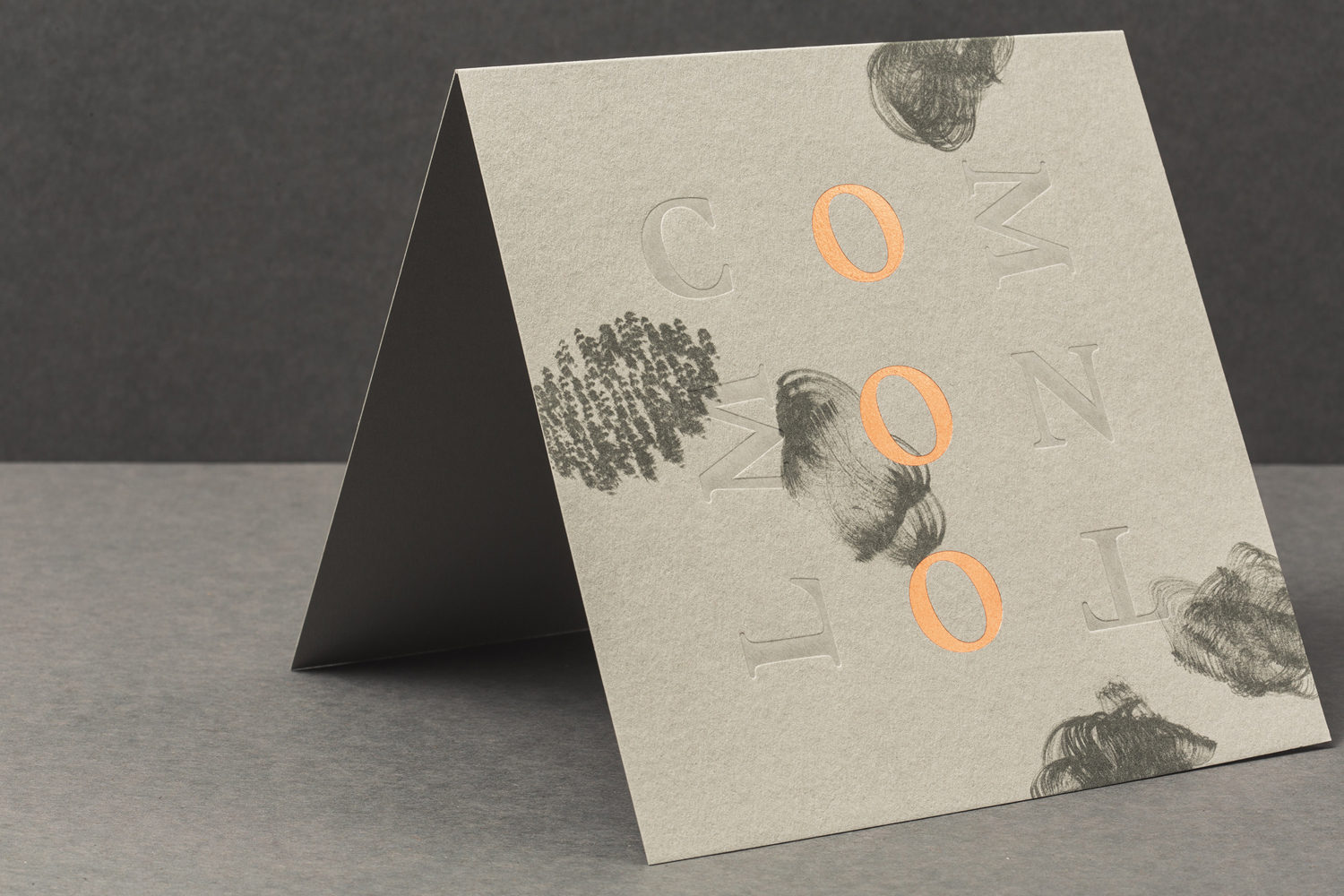
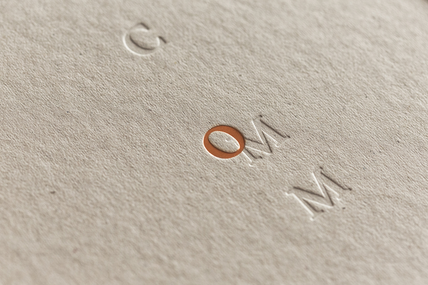
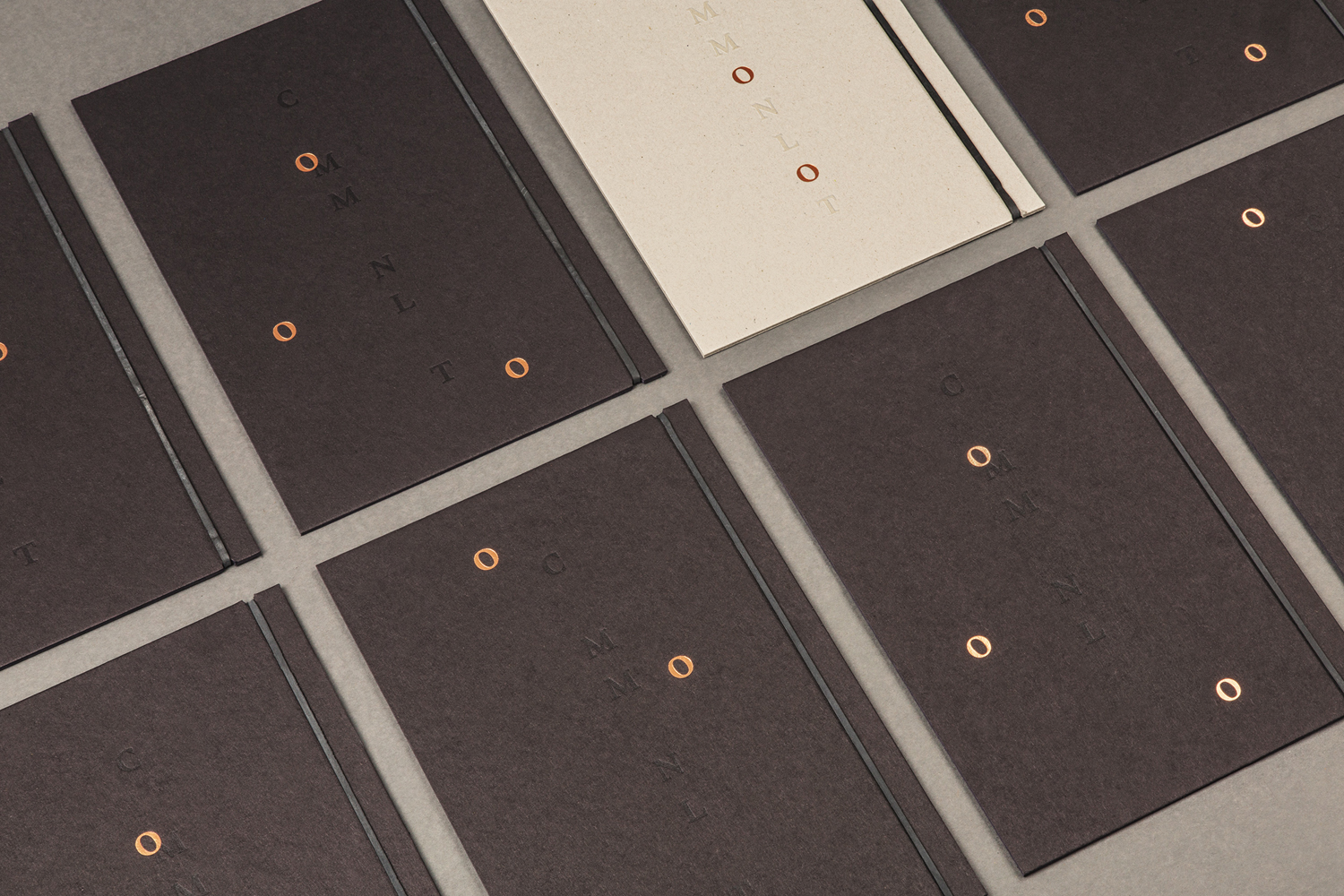
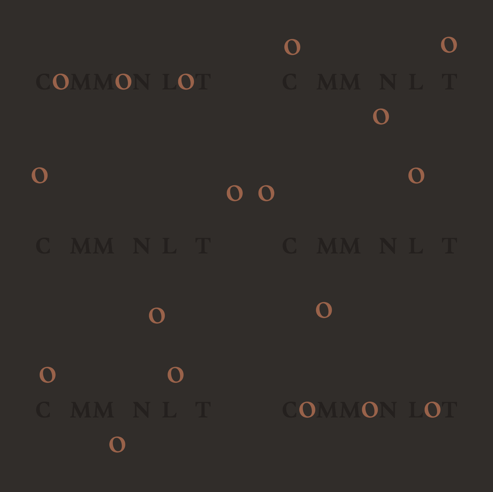
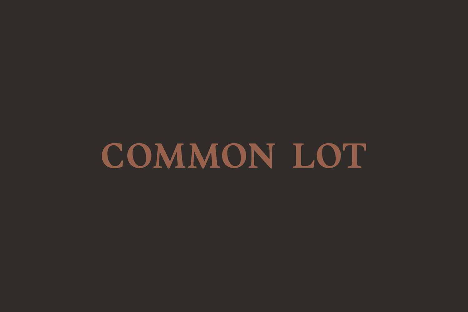
Taking inspiration from common pasture, shared plates and wayward sheep, Common Lot’s logotype, a fairly conventional uppercase serif wordmark, becomes a dynamic and irregular graphic device, with the Os freed from the base line and moving around menus. It is a fairly abstract idea, but one that manages to exist somewhere between the formal (when rendered online), and the more playful in print.
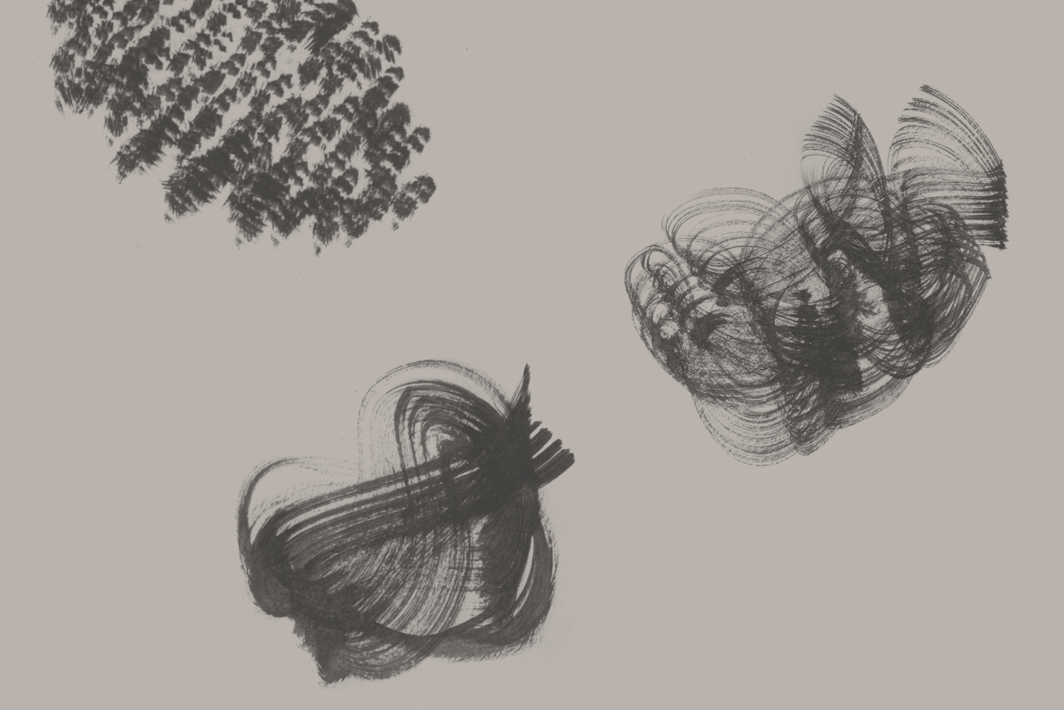

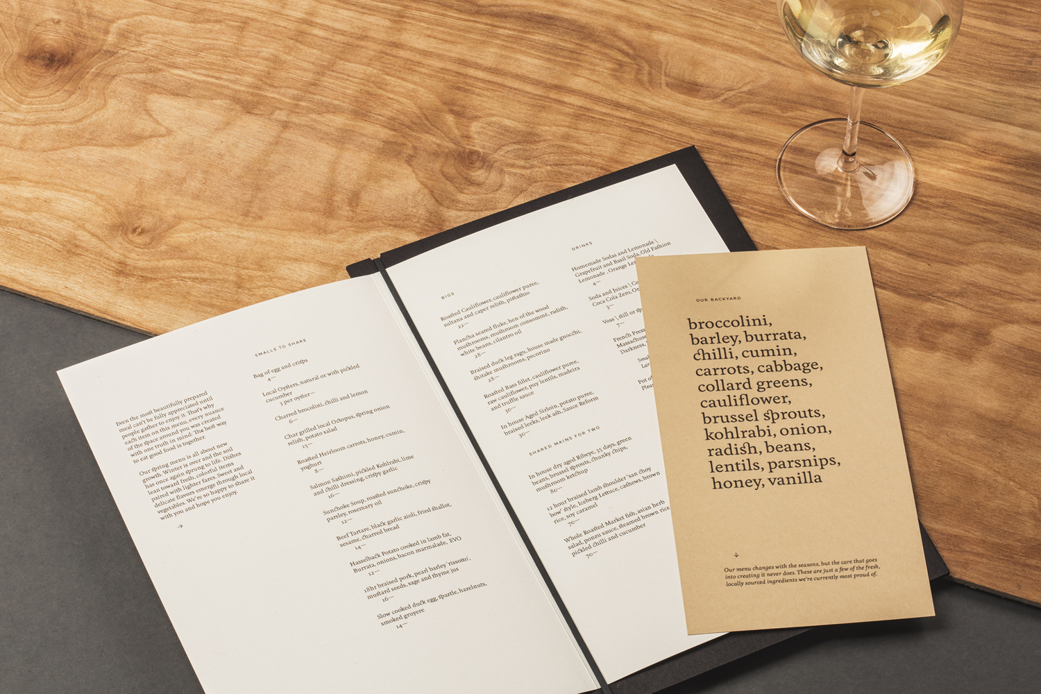
The formal and traditional tone of logotype, the layout of menus, type and typesetting are juxtaposed alongside the organic and the irregular qualities of patterns. Like the abstract nature of the free-floating Os of the logotype, pattern is abstract, although not as much. It is easy to see footprints and balls of wool in these, however, it is the former that feels a little smarter, a little less on-the-nose, and more restrained.
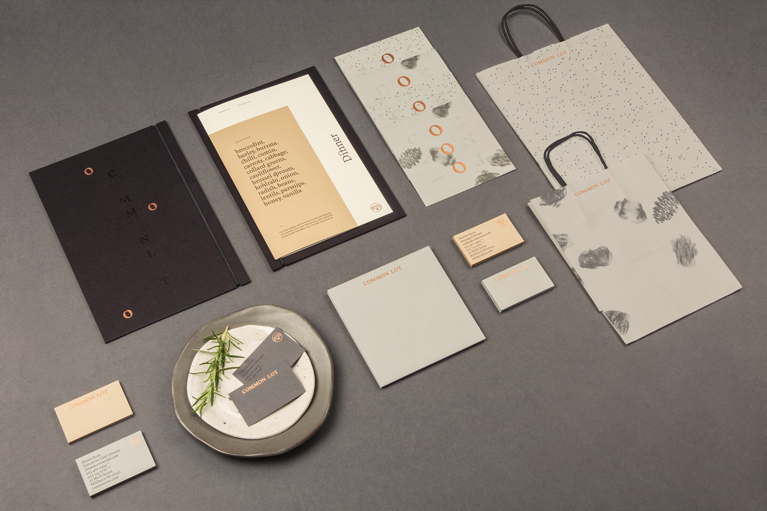
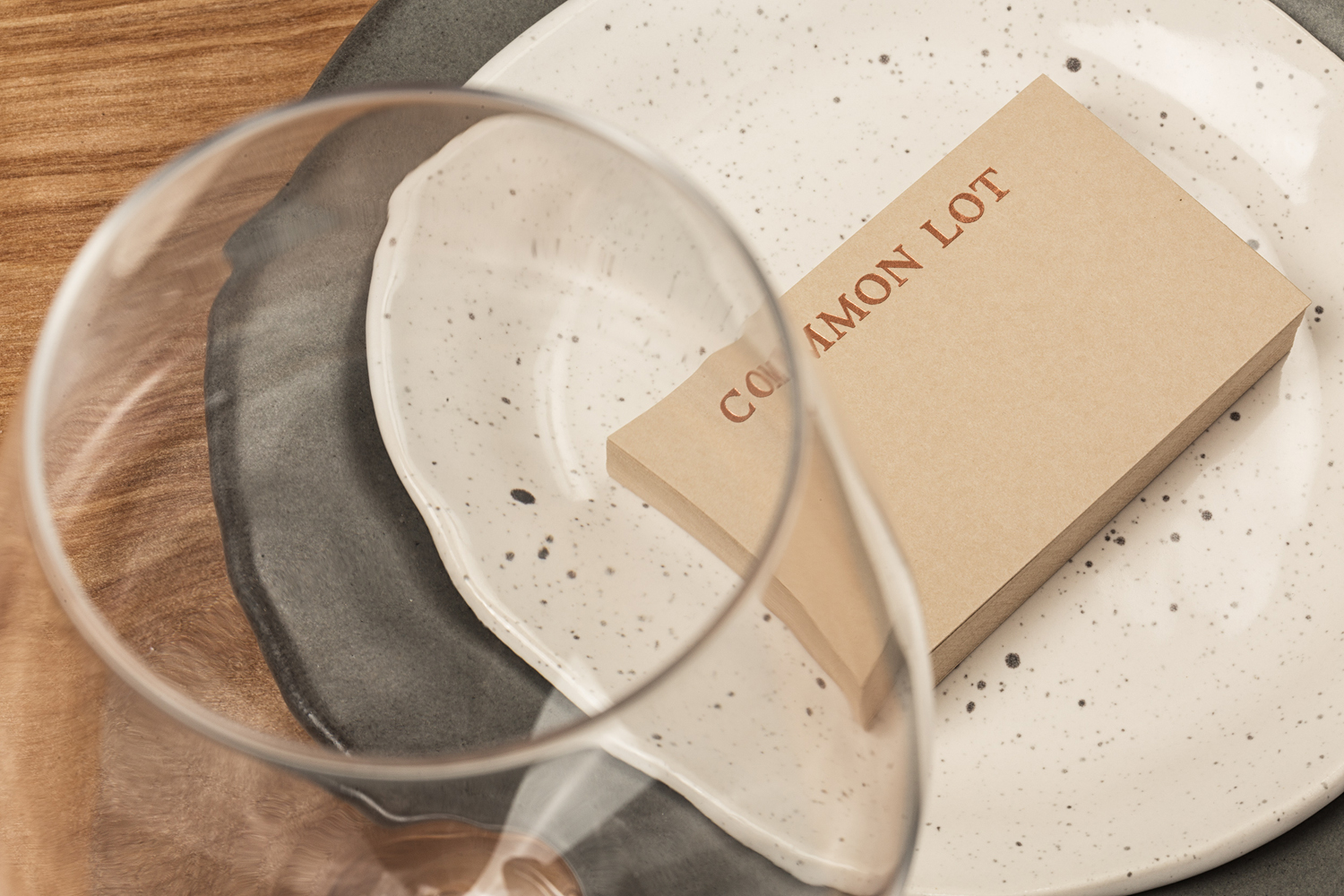
There is a strong sense of materiality to identity. Dyed uncoated papers, a number of different glossy print finishes, debased detail and different weighted boards contribute to an feeling of the earthy and high quality, and, much like interior design, balance the minimalist with unexpected finishes, texture and light, and work well to hold a few different graphic assets together. More from Perky Bros on BP&O.
Design: Perky Bros. Food Photography: Daniel Krieger. Opinion: Richard Baird. Fonts Used: Feijoa & National.
