Paulig Kulma by Bond
Opinion by Richard Baird Posted 22 May 2017
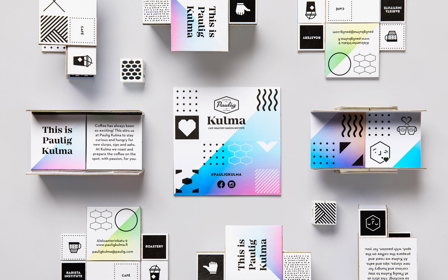
Paulig Kulma is distinctive space, located in the heart of Helsinki, developed by Paulig, the leading coffee brand in the Nordics. It combines a coffee shop, roastery and barista institute, and intends to appeal to a broad customer group, and accommodate a variety use cases throughout the day.
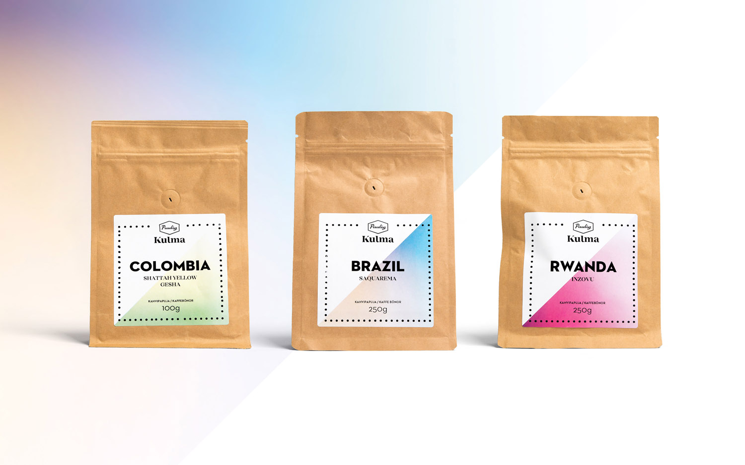
Paulig Kulma serves multiple functions. From the inviting and flexible space of the coffee shop, to the industry and craft of the roastery, and the creativity and process taught at the barista institute. Although these exist within separate areas, interior design and brand identity, created by Scandinavian design studio Bond, brings these together as a continuous, integrated and rich brand experience, in print across business cards, coffee packaging and labelling, as interior graphics, menu boards and lighting, and in the choice of furnishings, fixtures and fittings.
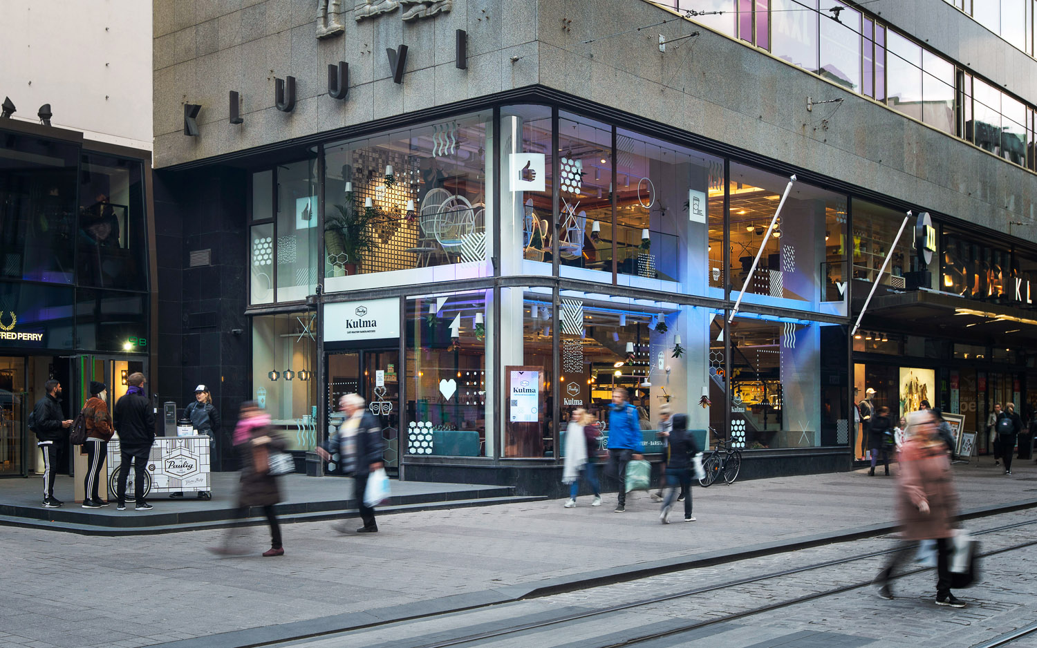
This is a thorough and holistic project. Brand identity draws its value not only from its quirky graphic expression but from its context. It has not been created in isolation. It makes the most of the stylistic and conceptual, perception and association, initial impact and a residual impression.
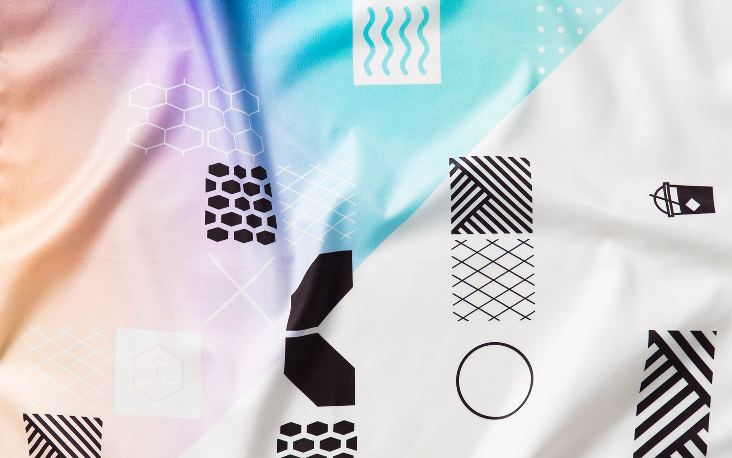
Continuity between interior and visual identity exists not only in the primary connection between gradients and lighting, and the use of pictograms site-wide, but conceptually in an underlying modularity, in the meeting of industry and creativity.
Visual identity and interior are interwoven, literally and conceptually. To judge this by printed assets alone would be to sorely under-appreciate the nuance, thought and hierarchy of experience, one where interior dominates and visual identity serves to layer this and also work as a distinctive expression outside of space.
BP&O is interested largely in ideas drawn from, and making a connection with, a unique experience. Less so about the stylistic, although that is of course a consideration. Visual identity, isolated, absent context, and aesthetically is likely to divide here. But it is not overbearing, and adds some neat touches to interior, bringing a youthful and convivial quality to elements of the industrial.
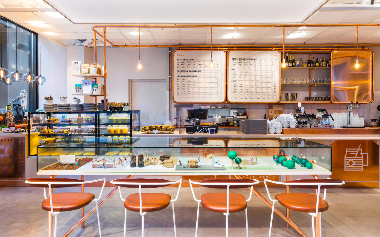
Kulma’s interior design is a veritable funhouse of form, finish and furnishing. There is an abundance yet continuity here, not often seen. It is a playhouse that mixes cosy hiding spots with communal areas, fixed seating with the modular and moveable, and there is a contemporary on-trend utility punctuated with moments of playful image.
It is a multi-purpose space. Rather than divide areas, one area bleeds over to the other. The industry of the roastery, its pipes and industrial associations reach right into coffee shop, emphasised by material colour, creating a distinctive aesthetic rooted in purpose. The barista school is visible through glass panels, connecting baristas-in-training with customers and vice versa. And the choices of wood and stools deliver a school-like continuity throughout.
Visual identity serves to do much the same. Rather than creating assets to divide, it unites the three key functions of space. There are the modular and industrial quality of pictograms. There is a parallel drawn between the craftsmanship of the barista and the carved qualities of the logotype and typography. The graphic and interior intersect in a variety of different ways, cut from metal, applied as window decals, and used across stools.
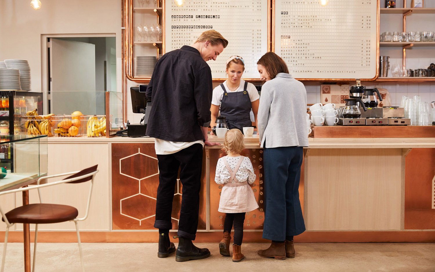
There is a strong commonality between the modularity of graphic assets, set within squares (square labels and napkins etc.), the square moveable cube stools of the cafe, and the cubes of a feature wall. Although the graphic assets draw on the industry of the roastery, and the process of learning, in shape and content, their modularity also speaks of the adaptability of space.
Graphic assets and interior design also to serve as a way to connect with both adults and children. The are places to discover and look at, a variety of different seating situations, both individual and communal. There is a sophistication and accessible quality in the industrial components, particularly in the warmth of the copper, but also moments of play in iconography, interior forms and displays. The table that houses a diorama and the wall of cubes are neat details.
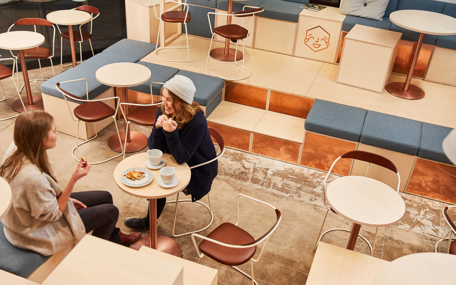
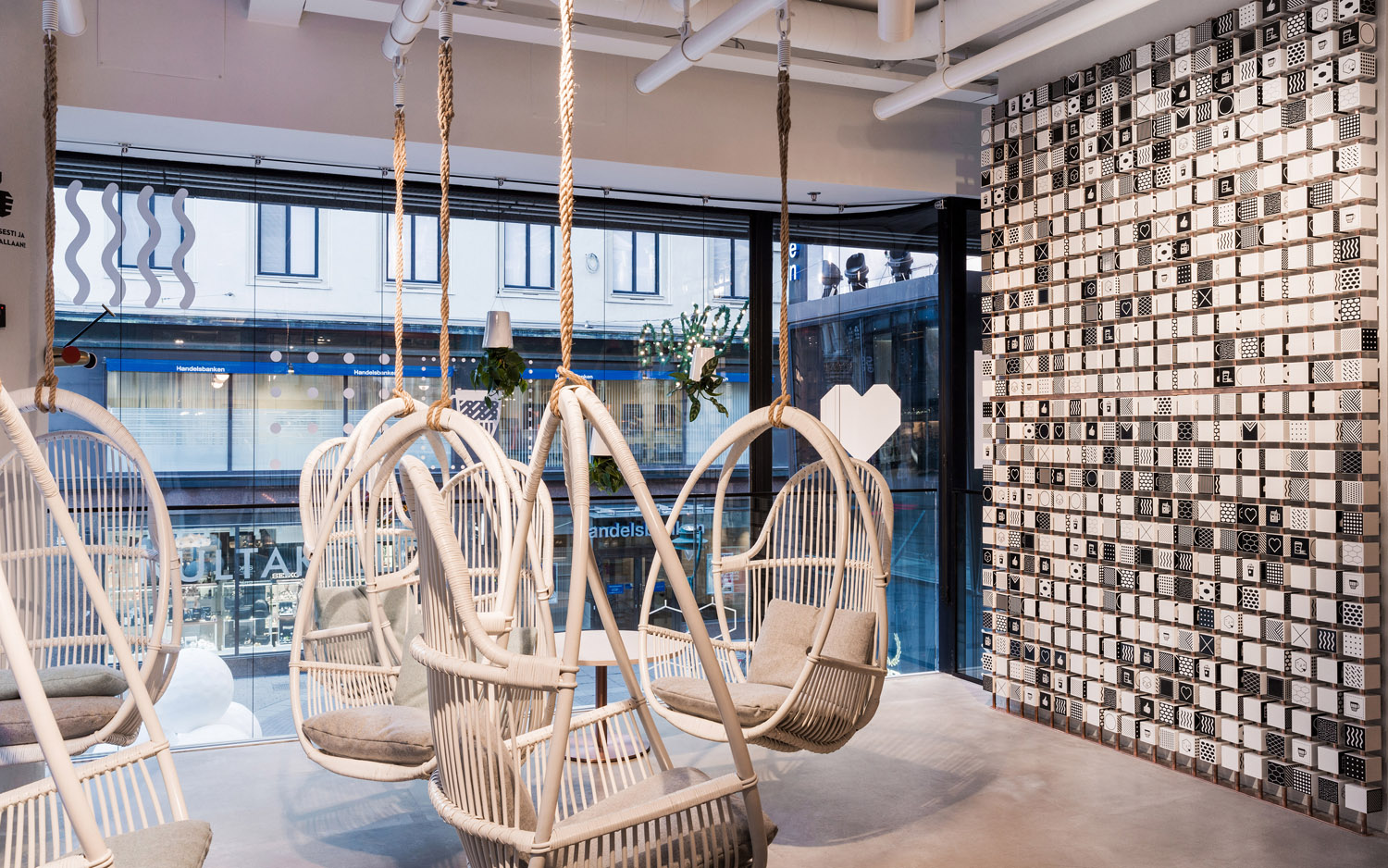
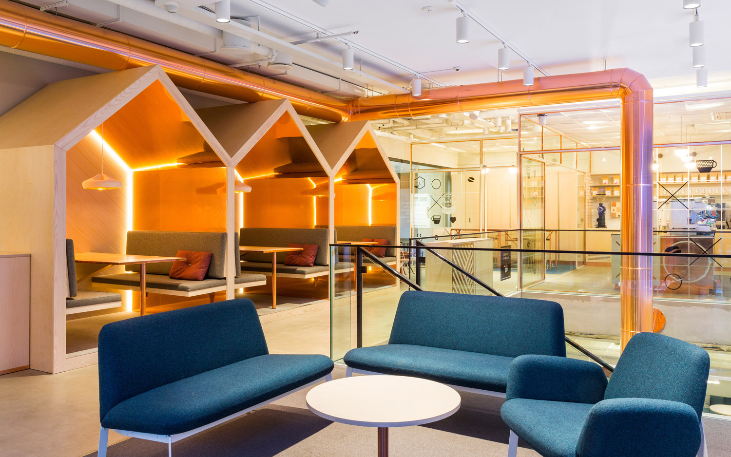
Highlights include the diversity of seating situations. The warmth of the copper. And the way graphic assets float in space across the windows of interior and those of the exterior.
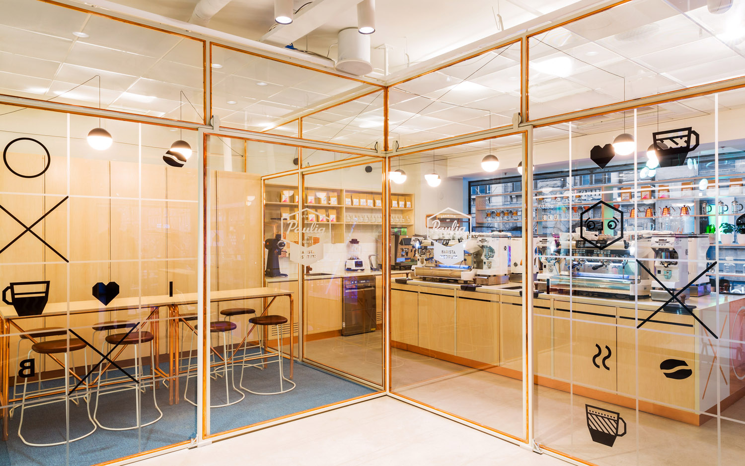
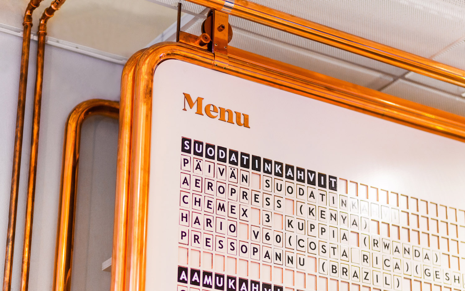
There is a lot going when it comes to graphic assets. There is a mix of illustrative styles. Light and heavy line weights. The fine and the solid. Colour plays with a soft gradation, but also an abruptness, bisecting print. Images of industry, coffee and the more personable are linked by a modularity, which also plays out in packaging and furnishing.
The Kulma logotype offers a more traditional crafted contrast to the modernity of image, although it is a shame to lock it up with the Paulig logotype. That is not to say the latter does not need to exist, only that to tie it down, particularly within the context of a modular system, seems unnecessary.

Visual identity functions to both connect and divide. White papers, boards and adhesive labels, black ink and type with sharp serifs allow it to step slightly out of line, to draw the eye, within a rich interior space.
Gradients function in a similar way. Where furniture of leather and light woods are earthy and crafty, copper piping and exposed concrete floors are industrial and utilitarian, gradients are cheerful and unexpected, and serve to call out packaging and pricing. These colours are also tied to space, and can been seen in the illumination around the edges. Again, these are playful in a modern and smart funhouse way, particularly when furniture, graphic expression and lighting are seen from the outside.
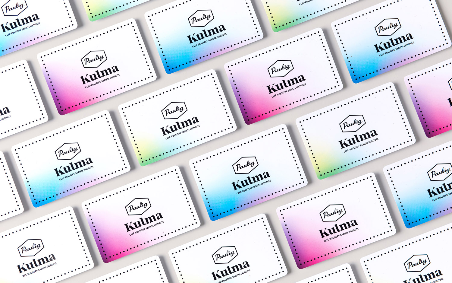
The white really works well to punctuate interior. It feels appropriately more conservative within the context of a space and experience of a material multiplicity, and a modernist exterior of concrete.
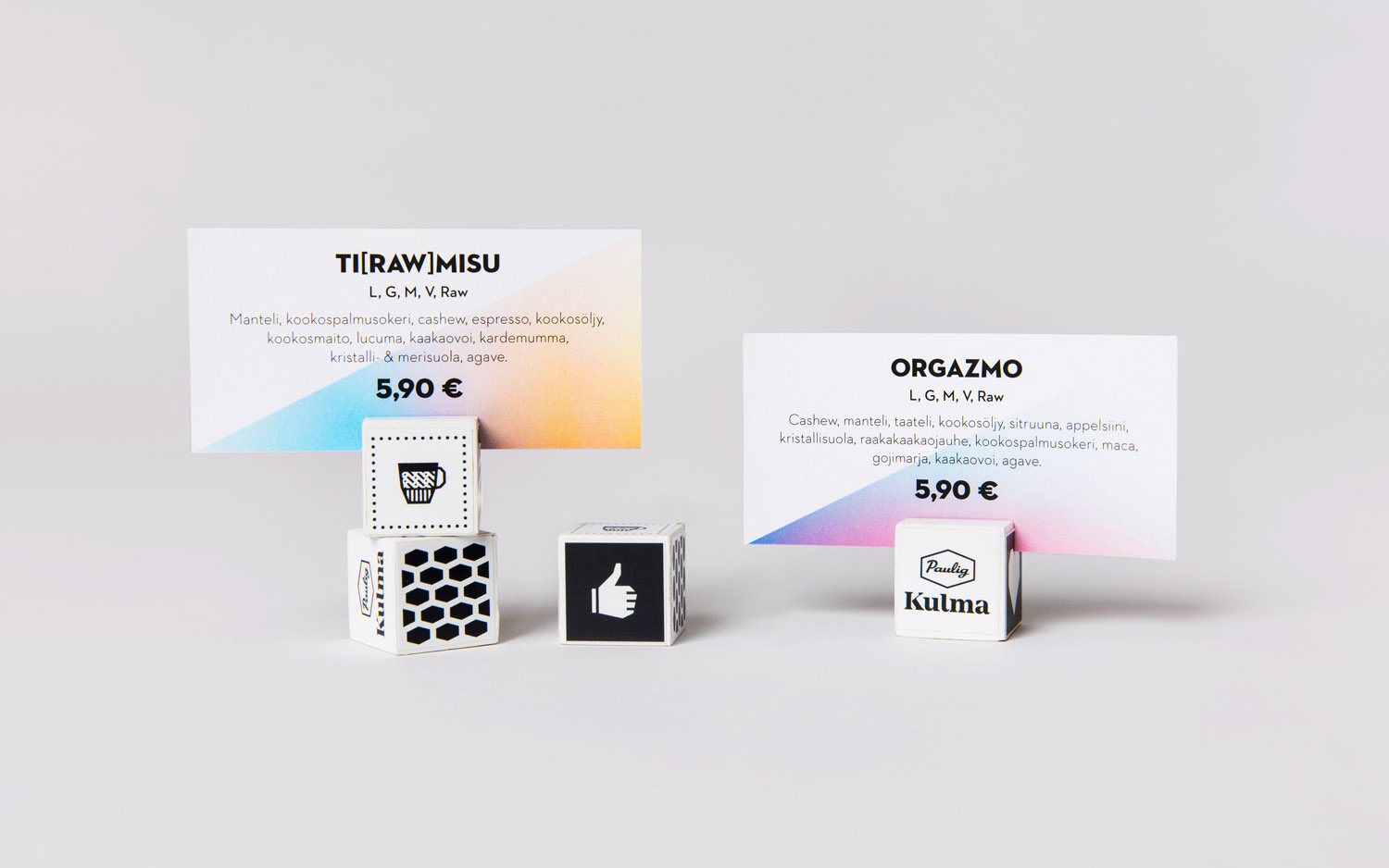
The work, interior and visual identity together, credits people with an intelligence. The chance to make the connections. The industry of the rosters, the process and creativity of the barista institute, and the modular utility, play and multi-purpose nature of coffee shop.
Visual identity is allowed to straddle the line between contrast and continuity. To divide and unify. It is distinctive in its own right yet grounded in the functionality, flexibility and multiplicity that informs space.
Paulig Kulma is a compelling, inclusive and modern space. It is not afraid to intersect the personable and the utilitarian, to spin the familiar and discernible into something more distinctive and conceptual. Utility has become a common go to when it comes to contemporary coffee shops, but this drives this forward, layering it with a warmth and play. More work by Bond on BP&O.
Design: Bond. Opinion: Richard Baird. Fonts Used: Mirador & Neutraface No.2.
