Designed by Bond
Norrin by Bond
What exactly is a ‘Norrin’? A cursory search reveals that it’s a word that means very different things to different people. For the Marvel-heads, Norrin Radd is an alias of the Silver Surfer character, described as “an honorable Zenn-Lavian who became the Herald of Galactus to spare his home planet Zenn-La and his beloved Shalla-Bal from Galactus’ hunger”. Of course!...
Siuru by Bond
Estonia’s Siuru plays with important questions, subverting and, at the same time, fulfilling expectations. Is it an art museum? A library? A cinema? Or a cultural institution? For a Bond (Veikkausliiga, Saaristo, Cable Factory) the design studio in charge of developing a brand identity for Siuru, this raised the concern, how do you brand something that seeks not to be characterised...
Veikkausliiga by Bond
How do you bring the fans, teams, and stadiums of the northernmost league together under a shared identity that captures the energy and passion that defines it? For Bond (Saaristo, Cable Factory & Northstar Film Alliance), the answer was in plain sight… the scarf – strewn across the terraces, held high, no matter the team or the weather. Veikkausliiga is...
Saaristo by Bond
‘Saaristo’ is the generic term for ‘archipelago’ in Finnish, but – to the outside world – it’s sufficiently distinctive to refer to the entire region in Western Finland, which now makes up a new tourism brand. This brand intends to generate more interest in (and visitors to) the world’s largest archipelago: a collection of 40,000 islands. This scale makes it...
Cable Factory by Bond
Cable Factory (Kaapelitehdas) is one of Helsinki’s most famous buildings, originally designed by the Finnish industrial architect Wäinö Gustaf Palmqvist in 1939. For many decades it was the largest building in Finland with a footprint of 56,000 m², and it remains one of the most iconic. In 1991 the site was redeveloped to become the country’s biggest cultural centre, housing...
Northstar Film Alliance by Bond
North Star Film Alliance (NSFA) is a joint venture between Estonia, Latvia and Finland. The Alliance intends to develop and promote themselves as one filmmaking region to international film and TV productions. It is a competitive marketplace, with other countries provide low tax rates and incentives to film big-budget spectacles on their stages using local crews. Together, the three countries...
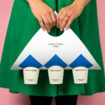
Anton&Anton Kioski by Bond
Anton&Anton (A&A) is an alternative to and antithesis of the large supermarket chains. Staff are described as relaxed, smiley and proud. Their ranges (mostly) organic, some homecooked and also available online for home delivery. With a desire to express an approachable, playful yet credible positioning, and a need to develop a cohesive set of packaging and communications assets A&A worked...
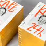
Kape 24h by Bond
Kari Aihinen is a Finnish chef with a growing international reputation. Aside from creating exclusive pop-up Finnish dinning experiences for New Yorkers, working for Ravintola Savoy and developing one-off Nordic-Asian menus with chef Eric Neo in Singapore, he is also the co-founder and headchef of Helsinki restaurant Roster. Roster is a distinct experience. It features an interior design of custom furniture with a...
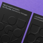
Loupedeck by Bond
Loupedeck is a Finnish startup and photo editing console designed to make the process of image manipulation faster in Adobe Lightroom for both Windows and Mac users. It is described as being an intuitive replacement for keyboard and mouse, is mapped exactly to Lightroom to encourage creative spontaneity and experimentation, and suited to beginners and professionals alike. To help establish and...
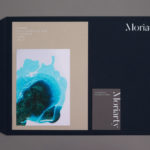
Moriarty by Bond
Inspired by the spontaneity and celebratory energy of parties and exploring the idea that curating great events is an art form, design studio Bond crafted a visual identity for new luxury event planning business Moriarty based around a series of abstract ink illustrations. These are paired with high quality dyed papers and boards, bringing a measured and distinctive contrast to printed...
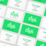
Sakki by Bond
Sakki is Finland’s national union of vocational students. It is made up of 15-20 year olds from a variety of nations, and offers support, tackles student issues, and engages in activism. Scandinavian graphic design studio Bond worked with the union to design and develop a mobile-first experience, and a visual identity made up of tilt-responsive iconography, a bright, simple and modern colour...
Paulig Kulma by Bond
Paulig Kulma is distinctive space, located in the heart of Helsinki, developed by Paulig, the leading coffee brand in the Nordics. It combines a coffee shop, roastery and barista institute, and intends to appeal to a broad customer group, and accommodate a variety use cases throughout the day. Paulig Kulma serves multiple functions. From the inviting and flexible space of the coffee shop, to...