Dr Jart+ by Pentagram
Opinion by Richard Baird Posted 15 January 2018

Dr Jart+ is a South Korean skincare brand that formulates its various ranges to tackle specific conditions, and derives its name from the positioning phrase “Doctor Joins Art”, an articulation of the brand’s unique fusion of dermatological science and art, presumably, something along the lines of pragmatism combined with creative leaps.
The balance between the psychological and physiological components of skincare—internal feelings and external sensation, the aesthetic and the remedial—are touched upon, alongside practical considerations such as a spacial sensitivity, shelf impact and range fragmentation, in the design of Dr Jart+’s new packaging and graphic identity, developed by Pentagram’s Paula Scher and team.
The design currently links Dr Jart+’s Ceramidin creams and liquids, which were launched in South Korea during 2017 and are due to roll out internationally in 2018, but will go on to include other ranges. These will share the same form language, but will be differentiated by colour and material.
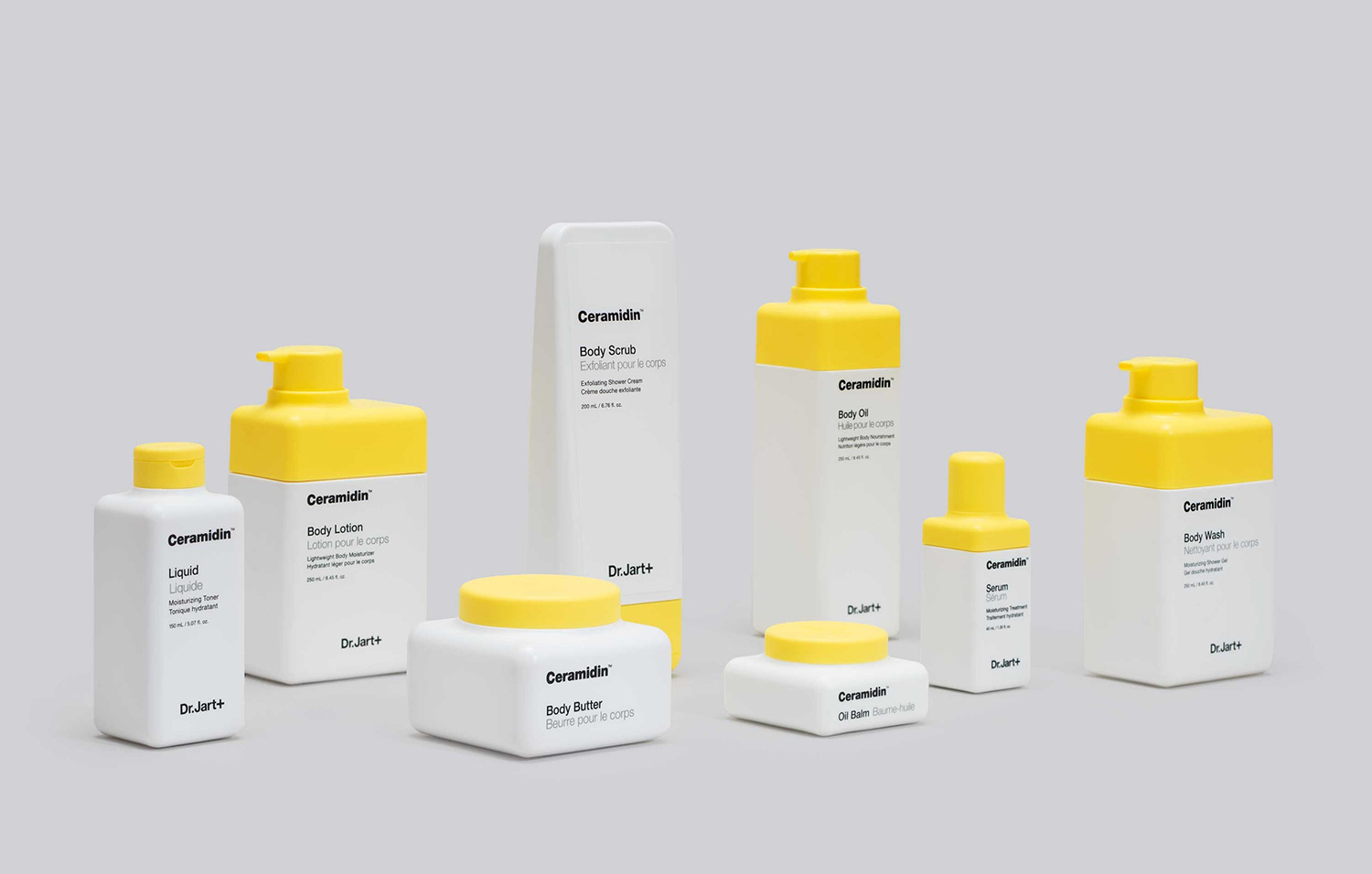
The simplicity of the result belies the neat confluence of ideas and the resolution of a number of strategic goals with the fewest material and graphic assets.
Pentagram’s approach takes the ubiquity and communicative immediacy of Helvetica, brought over from previous iterations, and combines this with a structural design that is unique in its references and nuanced in its expression, and builds the + of the name into a graphic language that intends to balance functionality and style. Structural and graphic language work as a through-line for Dr Jart+, with colour, texture and material due to serve as a differentiator across ranges.
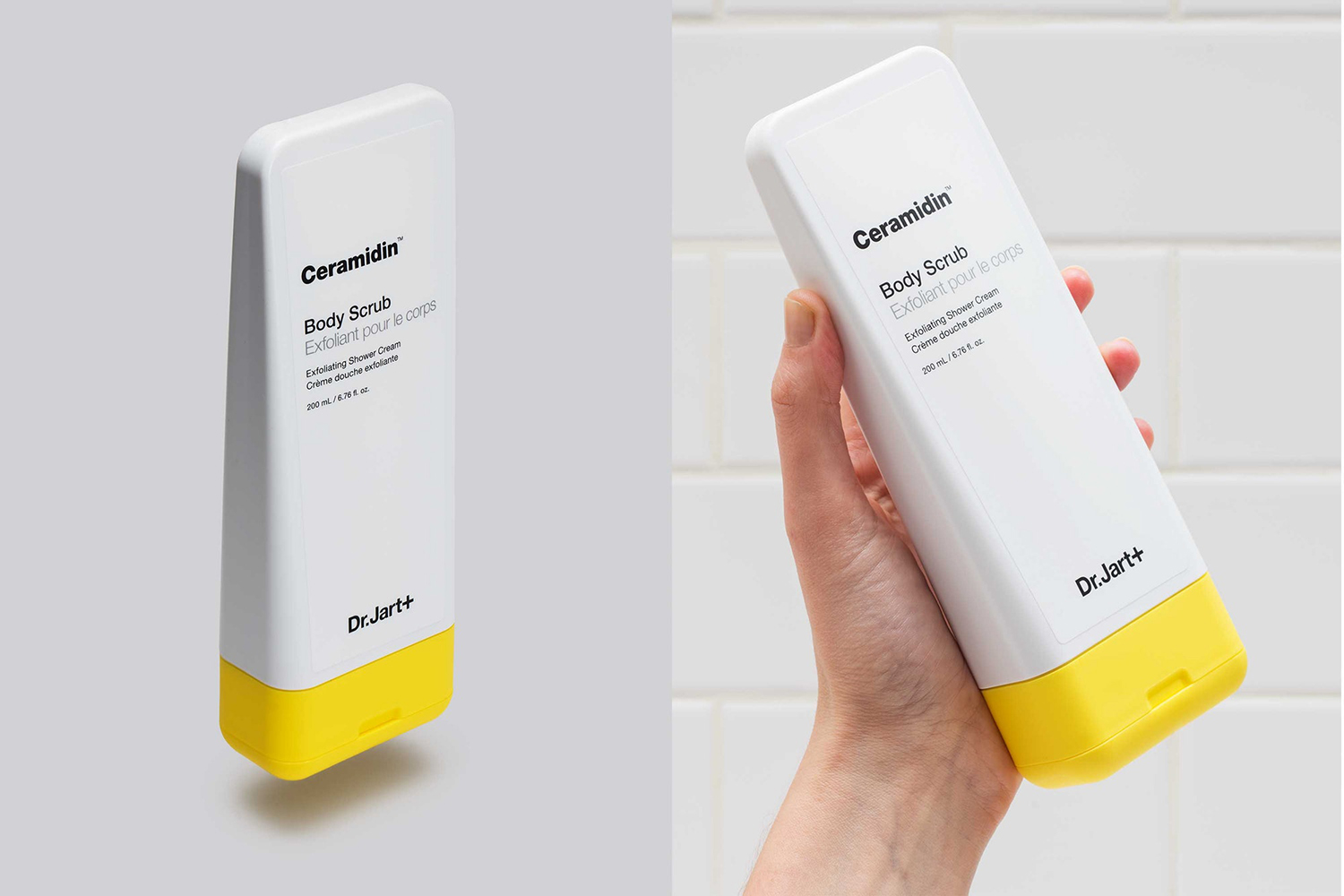
Strategically, structural design is recognised as an economical way to resolve a number of challenges, and work as a unique vehicle to carry forward and develop established graphic assets and maintain some form of continuity.
Key challenges included developing the brand’s unique positioning; a fusion of dermatological science and art. The creation of a sensory experience that evolves the promise of clinical effectiveness and comfort beyond words and graphic language. And balances aesthetic appeal and shelf impact with spacial and material considerations.
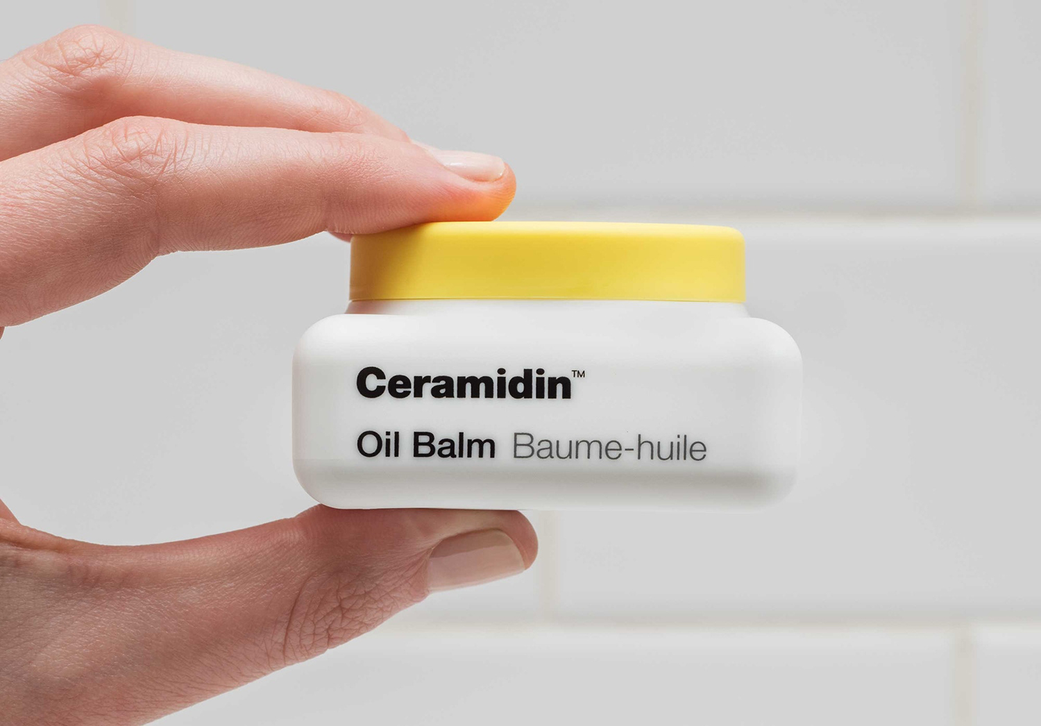
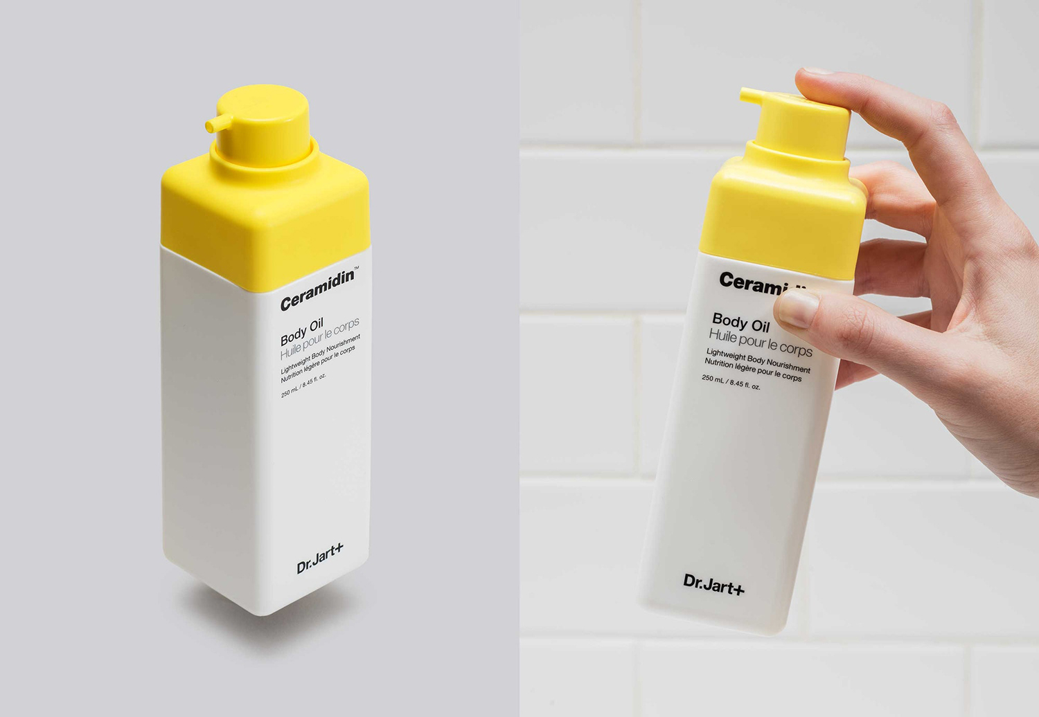
These are satisfied in the idea of bottle as sculpture, material feedback and allusions to paint tubes (art), oil and kerosene cans (maintenance). In the way that material and the softness of form mirror the smoothness of treated skin, and are comfortable to grip. And by keeping form and footprint within the constraints of shelf space, yet employing larger radii and a contrast of bright colour to deliver impact and distinction.
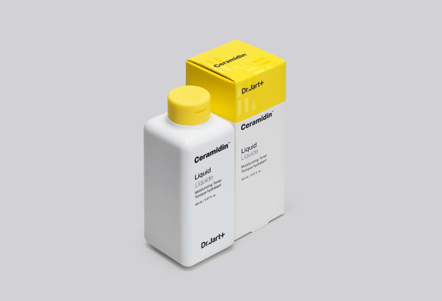
Other highlights include yellow as a surface for interaction and white as a surface to grip. A reduction of parts and a consistent dispensing language that indicates the viscosity of each product. And a robustness to shape and a volume in the opaqueness of material that ties into maintenance and clinical effectiveness, alongside a typographical utility.
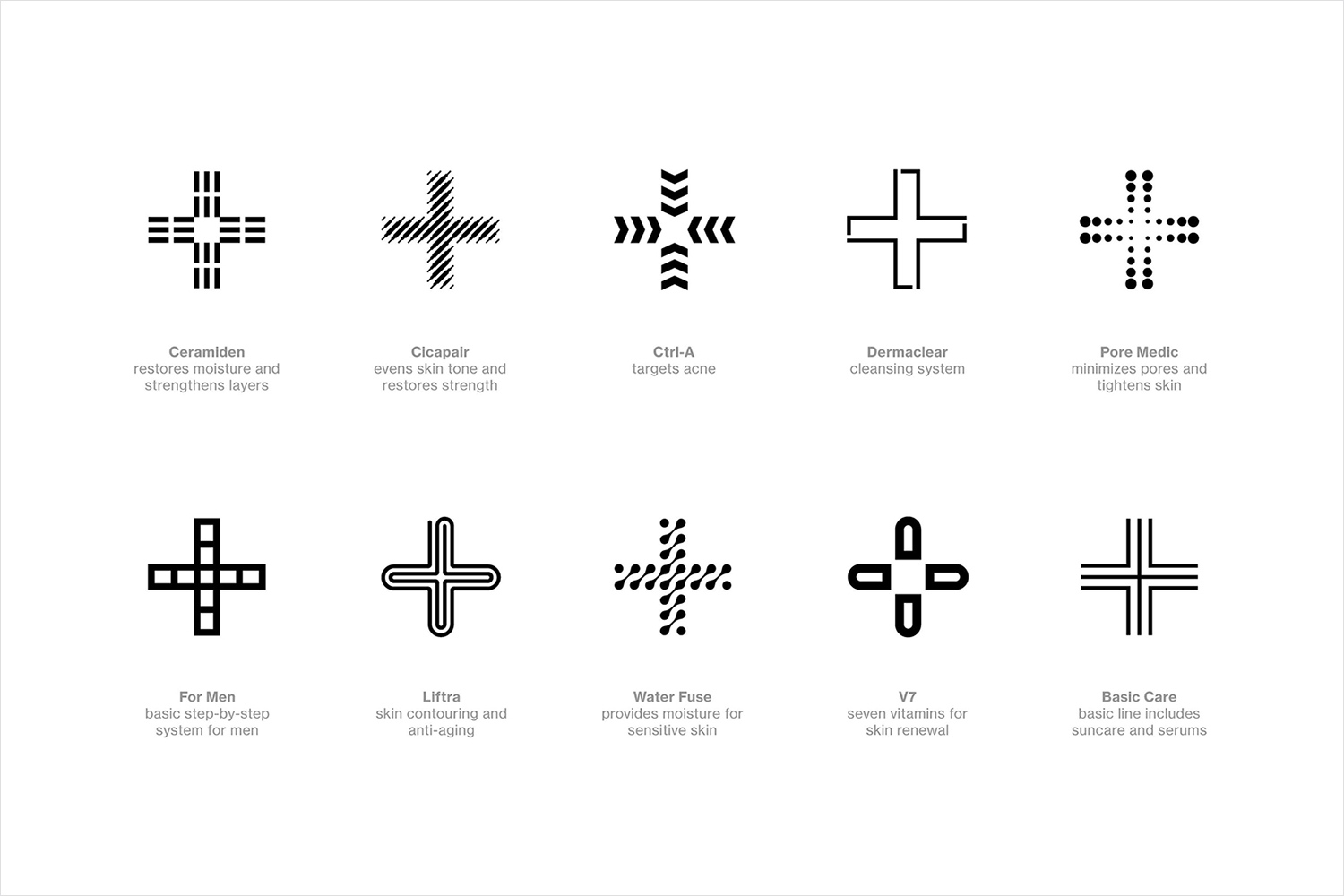
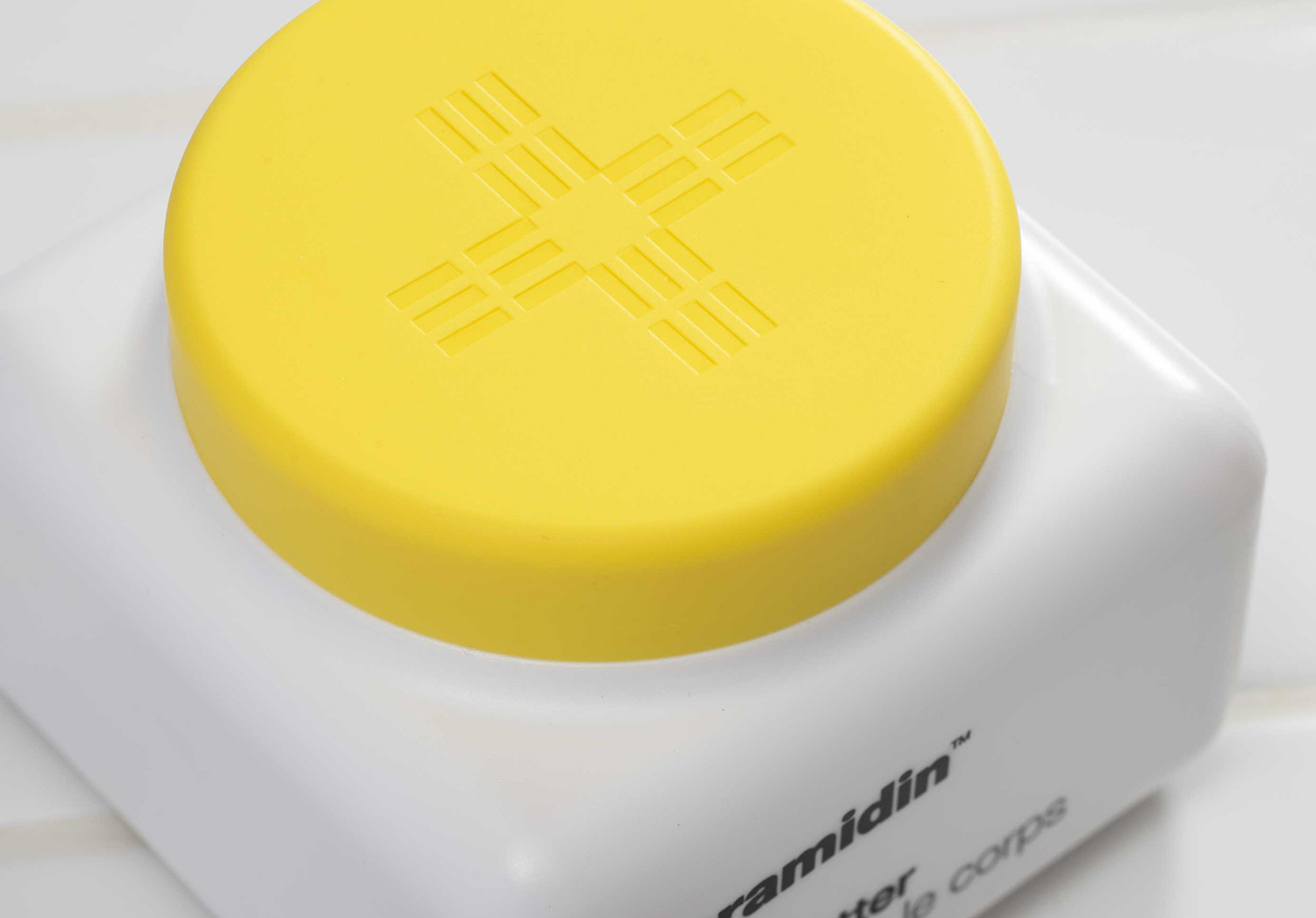
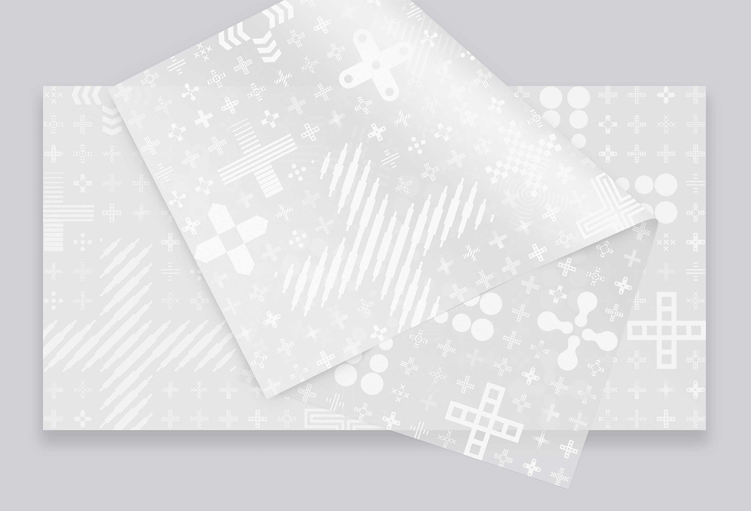
The + builds out the name, forming a graphic language that corresponds to conditions, treatments and ranges. This is currently employed as relief on lids, as a UV varnish on boxes and mocked up as a pattern on tissue paper.
Presently, it exists somewhere between a potentially useful but perhaps optimistic visual signifier, low in contrast, recall and lacking a conviction in its application, and a stylistic flourish at odds with a sophisticated and nuanced structural design.
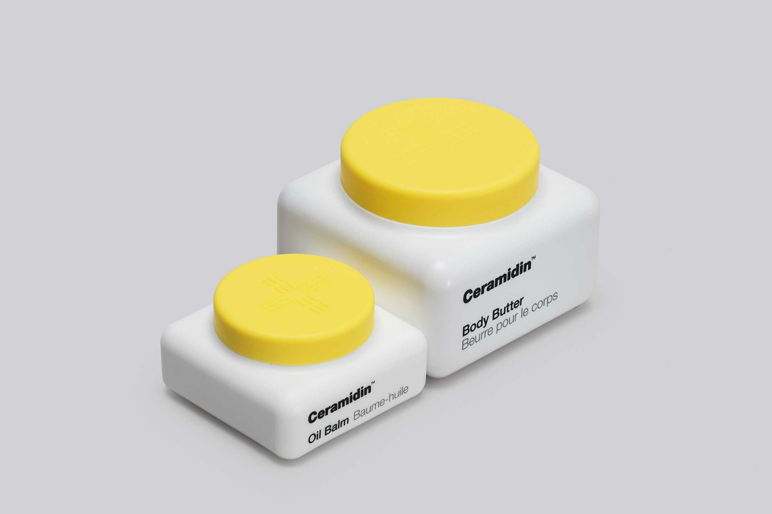
The result is a smart amalgam of references, communicative intentions and economical concerns that build to something singular and distinctive. There are allusions just out of cognitive reach, but present enough to play with perception and association, and leverage an international language of utility, effectiveness and maintenance whilst also embracing an aesthetic and material pleasure. There is a strong sense of identity and visual recall in form and colour, that avoids blunt metaphors and tired language of the skincare industry. Brand name is, hierarchically and literally speaking, bottom, a confident gesture in favour of a compelling and conceptually sophisticated material expression with shape and colour shape standing out online. More work by Pentagram on BP&O.
Design: Pentagram. Partner: Paula Scher. Team: Courtney Gooch. Product Designer: Piotr Woronkowicz. Opinion: Richard Baird.
