Designed by Pentagram
Windham Campbell Prizes by Pentagram
Back in 2013, Michael Bierut’s team at Pentagram (Twelve Labs, Becan & Natural History Museum) created the identity for Yale University’s inaugural Windham Campbell Prizes, a major literary award that honours outstanding achievement in the fields of fiction, non-fiction and drama. Bestowed by the estate of the writer Donald Windham and his companion Sandy M. Campbell, the awards are administered...
TwelveLabs by Pentagram
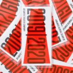
Remember when the conversation around gradients was about making ‘bad’ design look ‘better’? When RGB colours were frowned upon because you couldn’t print them? Yeah, those ideas feel a bit outdated now. HP Indigo can now run fluorescents affordably, and business card mock-ups (in RGB) are more about selling than printing. Technology marches on, expectations and standards evolve, and everything...
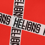
Helions by Pentagram
HELIONS… now that sounds impressive. Something to do with helium atoms and stellar fusion, the force that powers stars? Or perhaps it’s invoking Helios, the Greek god of the sun, blazing his chariot across the sky? Nope – it’s actually a tribute to Helions Bumpstead in Essex, a beneficiary of the British gift for naming that also gave us Pratt’s...
Bacàn by Pentagram
We’ve covered no shortage of work by Pentagram in the past, most recently Cohere but spanning projects for London Fashion Week, NYC Parks, National History Museum and more. This is the first time, however, that we’ve looked at a project by new-ish New York office partner Andrea Trabucco-Campos and his team – and it’s safe to say, we’re impressed. Graphic...
Natural History Museum by Pentagram & Nomad
If you grew up in the UK, the Natural History Museum is likely synonymous with two things: the massive blue whale suspended from the ceiling, or the equally large diplodocus skeleton. For many British kids, the museum is a childhood staple – either from school trips, or days out with parents who, rather savvily, combine a widespread fascination among youngsters...
Cohere by Pentagram
From Wes Anderson to ‘accepting the job’ and distinctly dystopian new romantic relationship models; in recent years, it’s felt like you can’t move for chat about AI – its weirdest uses, its hilarious shortcomings, and a hell of a lot of scare-mongering about it stealing our jobs. The platform that’s dominated much of the conversation is ChatGPT, an AI chatbot...
Nordoff & Robbins by Pentagram
For decades, Pentagram has been one of the most famous and renowned design consultancies in the world; but when it comes to the charity sphere, music therapy organisation Nordoff & Robbins is far less starry – it’s not, say an Oxfam, or an RSPCA, or Médecins Sans Frontières. Arguably that’s all the more reason for it to bring in the...
Atlantic Theater 2019 – ’20 Season by Pentagram
Atlantic Theater Company was founded in 1985 by playwright David Mamet and actor William H. Macy and, since then, has established itself as an influential Off-Broadway theatre group. It is also known for having a bold and original voice, producing groundbreaking new works by both emerging and established playwrights. This bold and original voice was central to the design of the theatre’s...
New Victory Theatre by Pentagram
The New Victory Theatre, located on New York’s 42nd Street, is described as the city’s first and only not for profit performing arts venue for kids and families. It has a programme that covers a multitude of artistic disciplines and draws on traditions from a variety of cultures. Alongside performances and family workshops the theatre also seeks to offer performing arts...
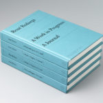
René Redzepi, A Work in Progress: A Journal by Pentagram
Pentagram partner Astrid Stavro and project team Jake Gilbert and Susanna Foppoli have recently completed work on A Work in Progress: A Journal, a book from the acclaimed Danish chef René Redzepi, published by Phaidon. Through Noma, a two-Michelin star restaurant that reimagined Nordic cuisine, René Redzepi has built a formidable reputation for innovation and inventiveness. His viewpoint and approach...
Shakespeare In The Park 2019 by Pentagram
Shakespeare In The Park is an annual event and duo of free performances presented by New York’s The Public that takes place at the Delacorte Theater in Central Park in May and June. 2019 saw performances of Much Ado About Nothing and Coriolanus under the theme “Rumours and Rebels”. The event was promoted through a city-wide campaign developed by Pentagram’s...
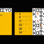
Kaiyo by Pentagram
Kaiyo, formerly Furnishare, is an online platform for the reselling and buying of used furniture, currently available in New York City and New Jersey, but with the intention to expand this internationally. Kaiyo picks up, inspects, cleans, photographs and uploads furniture to its online catalogue, easing the difficulties of selling secondhand online. It is part of a growing up-cycling movement,...