Garden 13, Graanmarkt 13 by Base
Opinion by Richard Baird Posted 21 March 2018

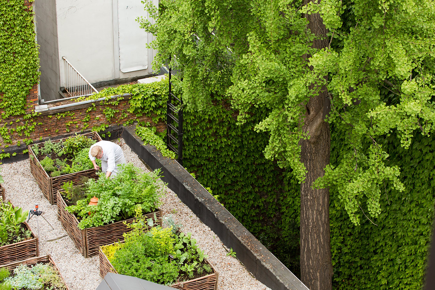
Graanmarkt 13 is a restaurant, high-end concept store and apartment in Antwerp. It is described by Base, the studio behind its graphic identity, as a special house, a crossover place full of surprises. This was articulated through a story that positioned Graanmarkt 13 as a haven for people in search of objects and experiences with soul and meaning.
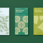
Garden 13 is a series of plant-based products and an online shop inspired by Graanmarkt 13’s rooftop garden philosophy. These products intend to develop the brand outside of its physical location, to reach an international audience.
In their packaging design for this new range, which builds on their initial identity work for Graanmarkt 13 Base tease the reader’s curiosity. They translate the feeling and sensory experience of using each botanical product into microcopy expressed as a single sentence over a variety of surfaces.
A pared-back but well-intentioned material language, a robustness that implies value, and a structural design that sees the cylindrical and simple link a breadth of products, serve as useful surfaces for emotive communication. This materiality is thoughtful and beautifully constructed, yet it is the words that are the real highlight. Copywriter Seth Rowden offers his opinion.

The tone of voice deliberately adapts to each product, from the light-hearted and conversational to the abstract and poetic. The taglines, which range from thirteen words to a mere five, are signed off with nothing more than the brand name. This is a confident and experimental approach in a space where packaging can often feel bland and ubiquitous.
Although the design is simple and relies heavily on the words, the copy-centric approach works because these mini-stories are clever and well crafted. Sentences like, “Feel the dirt, touch the leaves, follow the colour, and smell the roots,” and “Sow some flowers, dance a little, and I will always come back to you,” are evocative, liberating, nostalgic, and loaded with visual associations.
They tap into a universal feeling of freedom and of connecting to nature. It is a challenge to verbalise a sense as complex and intangible as smell, but so many of the words used in these sentences (leaves, flowers, even dancing) layer to create a vivid impression. I particularly like the playful and almost effortless line, “Salad is a wild thing.”
For me, the descriptions lose their subtlety and beauty slightly when they are written in the first person. This suggests that the product itself is addressing the reader, which feels less refined and sophisticated. That said, it is not a hard break in style and it could be justified on the grounds that each product has its own personality, audience and purpose.
Overall, the copy is intriguing and pleasurable to read. The cryptic front of pack works well because the products are photographed alongside the packaging, making it clear what is inside without having to compete for attention in a traditional retail environment. By using storytelling as a main pillar of the identity, Base has managed to capture the spirit of this unusual house known as Graanmarkt 13. More work by Base Design on BP&O.
Fonts: Lettera Text & Modern No.20