Helsinki by Werklig
Opinion by Richard Baird Posted 19 April 2018
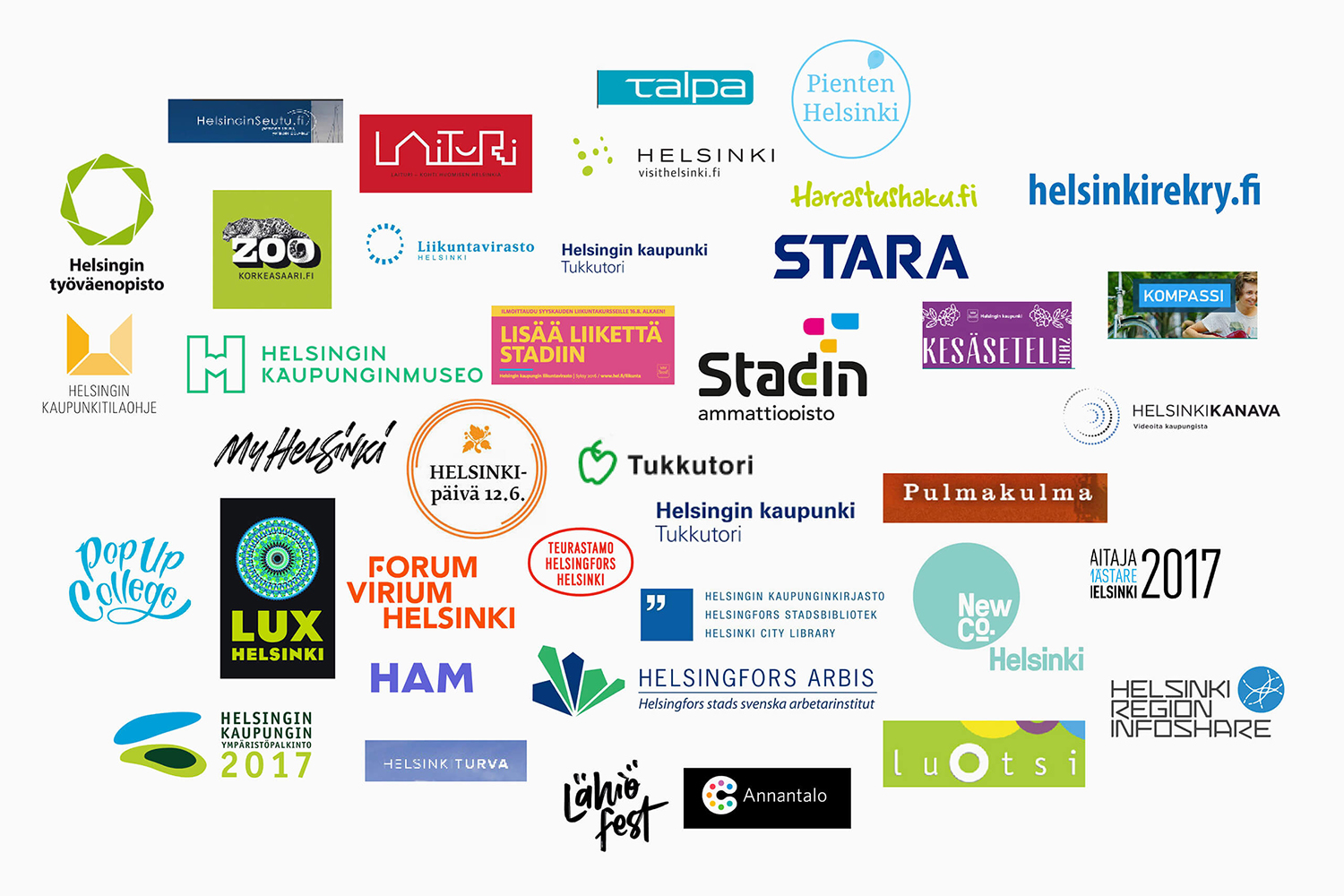
In August 2017 Scandinavian design studio Werklig was commissioned to develop the graphic identity for the Finnish city of Helsinki, a capital with an urban region of roughly 1.4 million inhabitants and 751,000 jobs. The challenge was to resolve a disparate and fragmented visual system that represented a broad range of public services, departments and development projects that were helping and informing a diverse group of people. These included locals, national and international visitors, those looking to make their home in Helsinki or seeking asylum. Although each entity had its own logo, these were often tenuously linked by the city’s coat of arms. This served as the beginnings of a new and integrated identity program.
With a desire to acknowledge a long and distinguished history yet signal a unified and forward-thinking cultural outlook, Werklig sought to create an adaptive, responsive and versatile system that went beyond a long-centricity and instead establish an inviting and cross-cultural platform of cohesive communications that could speak to a broad audience.
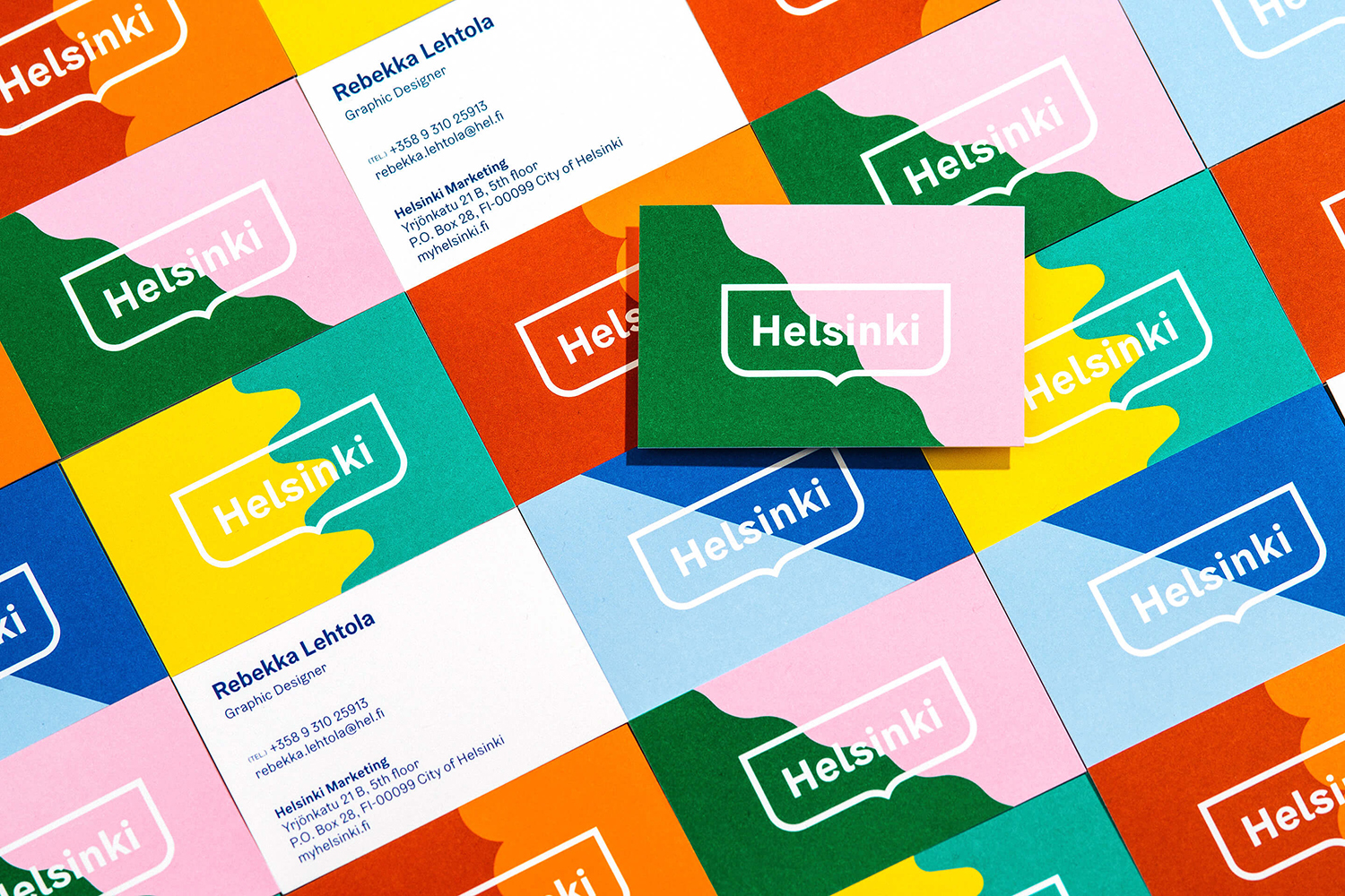
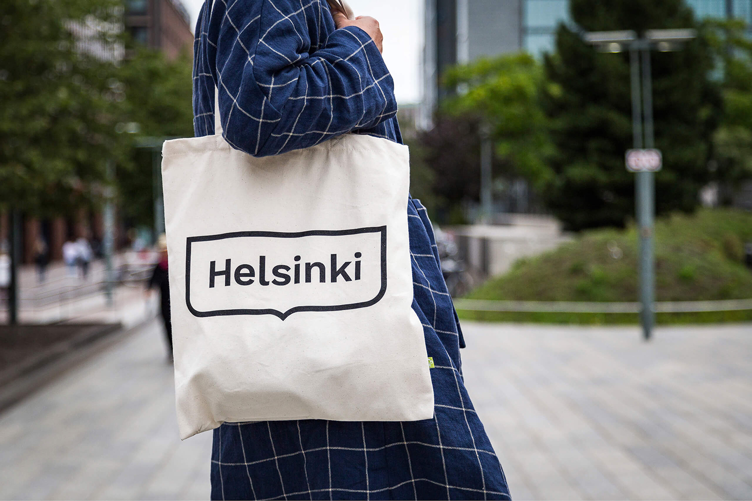
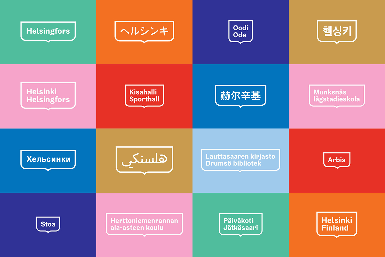
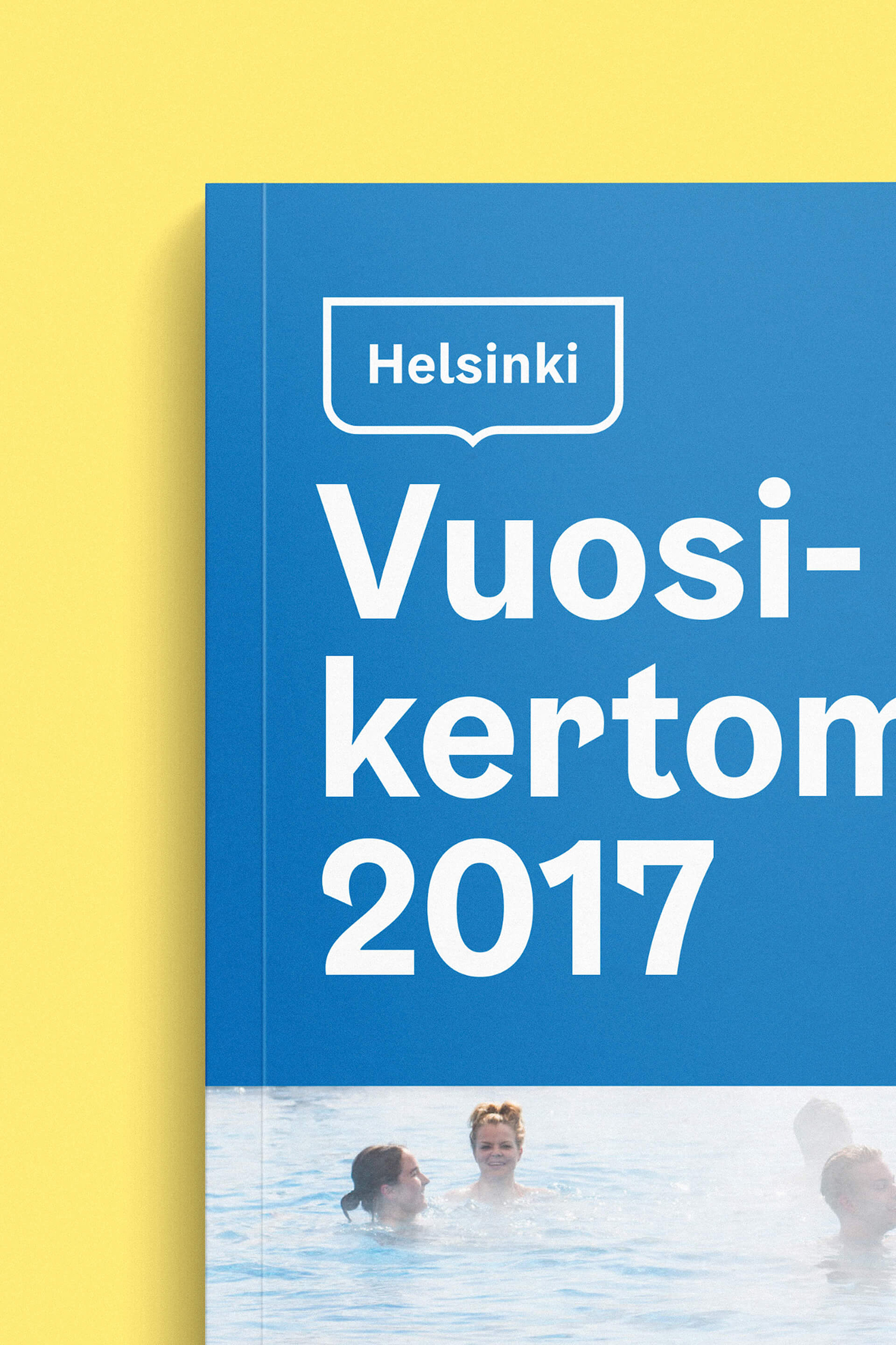
Clipping the bottom portion of the city’s coat of arms and maintaining but giving weight to its monolinear outline Werklig developed a distinctive container capable of expanding and contracting to accommodate a variety of languages. It is a simple device but one that serves to establish a continuity in the most challenging and basic contexts and quick to establish the city as inclusive and international. It is an identifiable shape, even if the text it contains is unfamiliar.

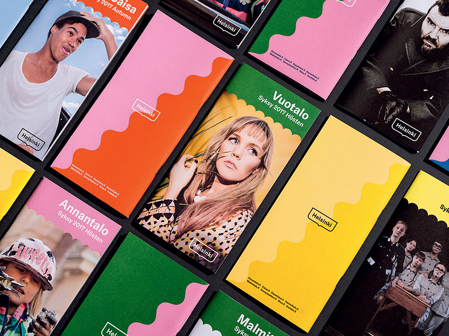
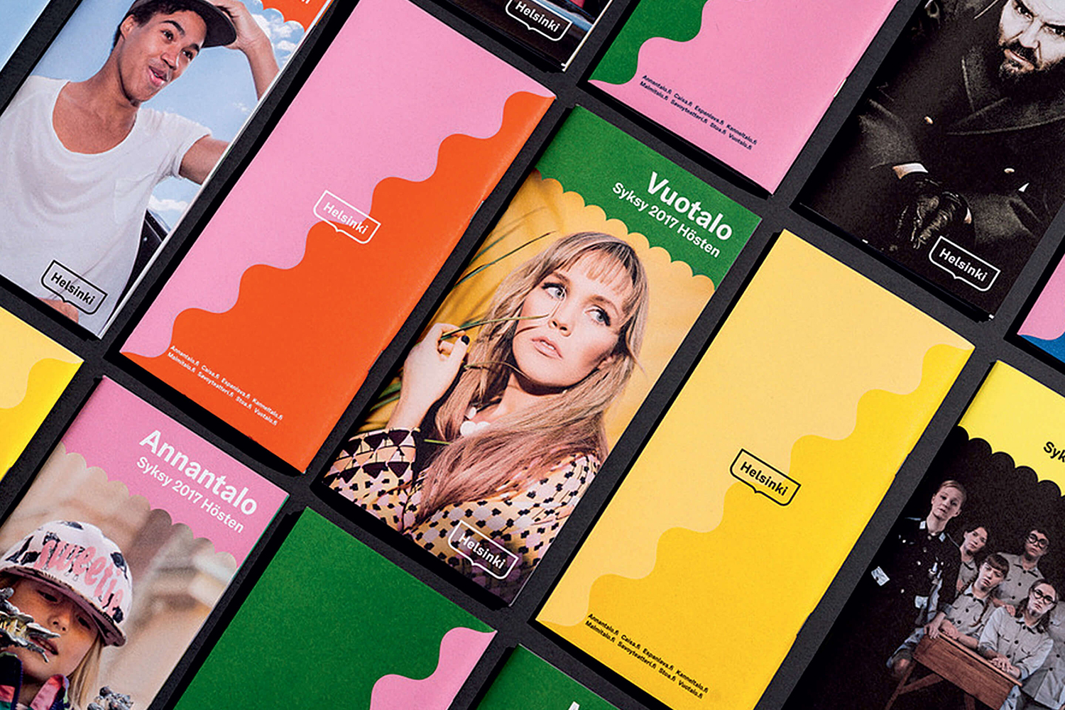
The wave motif builds this out, an appropriate nod to coastal location, intersecting colour and image, and changing to reflect the architectural details of the city. It works as another identifiable graphic expression beyond the logo and a tool for introducing communicative contrasts, an articulation of the diversity of experiences the city has to offer. Colour palette takes a similar approach, drawing together a variety of references. The effect is one of cheerful accessibility and modernity with a breadth that keeps it from leaning too far into the limitations of the current. And while some of the hues take a few liberties in their connections to the city, as a whole these make sense.
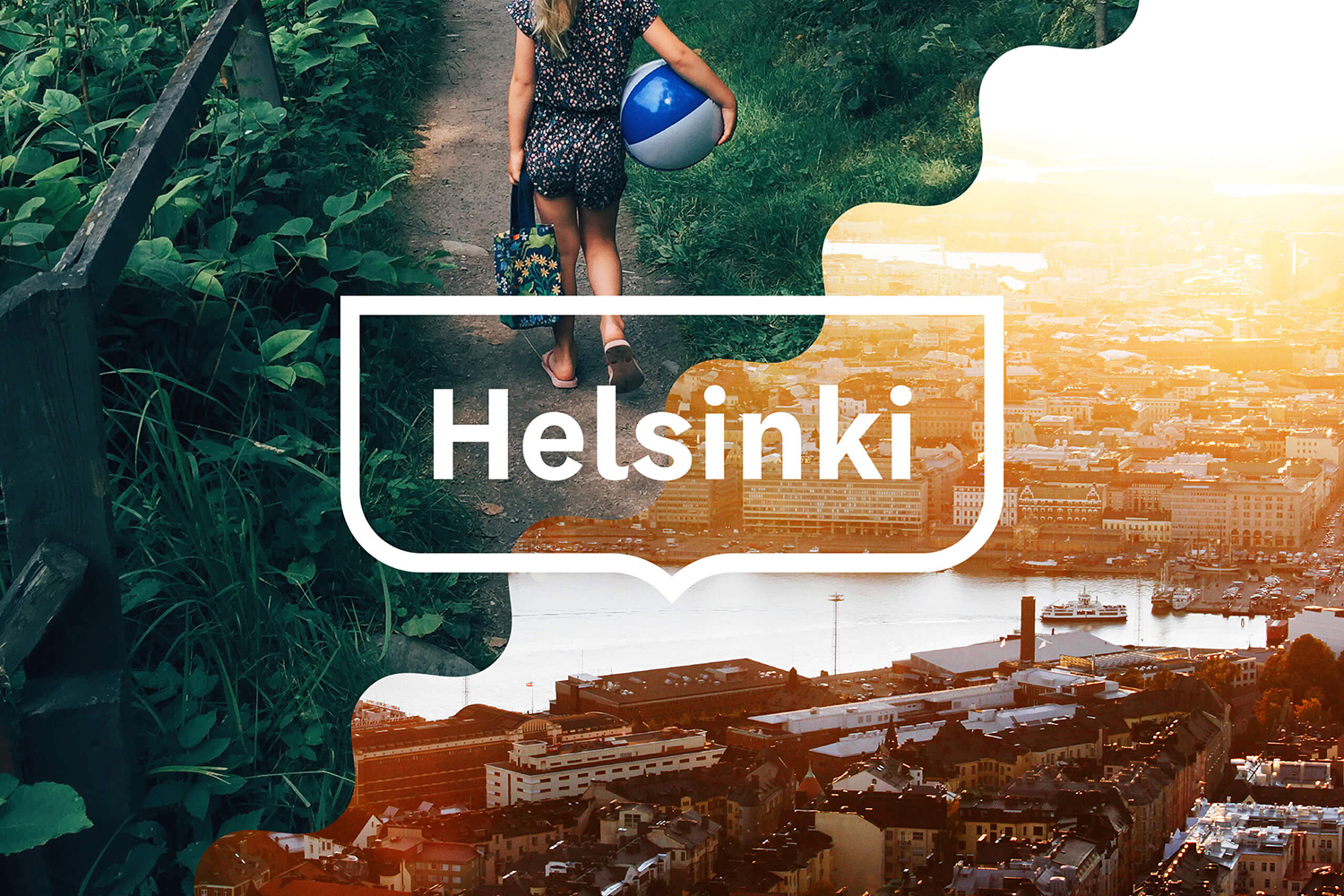
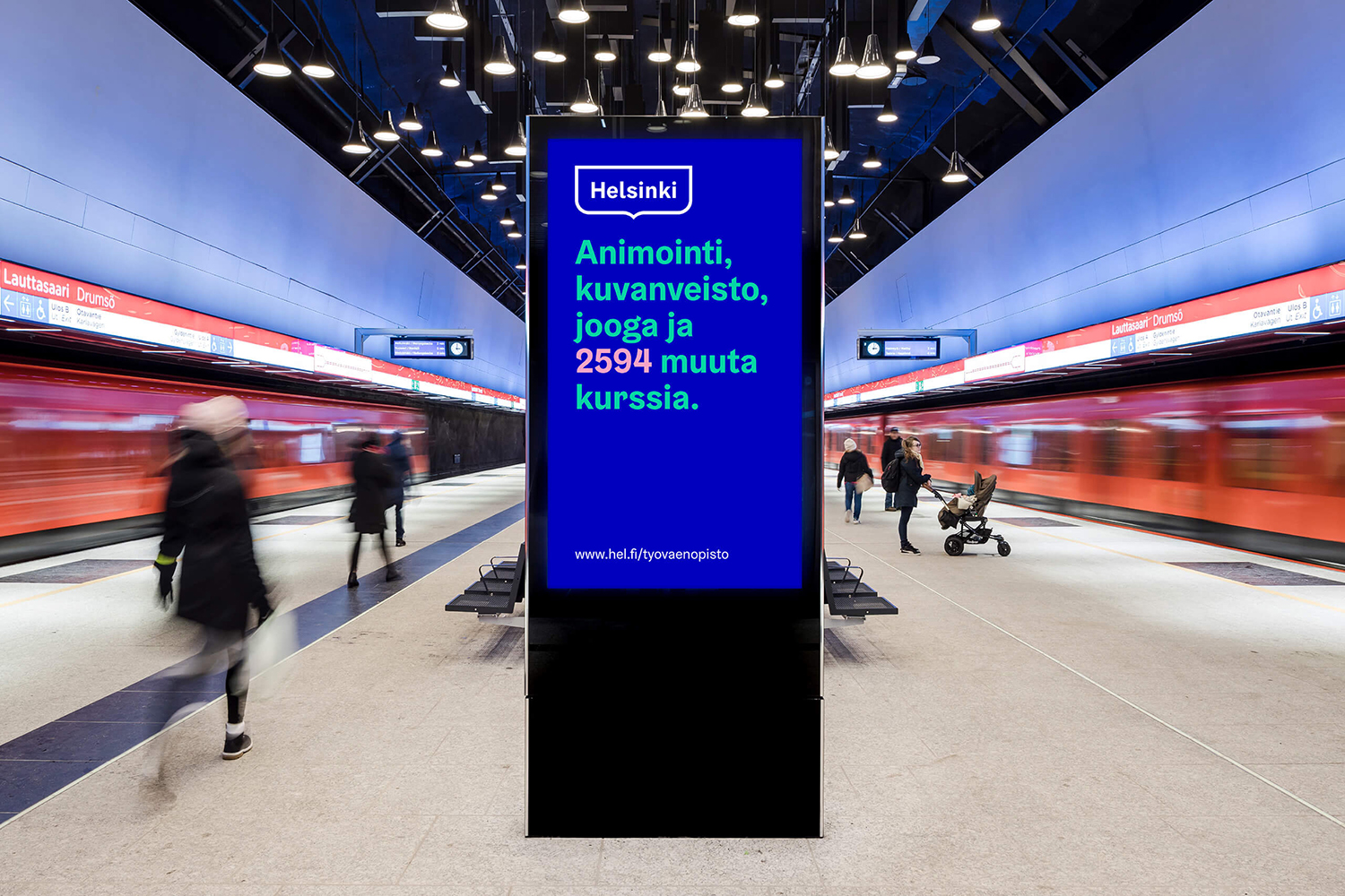
Helsinki Grotesk, a custom typeface with what are described as “wavy” details, provides both character and continuity throughout all communications, and a clear functional foundation. There is plenty of personality to this, and a subtly tied to the graphic motifs, which is maintained across many different languages. It has a convivial modernity, particularly in its animation. Its weighting and shapes sit comfortably in or alongside the Helsinki logo, and works within a variety of contexts, large across digital signage or smaller across business cards.
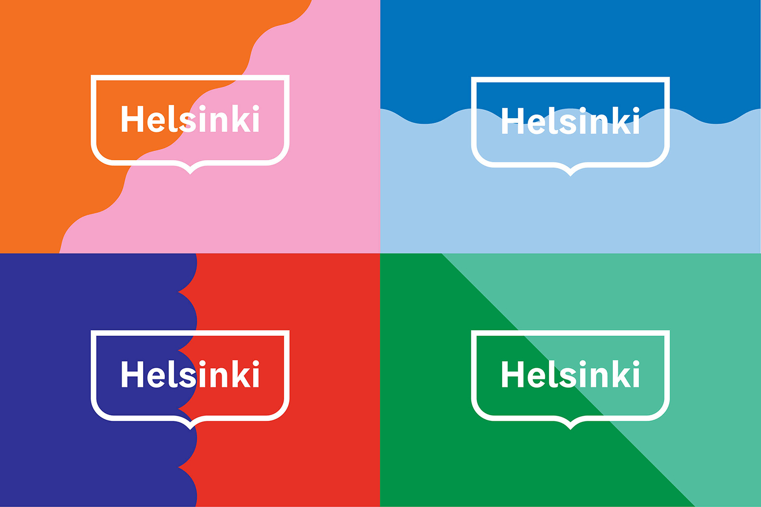
Highlights include the intersection of colour or image, running right through the container. The convergence of these makes for a visually distinctive yet consistent expression that conceptually is grounded in the meeting of people and the diversity of area, with enough variation to avoid it feeling tired or repetitive, and developed further using photography.

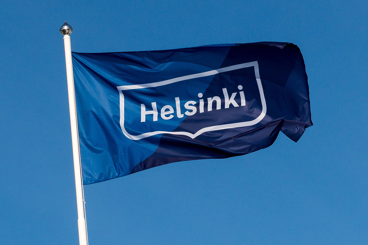
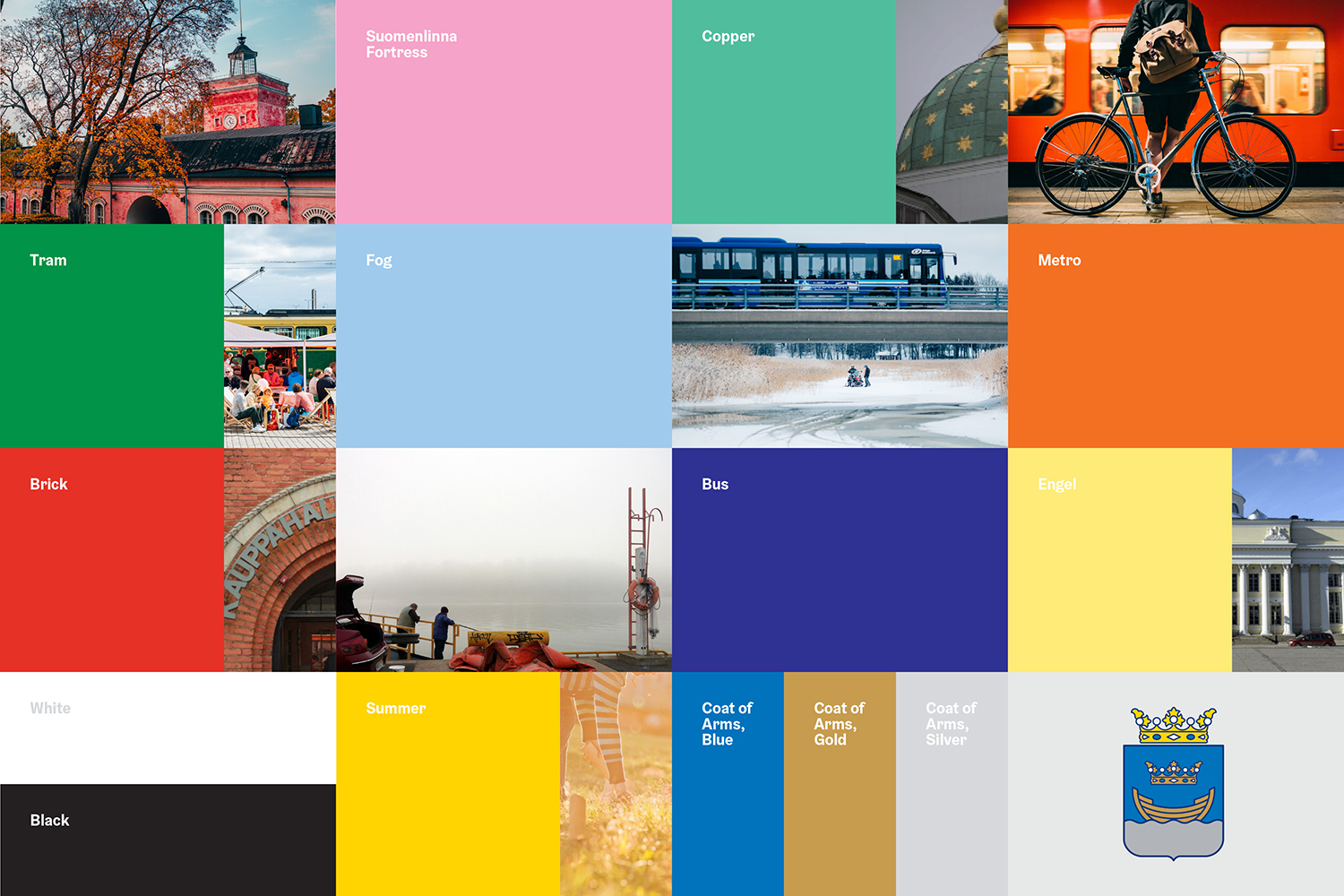
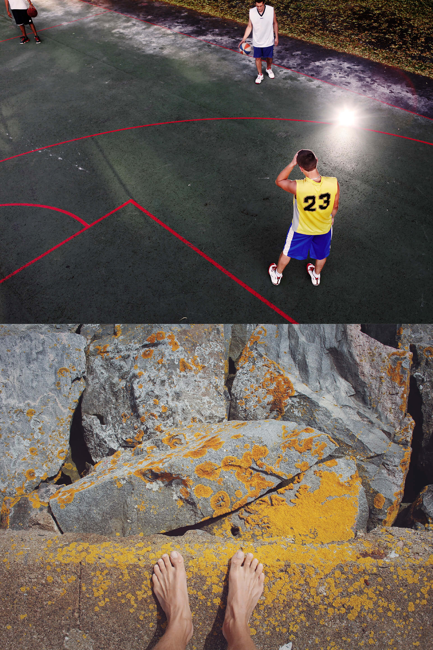
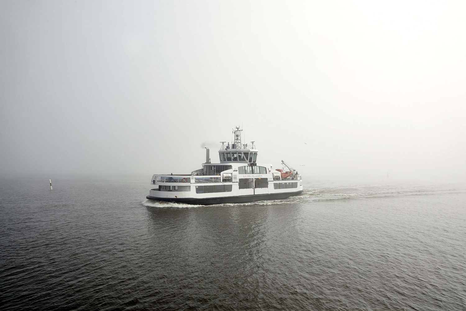
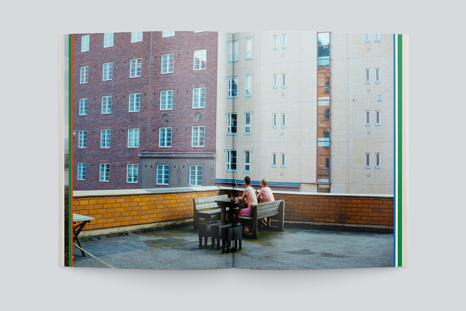
Moving and still image, absent any filters, intend to portray the city as it is. It is a noble gesture, communicatively serving to bring to light, much like colour, a sense of diversity, in people and experiences, as they truly are. These are well shot in their composition. And often paired with a complimentary or contrasting colour and/or shape, drawing out detail or calling out the almost graphic quality of Helsinki’s urban topology.
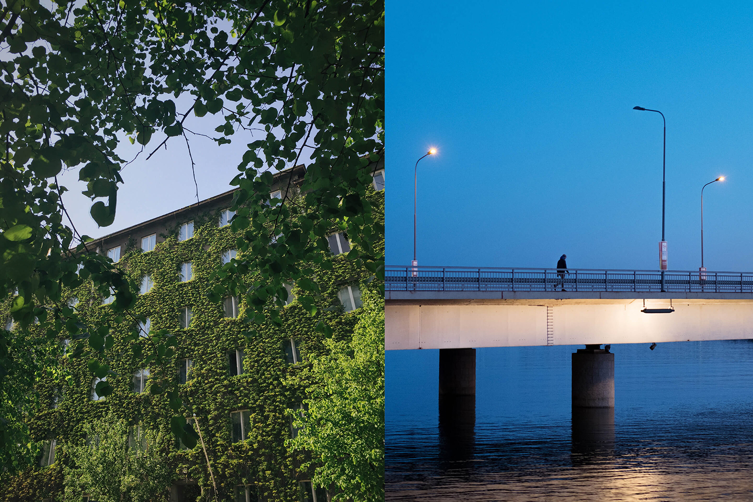
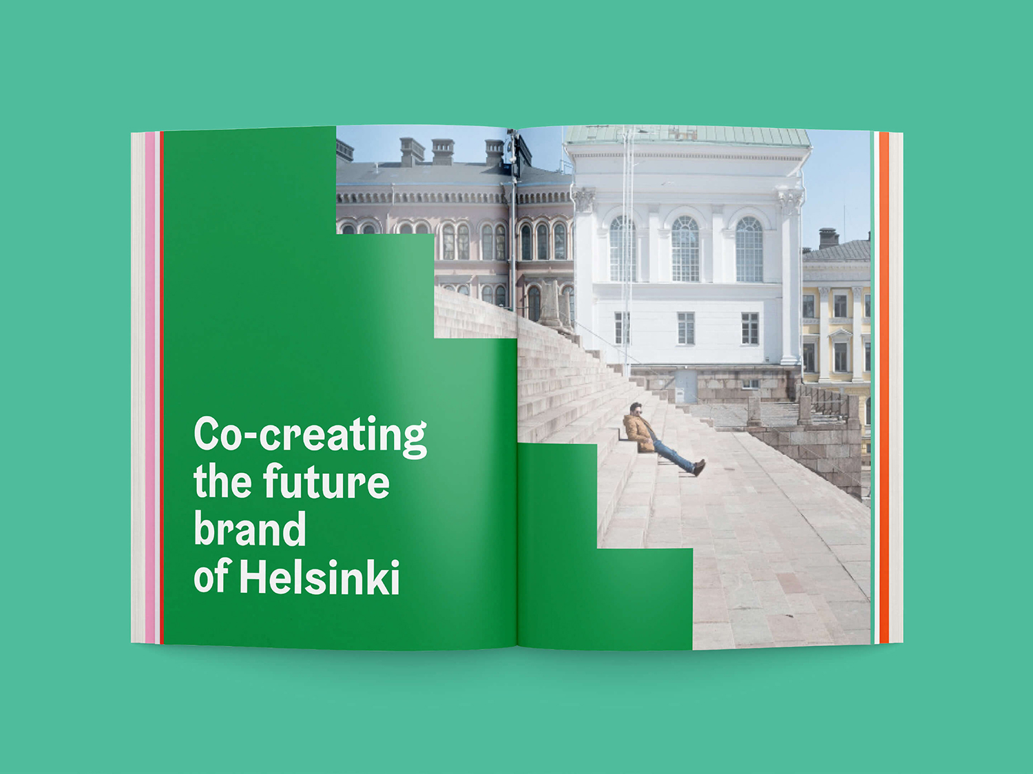
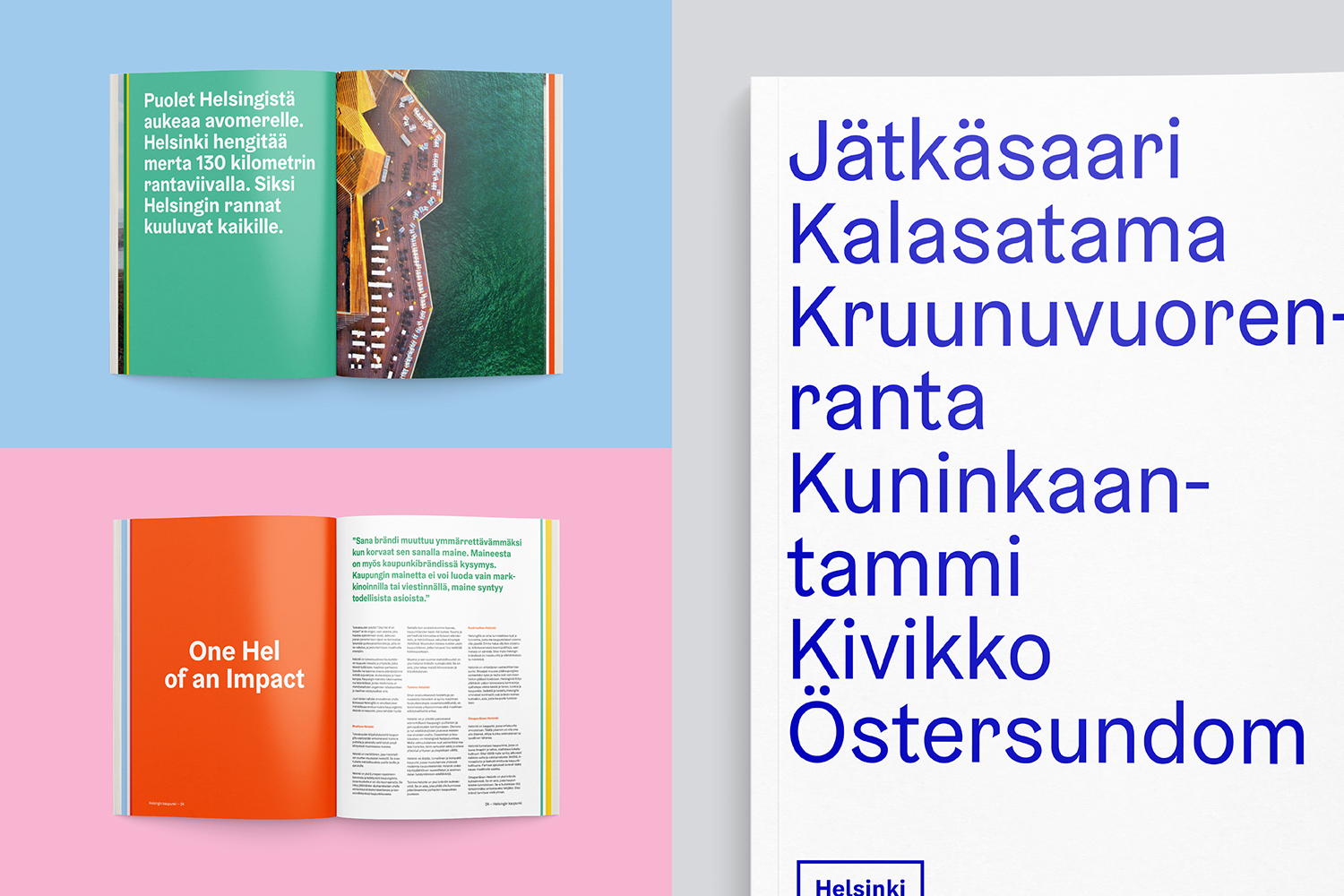
The result is consistent and cohesive. It effectively explores the diversity of people and place in colour, shape and photography. For the most part, it appears straightforward to implement and likely to offer the city some form of efficiency and financial relief, alongside a more resolved outlook. It certainly has a spirit of modernity and the logo container does have a fairly universal heritage sensibility without looking stuffy or tired. This histrionic component is more appropriately expressed through imagery, and presumably text.
A city identity is a lot more than its graphic identity but by the way it engages with its citizens, visitors and future residents, by the one to one human interactions, and the way they are able to move around the city and use its services etc. Graphic identity is far from a silver bullet, but it signals an intention and begins to unify the previously disparate and fragmented. There is a reassuring quality to a visual continuity, which is a great start. More from Werklig on BP&O.
Design: Werklig. Opinion: Richard Baird.
