Designed by Werklig

Teller by Werklig
The social and cultural activity of sharing stories has been, and continues to be, an essential part of human experience. Storytelling contributes to the cohesion of, and sometimes control over, individuals and groups, preserving and passing on knowledge, and instilling moral values. Many of us live by the values and knowledge established over thousands of years through stories. With improvisation...
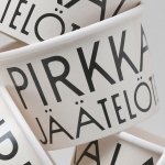
Pirkkalan by Werklig
It’s been years since millennials were first accused of buying too many avocado toasts and expensive coffees. The stereotype of young people loving handmade, refined and artisanal products holds true in their spending patterns, and today, that generation has matured into business leaders, reshaping the world’s mindset to align with these priorities. As consumers, Gen Z seem to be picking...
Sitko Pizza Co. by Werklig
Pizza making is a lot like brand identity design. It has many potential configurations: it can be generic or wildly individual, but fundamentally, it’s systematic, a framework of organised elements. It is a base that holds a variety of communicative assets and techniques (the toppings, if you will). Appeal is determined by how well this is orchestrated, and how well...
Helsinki by Werklig
In August 2017 Scandinavian design studio Werklig was commissioned to develop the graphic identity for the Finnish city of Helsinki, a capital with an urban region of roughly 1.4 million inhabitants and 751,000 jobs. The challenge was to resolve a disparate and fragmented visual system that represented a broad range of public services, departments and development projects that were helping and...
Holvi by Werklig, Finland
Holvi is a digital bank account created for entrepreneurs and micro-businesses with the intention of making banking, paperless bookkeeping and invoicing simpler and more efficient. Holvi is positioned as more than just a digital bank account, and comes with a plethora of integrated features. These include the seamless syncing of information between different systems, sending invoices in a few clicks, a...
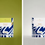
Suomen Jäätelö by Werklig
Suomen Jäätelö is a super-premium ice cream brand currently available in five flavours and a sorbet. These include Milk, Pistachio, Vanilla and Chocolate made from Finncattle milk, a Rhubarb sorbet and Spruce created in collaboration with iconic furniture maker Artek. Although ice cream is internationally ubiquitous, Suomen Jäätelö is described as having a distinctively Finnish character. This is expressed throughout its packaging design, developed by...

In Search Of The Present at EMMA by Werklig
In Search Of The Present is a new series of exhibitions on a 3–4 year cycle held at Helsinki’s Espoo Museum of Modern Art (EMMA). These intend to tackle many of the existential questions that we face in an ever changing world. The first exhibition, inspired by Olavi Paavolainen’s essay collection from 1929, took place between October ’16 – January ’17 and was a study in the representations...
Helsinki City Museum by Werklig
Helsinki City Museum, through its collection of objects and images, provides visitors with historical insight into the everyday lives and personal experiences of the people of Helsinki. It is free to enter and features 2400 sqm of exhibitions and public spaces, a cafe, inner courtyard, areas to relax and conference rooms. To coincide with a move to a new space;...
Hernesaaren Ranta by Werklig
Hernesaaren Ranta is an outdoor seaside area, located to the south of the Finnish capital of Helsinki, open during the summer months. It has food vendors, boat docks and terraces, and is part of an ongoing development project that also includes residential buildings. Graphic design studio Werklig were commissioned to create a comprehensive brand identity system for the entire area that, alongside...
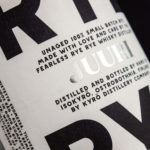
Kyrö Distillery Company by Werklig
Kyrö is a Finnish distillery, housed in a former dairy in the region of Isokyrö, that will yield a high quality 100% rye whisky in 2017 for national and international markets and currently batch produces a root variety for cocktails. Design studio Werklig was hired by the distillery to create their brand identity, which went on to include a logotype and custom typeface,...
Pikseli by Werklig
Originally built in the 1980’s by wireless pioneer Digita Oy, Pikseli is a building, located in the Vallila district of Finland’s capital city Helsinki, that provides office space to companies working within the digital industries. Design agency Werklig, commissioned to develop a new visual identity for Pikseli to attract new tenants, created a solution that takes the tiny universal screen unit of a pixel and...
Kontoret by Werklig
Created by consultant Ray Lindberg with the intention of setting new standards for flexible work environments, Kontoret provides low-cost office space by the hour, with wireless internet, printers and coffee, to freelancers, chief executives, local businesses and international travellers in the centre of Helsinki. Inspired by the “essence and basic needs of office work and the aesthetics of the classic office...