FranklinTill by Commission
Opinion by Richard Baird Posted 12 June 2018

FranklinTill is a futures research agency working with lifestyle brands, design-orientated businesses and organisations in a variety of sectors to explore and implement design, material and colour innovation. Their services include conducting, analysing and communicating research and bringing this to life through strategic insights, publications and experiences.
FranklinTill’s clients essentially turn to them for insight into form, colour and material, and their innovative and sustainable outlook. This, in turn, informed the development of their new visual identity, created by London based Commission. This is characterised by a critical coalesce of form, colour and material composition that serve to link business cards, stationery set and pin badges. Online, colour and form is explored, absent the tactile qualities of print, through the abstraction and diffused quality of imagery.

Meta–FranklinTill engages in two critical actions. Firstly, consultation with clients to identify design opportunities within contemporary culture—recognising and responding to shifts in the boundaries between technology, politics and social consciousness—with the intention of helping business and brands thrive in a rapidly changing world. And secondly, an editorial remit and events and exhibitions programme that generates insight into what is driving and shaping the creative industries.


Macro–In a broad sense, FranklinTill essentially observes, gathers and deploys insight into form, colour and material for a diverse client base who operate across many industries and sectors. They bring abstract and broad insight into foucs, and channel these into specific actions and activities, more on focus later. Commission do the same, and employ a similar process here. Not just literally in compelling material choice and graphic immediacy, but also in practice, in the use of new opportunities in print production. These converge to create a concise, memorable and relevant expression rooted in and articulating the practices of research and insight formalisation, its design and deployment.

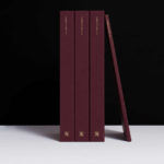
Micro–If there was ever an ideal use of extensive material diversity, paper marquetry, high contrast colour and the tactility of blind embossing, this is it. Aesthetic pleasure, conceptual relevance and clear communicative intention intersect in an intelligible and critical manner and share a similar interdependence as colour, form, type, proportionality, material and finish.
There is an observable symmetry between graphic design practice and the process of research and outcome actioned by FranklinTill, in fact, the FranklinTill graphic identity feels very much like a product of its own investigation into the creative industries. It is current, yet it has the potential to accommodate change–in colour, material and texture–that will help to give it a continued relevance. Colour and texture have an emotional and contextual potential—the potential to respond to place, person or industry—where arrangement and proportionality, material composition, form and finish establish a clear continuity. There is also a satisfying balance in the void between boards and the weighting of a blind embossed logotype.
The highlight here is the essential and critical interdependence of each detail. It is in the confluence of colour, material and form that a distinction emerges, where brightly colour boxes, increased use of paper marquetry, or the uptake in dyed boards and papers seem to be increasingly commonplace yet a cursory aesthetic detail.

Online, where the tactile component of identity is absent, the use of diffused imagery and transitions between the specific and abstract play, metaphorically, with focus. These make for beautiful backdrops set behind an abstract logo, recognisable in its use of colour balance and proportionality, and absent type. There is a problem of finding a way to deploy this within social media contexts. The rectilinear form does not lend itself well to those platforms that use circular avatar windows. Presently, publication imagery serves as an avatar, this does not work but could be easily resolved through proprtion and colour pairing.


The result, in the equal weighting of colour, form and materiality, in the full potential of graphic design, is far more sophisticated and temporal in its potential than the idiosyncrasy of type that characterised FranklinTill’s previous graphic communications. Side note, it is interesting to see the very specific and momentary nature of their publication design, it provides a useful opposite in which to measure graphic identity.
Where often dyed boards and print finishing has been used a final material flourish, it is a critical and essential component. Where this potential is challenged by the polished surface of the screen, the backlit vibrancy is leveraged to envoke a rich visual texture, a softness and transitional quality that envokes the materiality of frosted glass. More work by Commission Studio on BP&O.
Design: Commission. Photography: Luke Evans. Opinion: Richard Baird. Fonts: GT America.