Hages by The Studio
Opinion by Richard Baird Posted 22 June 2018
Hages began selling shortwave radios in Stockholm during the 1940s and is one of the oldest of its kind in Sweden. While the retailing of electronic goods has changed dramatically, sold increasingly online and on price by large chains, Hages has remained true to an independent spirit and established and developed a solid reputation.
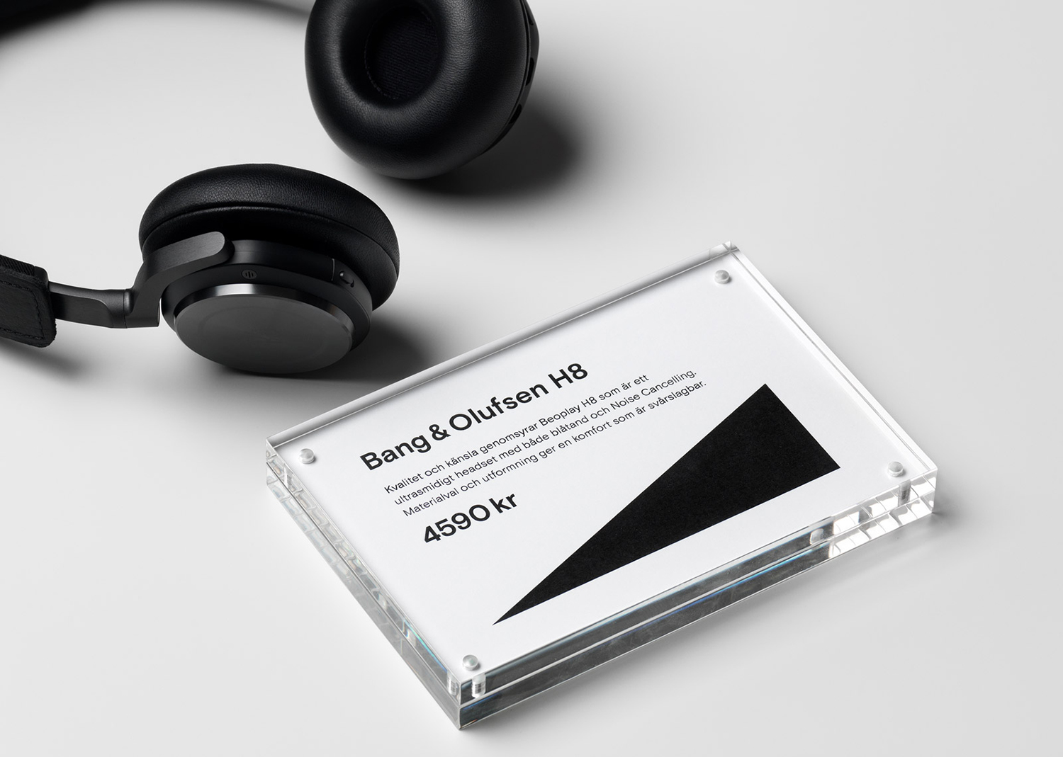
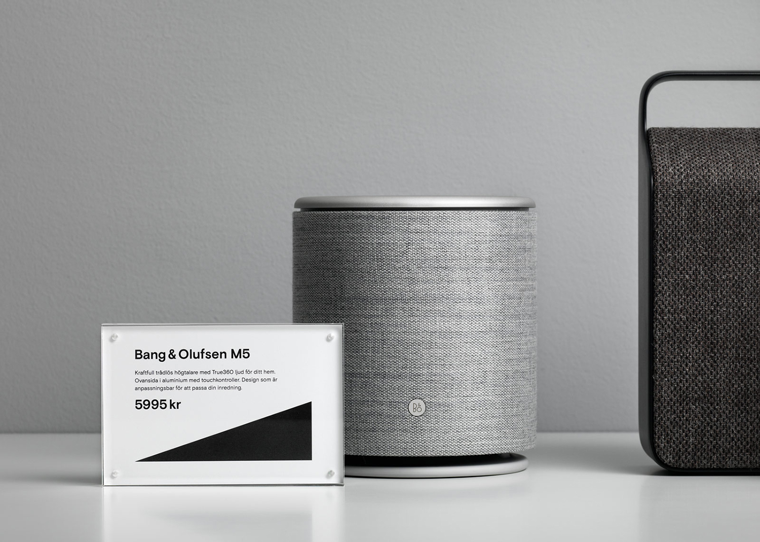
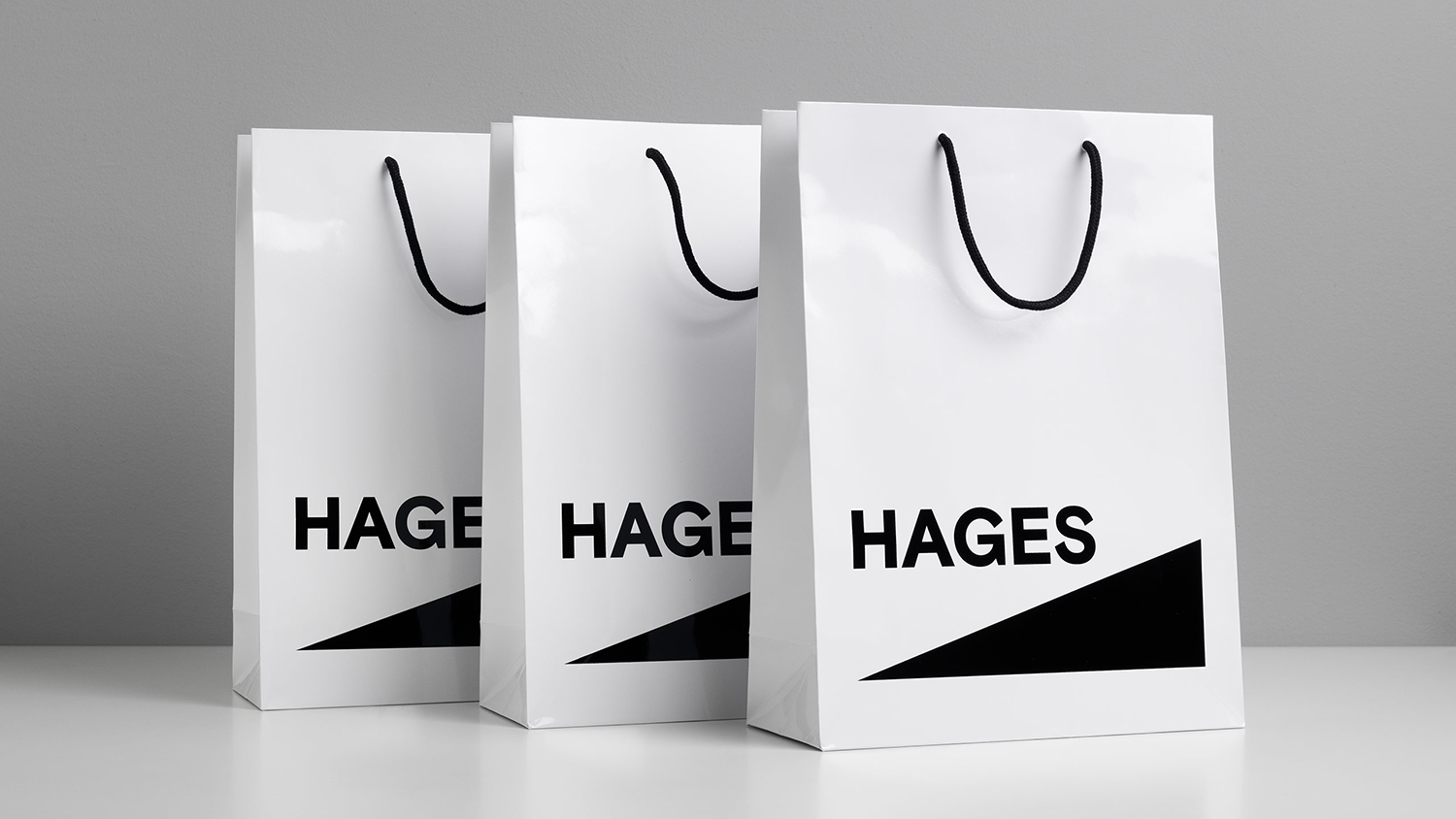
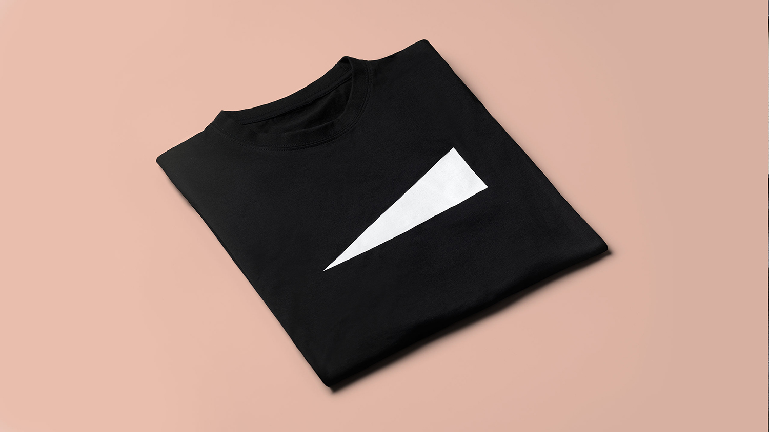
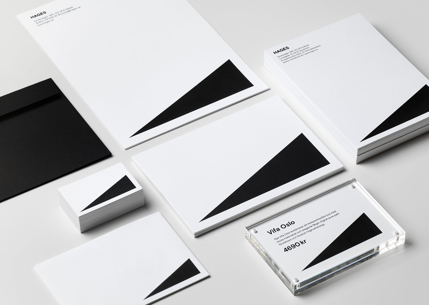
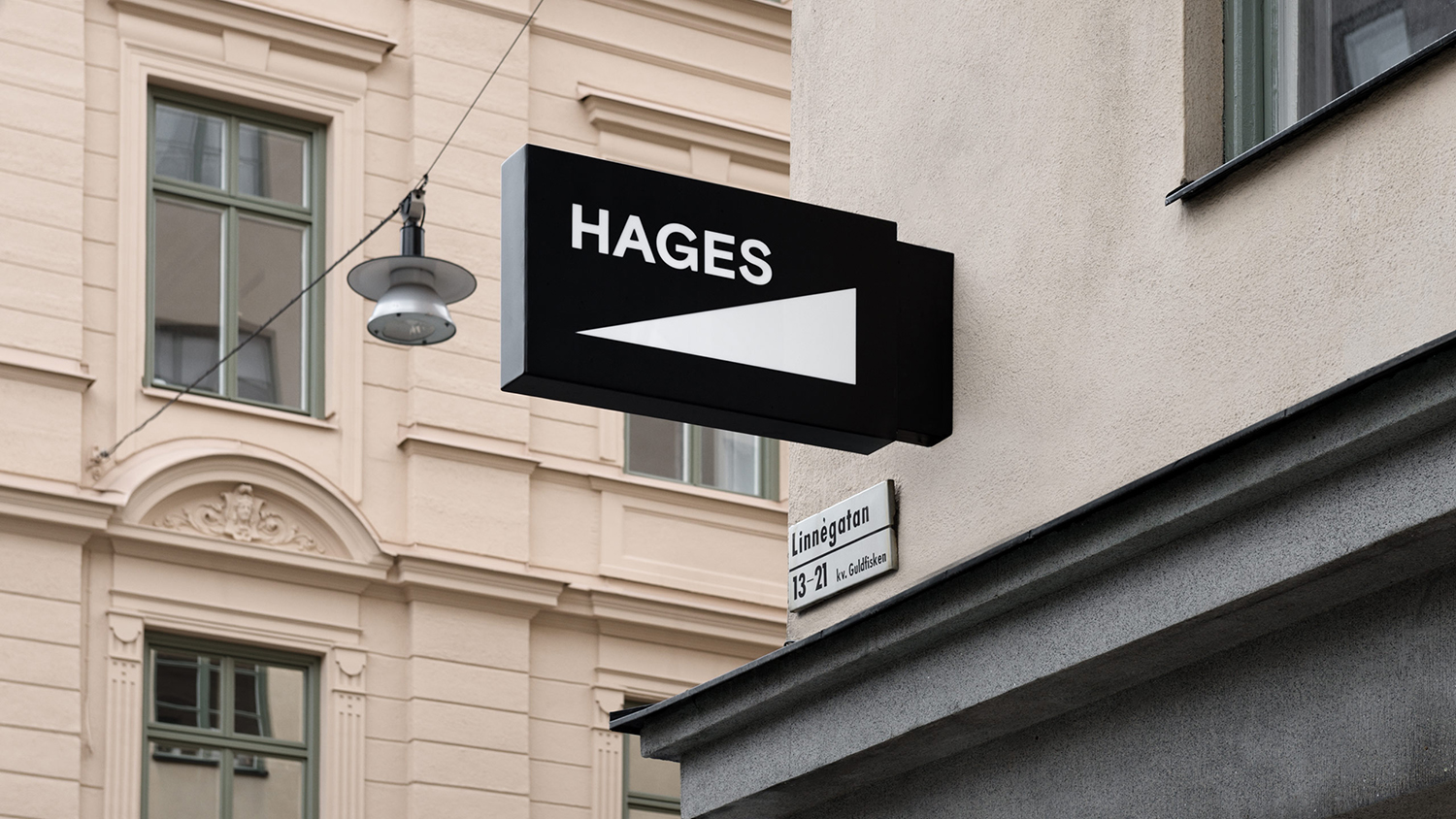
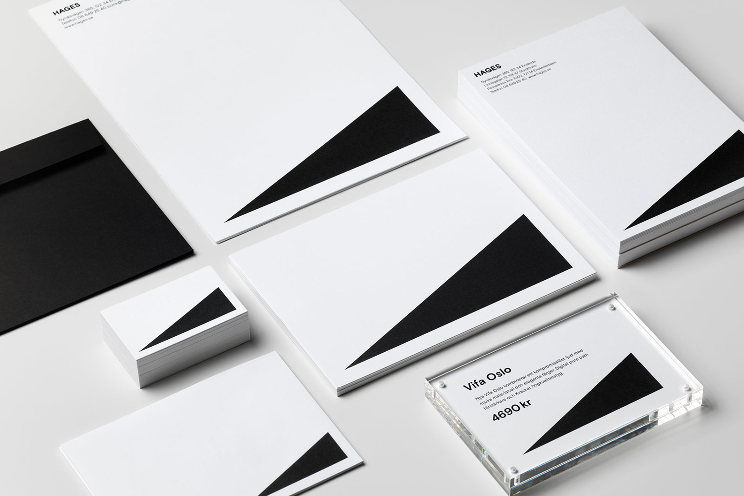
To coincide with the opening of their second store, Stockholm based The Studio worked with Hages to develop a new graphic identity, moving it from Hages TV & Video to Hage, creating a modern and reductive visual expression and reinforcing this through repetition across signage, stationery, business cards, t-shirts and bags.
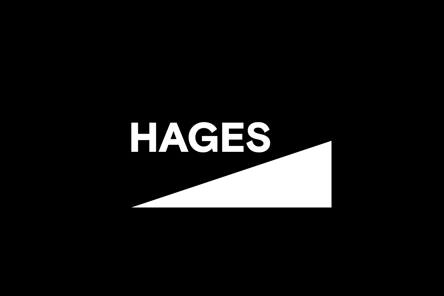
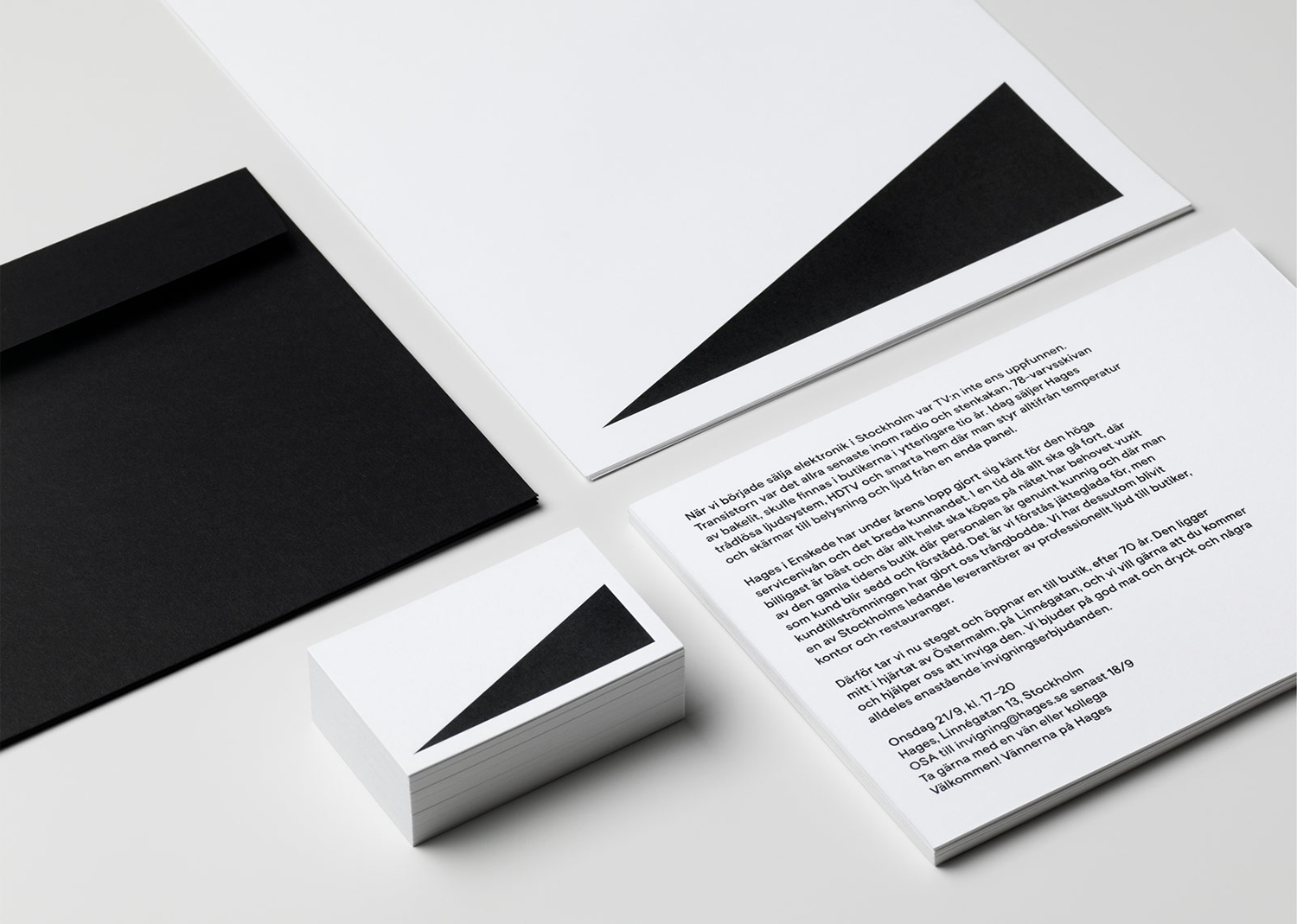
Although the form language employed is abstract in the absence of its haptic partner, contextually, within the audio visual retail environment, it is immediate. It is a universal graphic (uni-graphic) that spans and unites an increasingly diverse audio and visual world. There is a pleasant correlation between an electronics business with a significant legacy and the enduring visual language of the volume symbol that links early transistor radios with the digital devices of today.
Although not something that could be registered, or considered an ownable mark outright, it functions as a very present motif to project any number of associations on to. It has the capacity to eventually accumulate some of the legacy of the brand through its connection to name and in-store experience, whilst also projecting it forward in its modernity. Its potential could have been easily overlooked and is only truly realised in its unwavering repetition and bold proportionality across a variety of assets, and in conjunction with colour, type and arrangement.
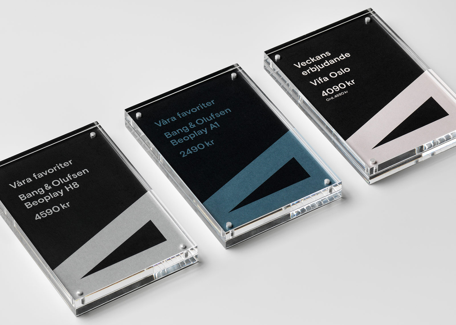
Type, form language, colour, arrangement, proportionality and repetition are effectively employed to create a distinctive and recognisable identity with the fewest assets. It recognises name as legacy and continuity, makes it an essential and critical component, the foundational element, whilst completely reconfiguring graphic expression, articulating an intention to seek continued relevance in response to a changing retail landscape. The bisection of print, the contrast of colour and the immediacy of form deliver impact. Type has a current and humanist warmth. And an unwavering commitment to shape and a belief in its potential to serve as a metaphorical device serves to develop recognition and accumulate intangible value.
Design: The Studio. Opinion: Richard Baird. Fonts: Basis Grotesque.
