Buk Seoul Museum of Art 2018 Season by Studio fnt
Opinion by Richard Baird Posted 3 July 2018
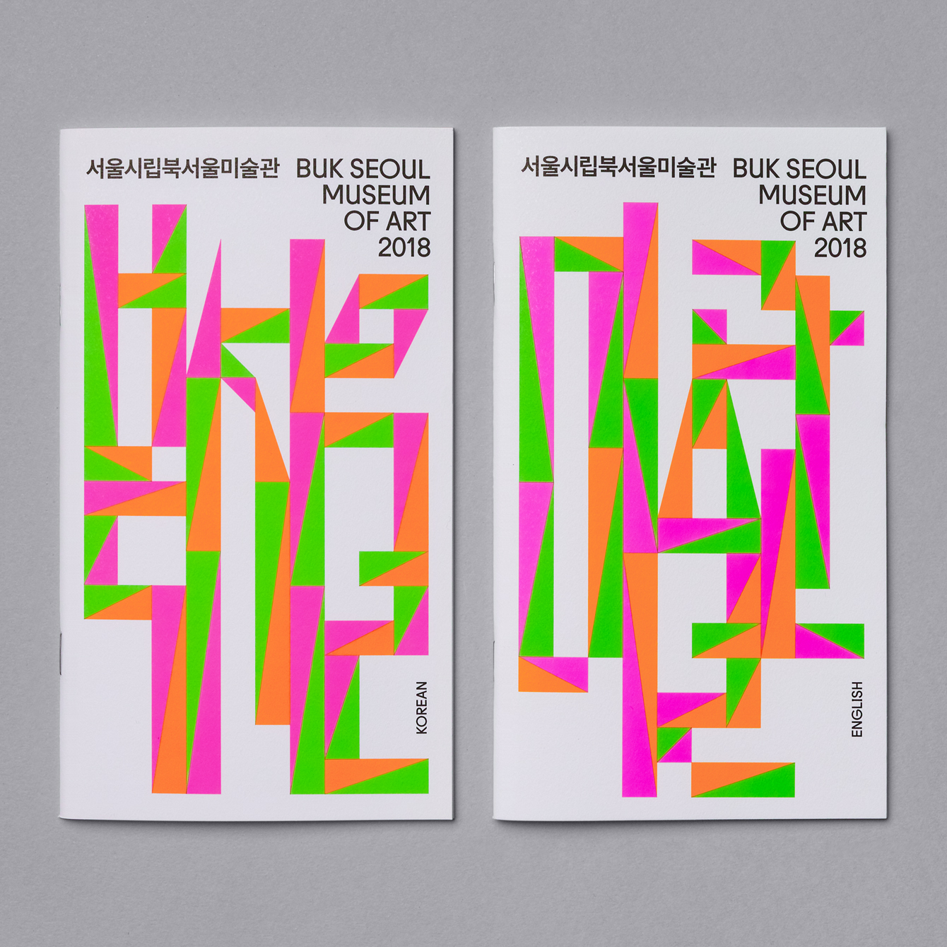
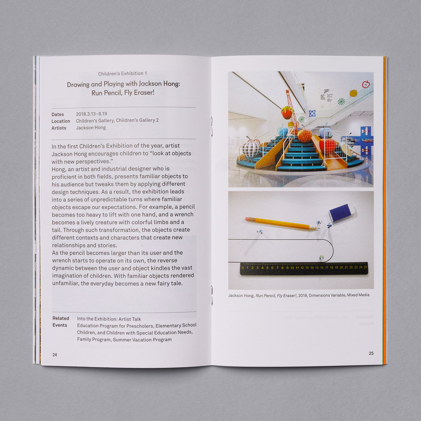
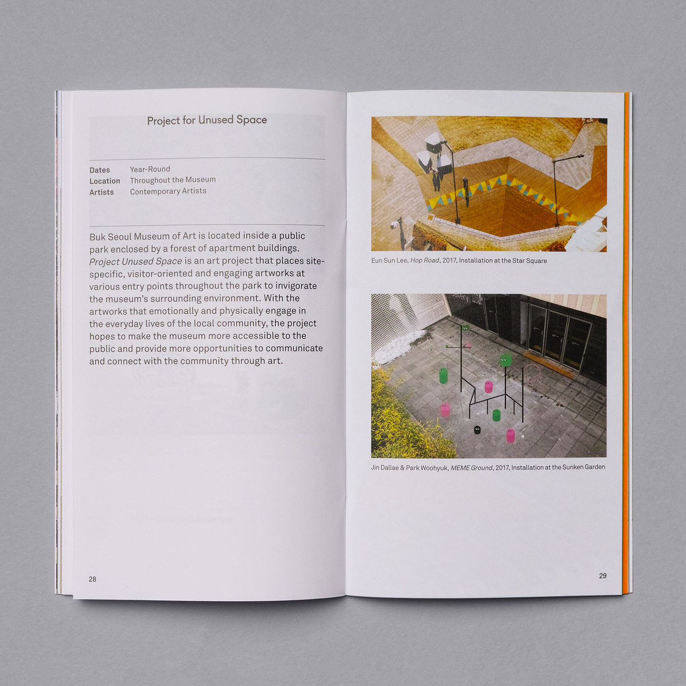
Buk Seoul Museum of Art is an art museum and park where art, community and nature coalesce. It promotes cultural activity and interaction and brought cultural spaces and facilities to the North-eastern part of Seoul where they were previously lacking. The museum is marked not only by its distinctive forms, designed by Samoo Architects & Engineers and completed in 2013, but in its interaction with the hill Nowon. The movement of people through and around built structure and natural park, and the dialogue and interaction between external structure of the museum and its shaping of natural landscape is captured in the museum’s 2018 season programme guide, designed by Studio fnt, through colour, form and imagery.
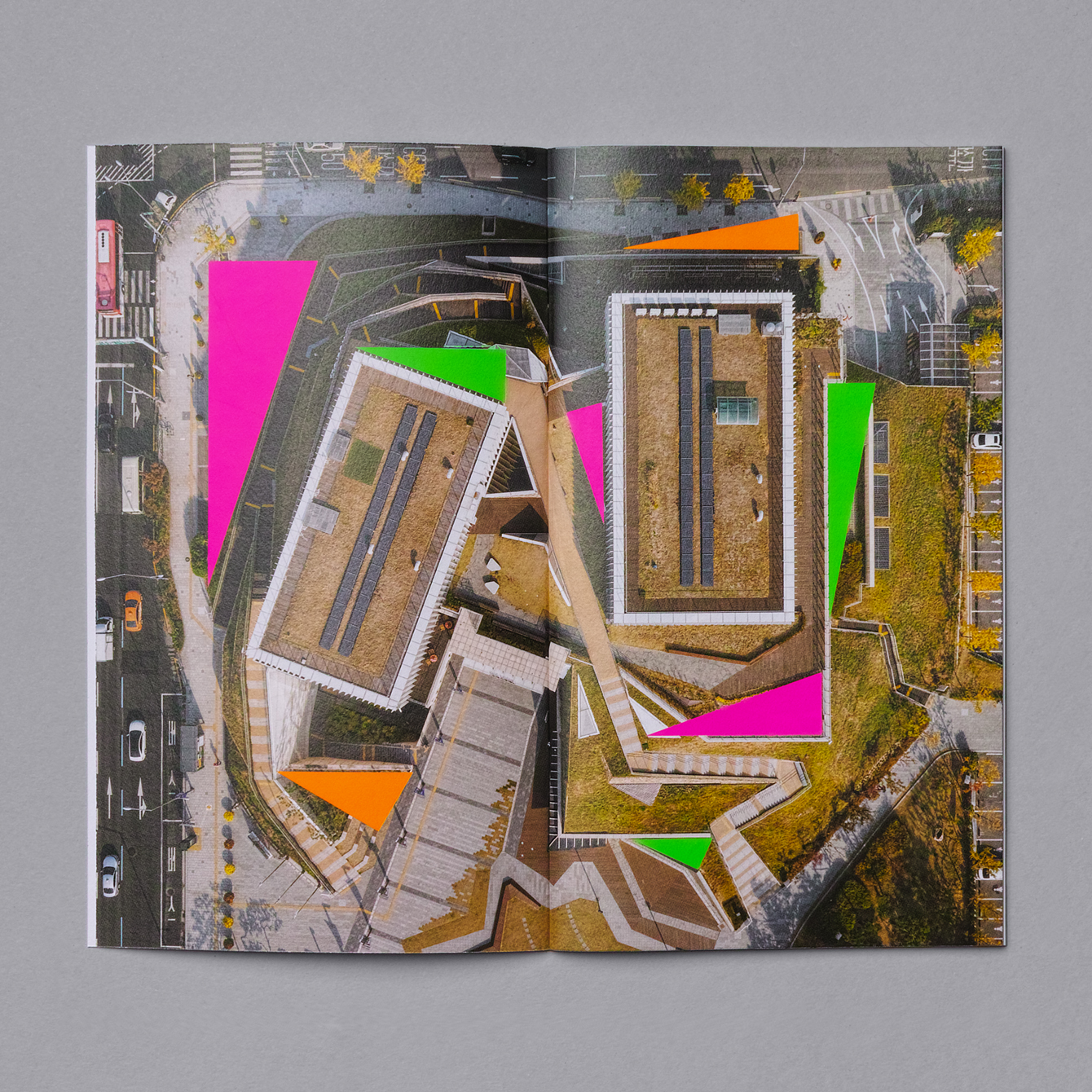
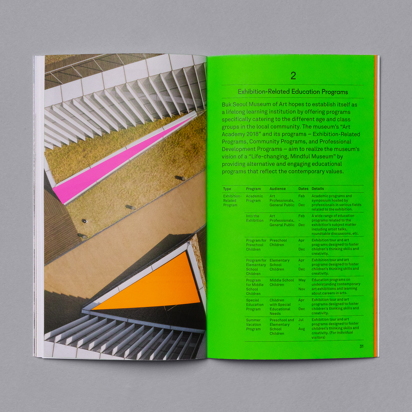
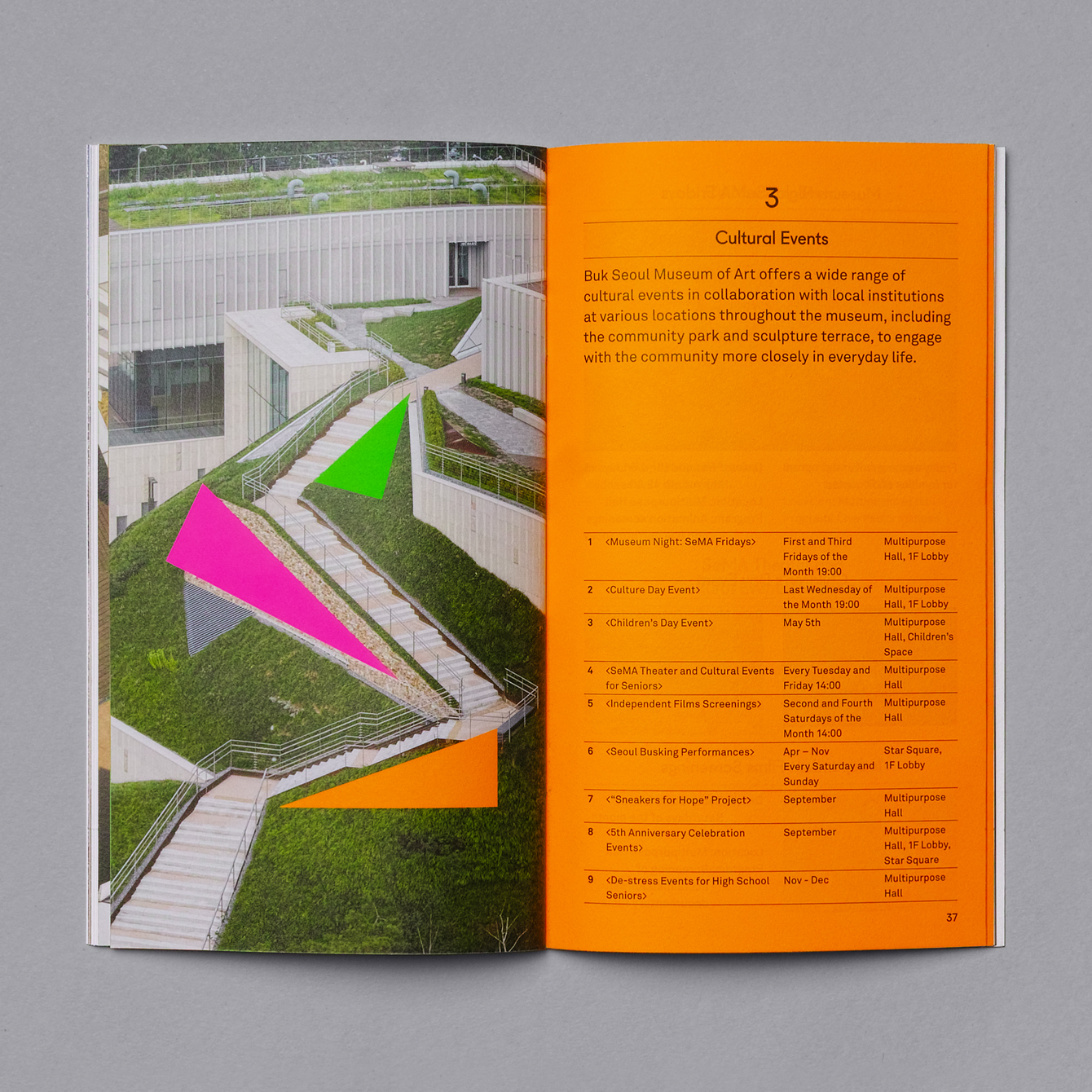
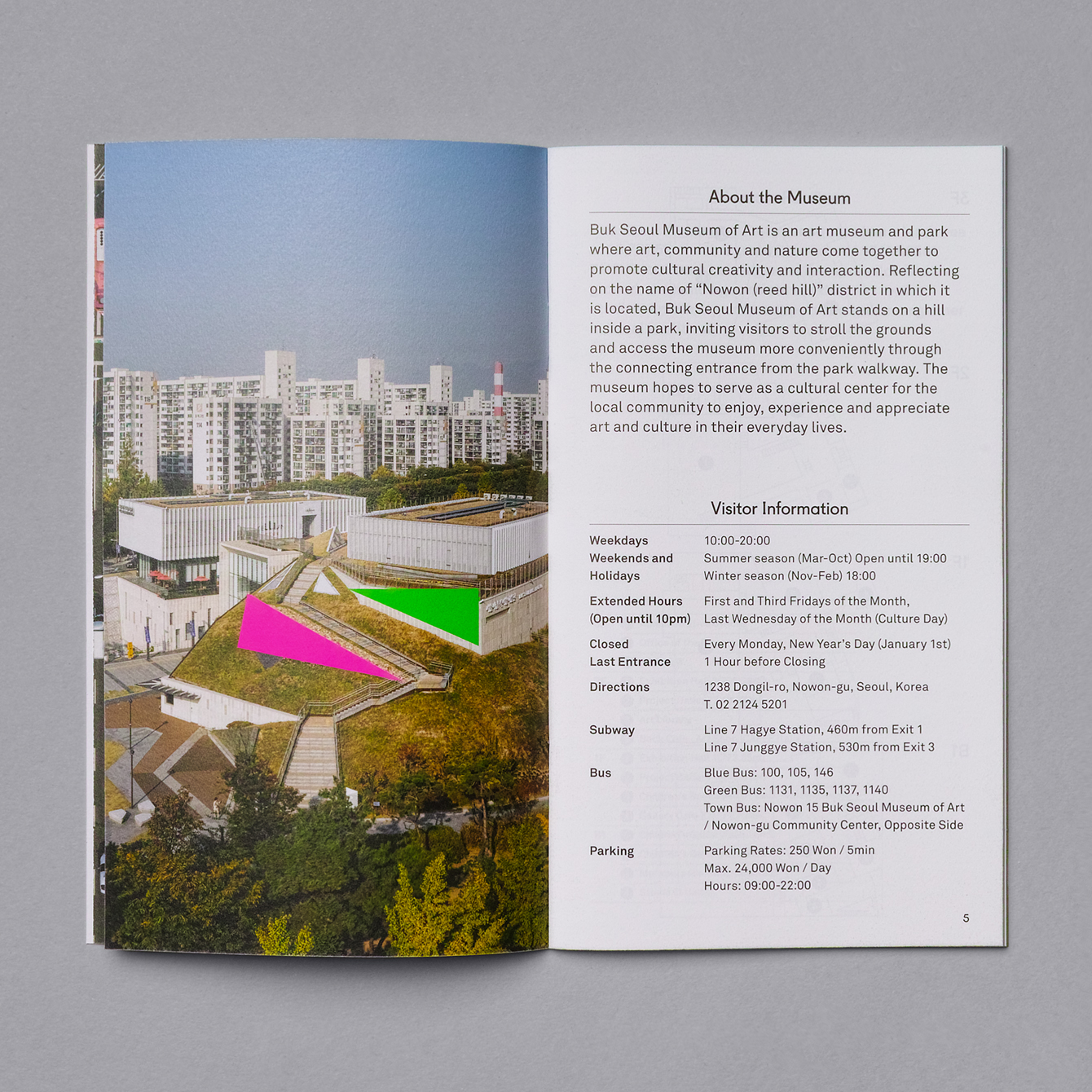
Meta–The museum has strong graphic qualities. The areal view in particular. There is a pleasant intersection between precise geometry, manmade and natural materials. Stone built triangular walls, the way grass moves up onto the surfaces of the building, and how the building appears to cut into and reconfigure the hillside are fantastic architectural gestures, gestures that are clearly rooted in the intentions of the museum to develop a space for creative interactions. The abstract and the material. Structure, people and parkland. This makes for a compelling reference point in which to build a distinctive graphic expression for the museum’s 2018 season program.
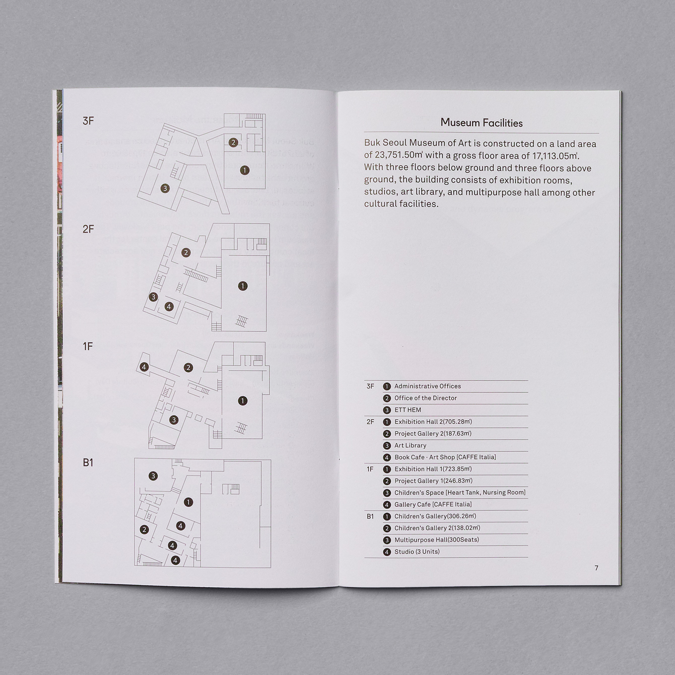
Macro–Buk Seoul Museum of Art falls within the graphic language of Seoul Museum of Art (SeMA) which is characterised by a mix of black humanist serif, grids and plenty of white space. This serves to link two very different buildings, modern and colonial period architecture, with a shared creative remit. Much like this new space, seasonal identities are reshaped with each new season but maintain a typographical and spatial continuity that speaks of modernity.
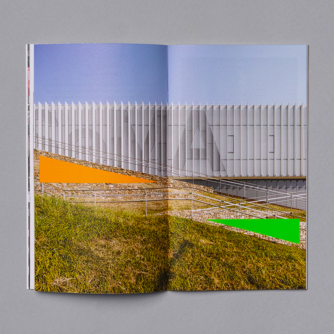
Micro–There are a couple of nice ideas and gestures at play here. There is a smart use of two-dimensional form to connect architectural structure, movement through the park and the potential for intersection and interaction, both as a strong cover graphic and in the mix of geometric shape and rich photography inside. Fluorescent colour serves to draw these out. They have a vibrancy and energy that feels well-suited to a dynamic public space as well as being eye-catching and distinctive but also has a seasonality. These call to mind the bright green grass of spring and the dried grass of late summer and Autumn, tying them more directly to the way the passing of time, the changing of seasons and light affect the natural landscape, architectural structure and the people that visit and interact with these. More work by Studio fnt on BP&O.
Design: Studio fnt. Opinion: Richard Baird.
