Osofor by Paul Belford Ltd.
Opinion by Richard Baird Posted 19 July 2018
Osofor will be a digital-first and lab-grown diamond jewellery business able to create stones of any shape and cut. It will offer a modern and sustainable luxury brand to those who desire the material qualities of diamonds without the environmental and sociological impact. Osofor intends to distinguish itself further by fusing enduring aesthetic desirability and artisanal practice with experimental materials, unexpected production processes, a highly-personalised service and a “beautifully-designed immersive online experience”.
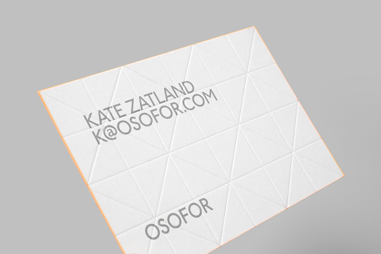
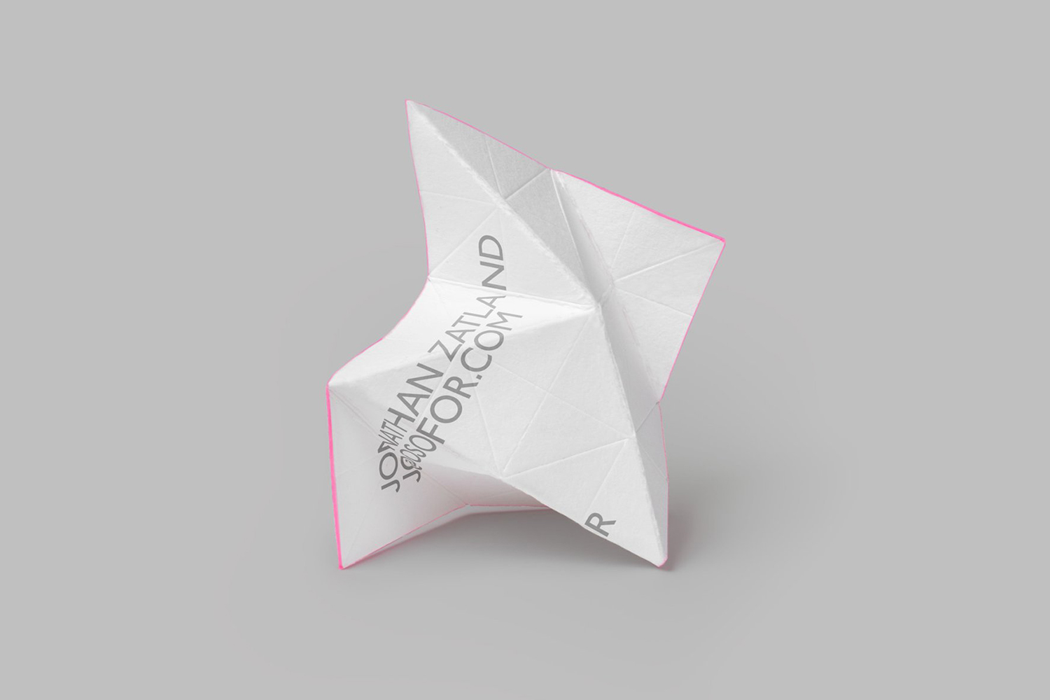
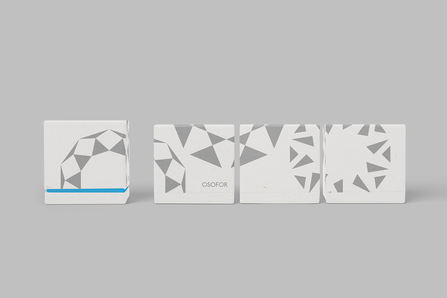
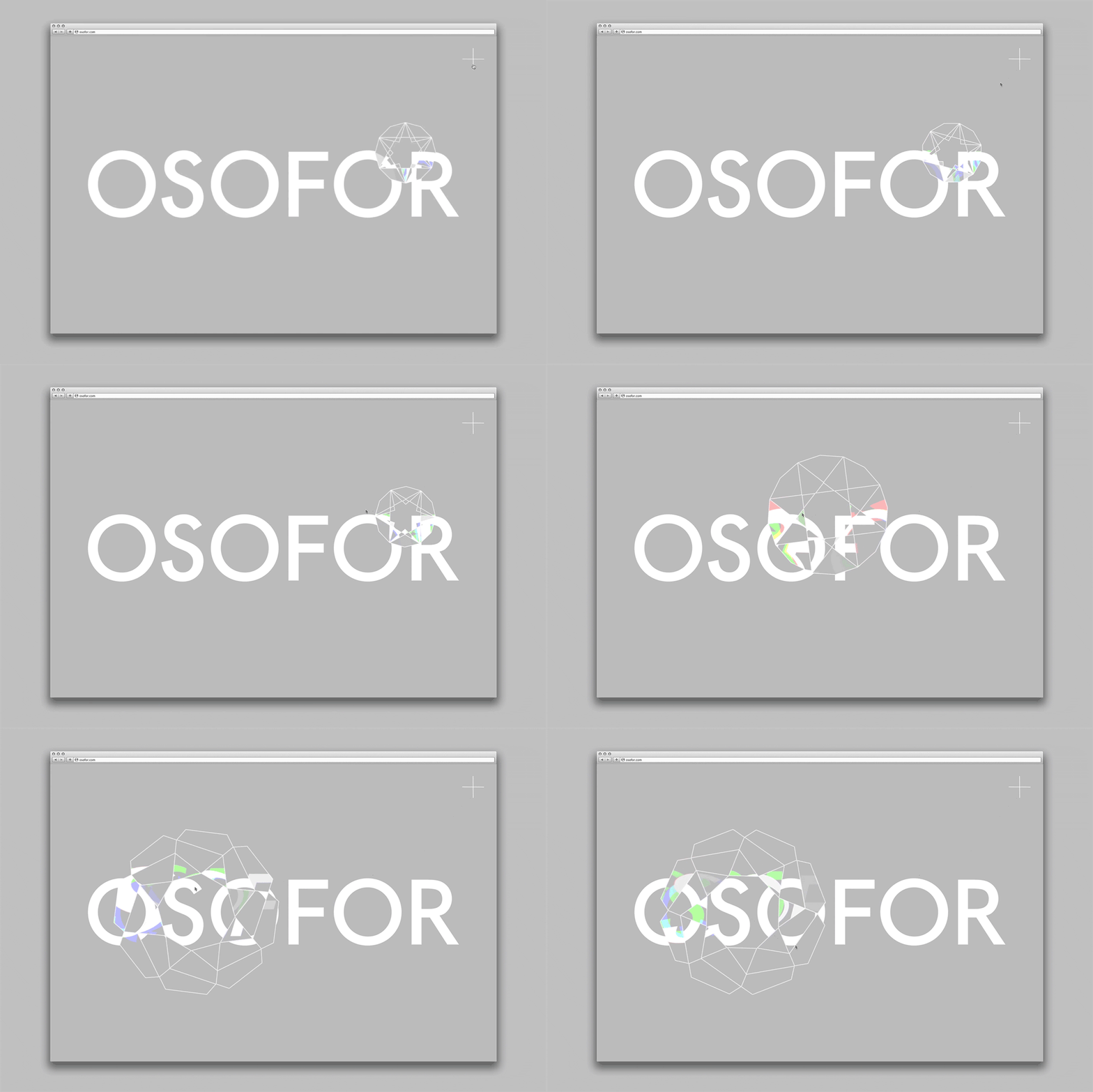
The business is currently at the stage of product development; working with scientists, material technologists and inventors to develop a carefully-crafted launch collection. Paul Belford Ltd. was commissioned by Osofor to develop its graphic identity. This is characterised by a variety of cut stone-like symbols, faceted stationery and an animated visual gesture online that refracts the white light of an uppercase sans-serif logotype. This links website splash page, business cards, letterhead and packaging.

BP&O breaks slightly from convention, publishing work that still has a speculative foundation, absent product or retail platform, but does bring a strategic breadth to the site. Early stage development in conjunction with early-stage identity design serves as a tool in which to give the impression of a total vision.

Presently, graphic identity feels very much reflective of Osofor’s early-stage development, an expression of potential to, say, investors. As the brand intends to be perceived as modern and luxury, one that pairs the enduring craft of diamond cutting with today’s material and productions technologies, its visual identity functions well to articulate this in a singular way with a familiar graphic immediacy, form and and colour language, but also with range and distinction in the variation of its visual, material and digital implementation.


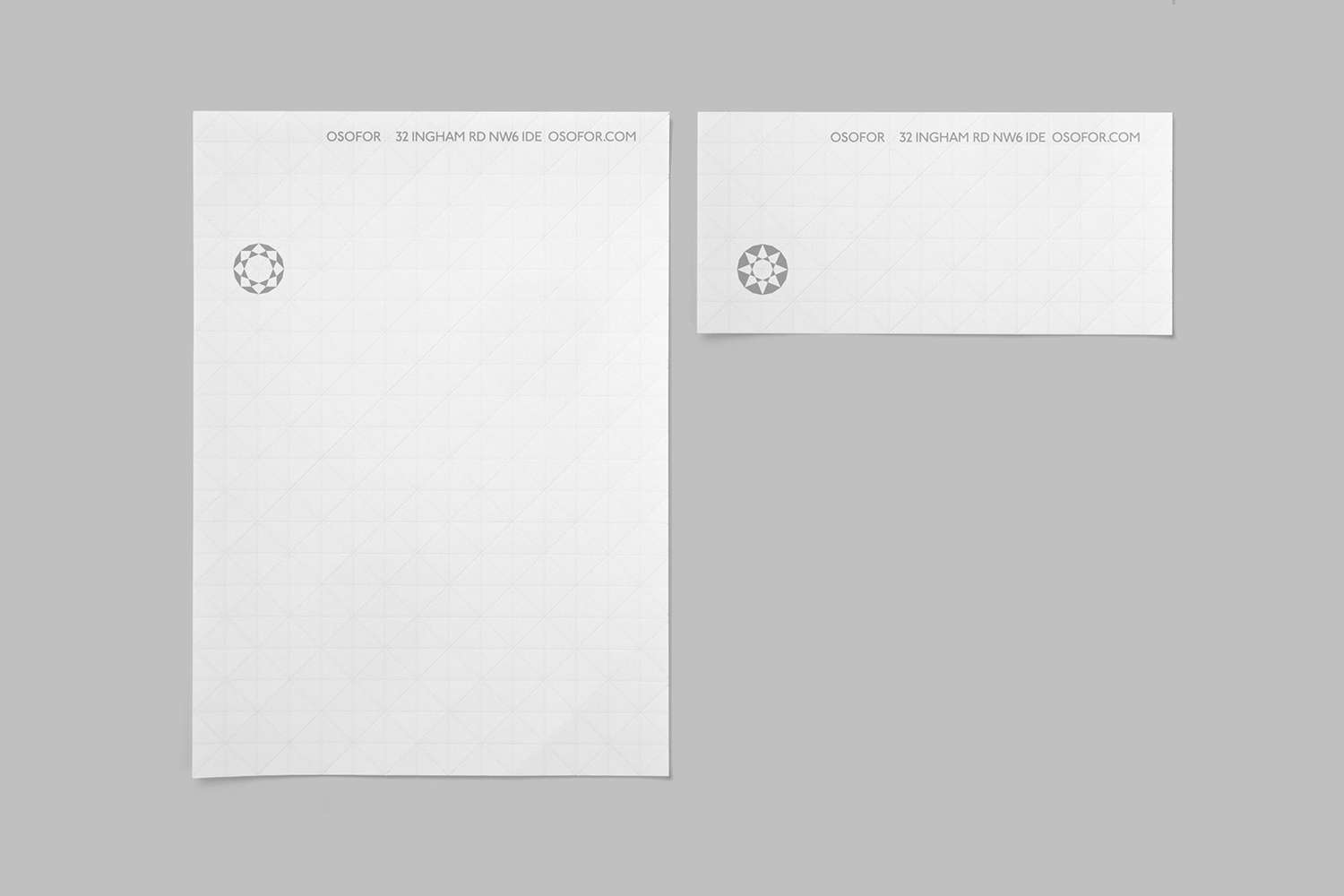
There are two essential components to jewellery, the tangible; aesthetic and material properties, and the intangible; the feeling of luxury, the potential of technology and the story of innovation and sustainability. As a digital-first brand, website will be a critical factor in resolving and communicating these. The combination of splash page, which features a lovely digital facsimile of the refraction of white light into colour through the prism of cut stone, the materiality of blind embossed facets and the implication of refracted light through slivers of colour, serve to touch upon technology and a very specific material experience. They should work as graphic gestures in which to project the intangible on to once the site is live.
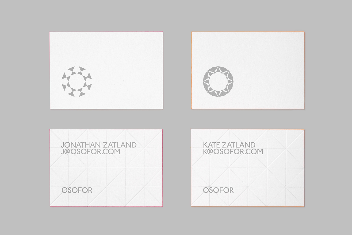
The symbols express something of the potential to cut diamonds into a variety of shapes. The value and distinction is in the breadth of the illustrations, rather than their individual qualities, although some of these are quite neat. There are plenty of distinctive shapes here, and outlines and fills help to further range and interest. As these are applied to packaging and stationery it is quite straightforward, as is the visual language employed, as mentioned earlier, but colour and print finish add a layer without an excess. Without the website, the digital experience and the intangible value at the forefront, this does feel early-stage but open to reconfiguration as the brand moves closer to launch. More from Paul Belford Ltd. on BP&O.
Design: Paul Belford Ltd. Opinion: Richard Baird. Fonts Used: TBC.
