Assembly by Ragged Edge
Opinion by Richard Baird Posted 6 August 2018

Assembly is a new hotel from Criterion Capital located on London’s Charing Cross Road. It throws out expensive amenities to instead focus on delivering fun yet sophisticated rooms in a central location. These rooms are aimed at experience-hungry young travellers and competitively priced with interiors inspired by London fashion icons and furnished with best in class beds, showers, sound-proofing and wi-fi.
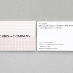
Brand strategy, developed by Ragged Edge, positions Assembly as the antithesis of the stay in and cosy offering of other hotels. “Get Up And Go” delivers this in a concise and impassioned manner. This is supported by emotive and enthusiastic copywriting and a graphic identity of typographical juxtaposition and imagery that focuses on access to an exciting and diverse urban experience rather than an interior indulgence. This connects posters, interior and exterior signage, social media imagery, tote bags, key cards and packaging.

Although positioned in opposition to the cosy and stay in verbal and visual language of other hotels, Assembly still is very much a place with smart and comfortable rooms. These are, however, compact, which is likely the foundational impetus that drove positioning. Acknowledging this, and giving it a modern experiential presentation linked to outside possibility feels smart whilst the naming of the room sizes Snug, Nest, Den and Pad lends these an appealing short-stay quality, essentially leaning into and owning the limitations others my avoid.


Meta–Hotels essentially facilitate access to something other than the room, a greater intangible value which is part of the experience economy. Yet, in need for differentiation, within the shared space of the city, seek to augment this access. To provide a comfortable base. The extent of this comfort (material, service, legacy) establishes competitive differentiation and layered price points.
Assembly focuses largely on access, the key to the city and its many experiences. The room key is perhaps the best singular expression of this intention in the intersection of functionality, form, words and graphic expression. Positioning sees young travellers as those who do not visit cities to hang out in hotels and increasingly use new technologies and services to find places to stay. Assembly finds a middle ground between the self-managed nature of Airbnb and the reassurance of a hotel chain. Central to this is a spirit of urban adventure and discovery, it does not co-opt the aesthetic of the surrounding landscape, although there are elements of this, only potential through words and custom type.

Macro–In many ways, graphic identity is broad enough to capture the essential qualities of many international cities, that architectural and sociological jostling of buildings and people. It does this primarily through typographical juxtaposition or type as topography, moving between the brutalist letterforms of the B, J, L P, R and U, through to the more classical formal attributes of the A, E, F H, K, M, N T,V,W and Y, and the grotesque shapes of the remaining letters. These are wrangled into a coherent logotype, statements and calls to action that drive home the material and cultural diversity of the city alongside colour. Disparities in line weight and flourish are mediated by caps, a consistent cap height and baseline. There is a play and sophistication in the combination of type, moments of awkwardness yet character, which is very much in line with the dressing of rooms and the London skyline.

Social media imagery and the imagery on the Assembly website co-opts the city into identity; architectural and sociological character. These are modern, diverse and representational. There are an immediacy and reality to many of these, they capture the spirit of the hotel, and that of the Instagram platform which essentially means it lacks polish but has an authenticity, dissolving the barriers between hotel character and guest.
Other highlights include the collage-like nature and animation of image and type online. The breaking and jumbling of words into clusters of letters. The photography of Our Location captures the arts and a sense of play, although without words does not feel complete. And finally, a simple booking process built around a sentence.

Copy Opinion by Seth Rowden
This is a brand that knows their audience. I can almost hear the questions in those early meetings: How do most hotels sell themselves? Answer: Let’s do the opposite. How do we describe what we’re about in a few words? Answer: “Get up and go” – a great brand statement backed up with a set of assertive slogans such as “Wake up to the city”; “Don’t visit live it”; “Less chill more thrill”. The language used is an integral part of the identity, with these snippets acting as a declaration of Assembly’s opinion on travel.
What makes this strategy work is that it’s based on observation. Some people visit cities to explore, not to see the inside of a hotel room. The video leads with this insight. We see bold flickers of text reminiscent of a faulty television screen. The message tells us to kick back, unwind and get cosy. Then the hard break to a repetitive yawn. This last touch reminds me of a collective response from a group of people on social media, like hearts (or in this case, yawns) floating across a Facebook live video.
The sentences are short and fast-paced, just like a city. A few have double meanings that are dangerously close to sounding dismissive. Lines like “Get lost” and “The hotel that doesn’t want you to stay” appear in context, and would likely appeal to a younger audience. I like the repetitive use of the verb “get” as a memorable hook throughout the video, although some lines sound better than others. “Get surprised” feels unnatural and “Get kebabs” is a definite wild card, whereas “Get goosebumps” is rather lovely because it is specific and avoids cliche.
The result is an impressive use of language that captures the energy and variety of things to explore in London. Ragged Edge show us that people are moved by good ideas first, and everything else should come second.