Broadgate by dn&co
Broadgate is the largest pedestrianised neighbourhood in Central London. It is adjacent to the busy transport hub of Liverpool Street station, surrounded by Shoreditch, Spitalfields, Old Street and the City, made up of a diverse community and uses that span innovation, finance, food, retail and contemporary cultural activities. The area will receive a £1.5 billion investment to further its development...
Piccolo by Here Design
Piccolo is an Italian seed brand with a particular favour for those that are ideal for urban growers, people with small balcony gardens or working with limited space. It is a brand with character, with product naming that includes Slim Jim Aubergine and Spacemaster Cucumber expressing the space-smart dwarf varieties of the range. Piccolo worked with UK-based studio Here Design to develop a...

London Fashion Week by Pentagram
Twice a year the British Fashion Council exhibits the very best in British fashion to national and international audiences. It does this through three events, each held at Store Studios on the Strand. London Fashion Week (LFW) and London Fashion Week Men’s (LFWM) offer the industry a look at upcoming womenswear and menswear collections, while London Fashion Week Festival (LFWF) provides...
Colours May Vary by Build
Colours May Vary is a Leeds based creative lifestyle store, independent bookshop and events space. Its physical and digital stores are filled with a variety of products, from riso prints, books and magazines to ceramic sculptures, cards and banners. There is a variety to these objects, yet a curatorial through line of beauty and usefulness that makes the Colours May...
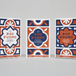
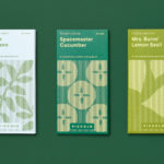
Riso D’uomo by Here Design
Riso D’uomo is a Milanese Carnaroli rice brand, cultivated from the same stock over hundreds of years, and grown within sight of the historic Duomo di Milano. Carnaroli is often referred to as ‘the king of rice’, and is known for its high-quality nutritional properties, cooking consistency and a ‘bite’ that makes it ideal for risotto. Taking inspiration from Riso D’uomo’s provenance, specifically the ornate...
Boundless Theatre by Spy
Boundless Theatre, led by Artistic Director Rob Drummer, is a UK based theatrical group that creates plays for 15 to 25 year olds, “as well as curious others”, that respond to a diverse global culture and empowers young people to collaborate and find their voice. In the spirit of the name, Boundless Theatre tours both nationally and internationally. With the intention of...
London School of Hygiene & Tropical Medicine by Spy
The London School of Hygiene & Tropical Medicine (LSHTM) was founded in 1899 and has established itself as a world leader in the fields of research and postgraduate education in public and global health. The university is made up of more than 4,000 students and 1,000 staff across 100 countries, and is one of the highest-rated research institutions in the United Kingdom....
Rimowa by Commission
Rimowa, an abbreviation and then compound of founder Richard Morszeck Warenzeichen name, is a Cologne-based manufacturer of luxury luggage. It has a significant history, beginning in 1898 as a travel and leather goods maker known for its innovative approach, and growing to become an international brand with a distinctive line of polycarbonate and aluminium products. Rimowa’s first fully aluminium designs were created following a...

Deptford X by IYA Studio
Deptford X is an arts festival that takes place over ten days across a number of public sites and spaces throughout the district of Deptford, south-east London, with the intention of engaging audiences in active and unexpected ways. This year’s festival, the 18th, builds on a new curatorial approach which was first trialled in 2016. To coincide with and mark this...
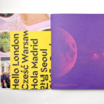
Campus by MultiAdaptor
Campus is Google’s network of co-working and event spaces for the many start-ups it has and continues to help fund. These are located in London, Madrid, Warsaw, São Paulo, Seoul, and Tel Aviv, with another to open in Berlin soon. The Campus community has over 80,000 members and collectively received over $537 million in funding which has created more than 11,000...
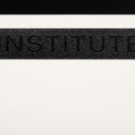
Institute by Commission Studio
Institute is a full service creative studio from New York working with clients to connect with people through creative direction, live experiences, concept development, content creation, production and post-production services. Institute’s work is described as being underpinned by thoughtful and meaningful creativity, and although their clients are often high profile, their presence is intentionally modest. London-based Commission Studio worked with Institute to develop...
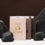
Old Spike Coffee by Commission Studio
Old Spike is a coffee roastery, subscription service and wholesaler, cafe and social enterprise working with the homeless, located in South East London. It is situated on the site of a former workhouse, a place where the poor would break rocks over metal spikes for food and lodgings, and where the roaster gets its name. With a desire to separate the roastery’s commercial...