Riso D’uomo by Here Design
Opinion by Richard Baird Posted 5 March 2018

Riso D’uomo is a Milanese Carnaroli rice brand, cultivated from the same stock over hundreds of years, and grown within sight of the historic Duomo di Milano. Carnaroli is often referred to as ‘the king of rice’, and is known for its high-quality nutritional properties, cooking consistency and a ‘bite’ that makes it ideal for risotto.
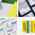
Taking inspiration from Riso D’uomo’s provenance, specifically the ornate marble floor tiles of Duomo di Milano, Here Design developed a graphic identity for the brand that draws a striking aesthetic response from a combination of type (Mostra Nuova & Granby), colour and illustration. This serves to differentiate, whilst also touching upon origin and the historical continuity of the stock.

Although the stylistic result is one of impact and clear differentiation in a conservative and conventional market, there are a couple of neat associations at play. Drawing heavily on the navy blue and terracotta patterned floors of Duomo di Milano, yet reducing these down to a modular system of solid shapes, outlines and fills, Here Design build a cohesive visual expression that weaves together an element of history, regionality and grandeur. This is less about blunt and generic geographical image, rather a singular and memorable idea with a number of relevant and interesting allusions.


Illustration forms an unmistakable continuity. One that can accommodate a plethora of rice varieties. There is just enough variation in shape, lines and fills to divide the range, although, presumably, shelf layout helps. The relationship between illustration and type is clear and satisfying. Type similarly plays with the period and the artisanal, while size, weight and arrangement establish a simple hierarchy.

There is an elegance and visual drama to the work that feels fitting for the “king of rice”. It finds a balance between retaining many of the historical qualities of the reference point whilst developing this in a way that is modern, unique and useful going forward. Often the premium and artisanal demands restraint, space, typographical nuance and an element of materiality in surface or finish, this is quite different. The value is in the idea, in the uniqueness and boldness of its graphic expression. More work by Here Design on BP&O.
Design: Here. Opinion: Richard Baird. Fonts Used: Mostra Nuova & Granby.