London Fashion Week by Pentagram
Opinion by Richard Baird Posted 12 March 2018

Twice a year the British Fashion Council exhibits the very best in British fashion to national and international audiences. It does this through three events, each held at Store Studios on the Strand. London Fashion Week (LFW) and London Fashion Week Men’s (LFWM) offer the industry a look at upcoming womenswear and menswear collections, while London Fashion Week Festival (LFWF) provides the general public with a unique shopping experience.
The London-based studio of Pentagram, led by partners Jody Hudson-Powell and Luke Powell, created the graphic identities for all three events. While each is distinct in its content and audience, they are linked by the concept of ‘discovery’, and the intention of bringing to light and juxtaposing emerging new talent and London Fashion Week’s enduring legacy. This is expressed by the intersection of lettering and type. Each event is founded on this interaction, yet has its own unique character which then forms a continuity across their own print and digital communications, from posters and brochures to motion graphics and supergraphics.


The delicate calligraphic lines, stroke contrast, quirks and flourishes of Ogg, as well as its consistent typesetting, functions as a useful communicative and visual anchor, one that effectively alludes to an ongoing legacy and craftsmanship. The visual language at play is familiar, universal and well-suited to a broad audience. Lettering and custom typography, interlaced with Ogg, is a recurring motif across all three events. The disparity between the two is acute. As a concept; the tension between heritage and modernity, is intelligible and stylistically interesting in its resolution.
While typographical juxtaposition offers a communicative immediacy and visual impact, there are moments of subtle commonality and thoughtfulness throughout. This appears to be largely based around an implied materiality, which ties in well with fashion and has an interactivity that alludes to a critical relationship between past and present, enduring ideas and practices, alongside new voices and technologies. This is explored in overlaps, the layering of ink, transparency, grain, depth and motion.


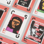
London Fashion Week Men’s is characterised by loose organic lines and loops, the suggestion of light and shadow, grain and a black and orange colour palette. Cropped and oversized type is eye-catching, moving between abstract shape and well-defined letterforms. Its initial impact is followed by a finer texture, a sense of the urban and spray painted. Eye-catching form followed by detail up close is something resonates well with clothing. As Ogg is weaved into this there is an interesting mix of interdependence and what Pentagram describe as agitation. A jostling for prominence.
Modern urban artwork with a cut and paste collage quality explores a stylistic and thematic intersection that feels fitting for the concept of discovery, new ideas, new talent and the creative process. It is a simple and intelligible expression of the overarching concept that links all the events, and brings a bit more visual breadth to the work.


London Fashion Week


London Fashion Week, the womenswear event, immediately subverts tired gender stereotypes. There is a strength and unflinching immediacy to the direction. Where the approach to Men’s had a soft, organic and dark quality, Women’s is light and bright, sharp, angular, bold and unwavering.
The layering of ink builds in a sense of the material and tactile, well-suited to a fashion event. The relationship between the legacy implied by Ogg and the bold and sharp character of custom type makes for a clear communicative intention, one of absolutes, the bookending of time, the past and present. Its brutal and architectural implementation feels very current. Colour contrast here is much lower between the two typefaces. They become difficult to define, almost inseparable, a critical relationship is formed, in contrast to the jostling of the men’s graphic identity.
Oversized type and its cropping reduce type to abstract forms. A distinctive and strong graphic expression is formed, particularly across the invitation envelope, which is a real highlight. Again, this feels really well-suited to an industry of strong silhouettes, bold graphic patterns and signature colour.


London Fashion Week Festival

London Fashion Week Festival brings over the sharp angular forms of the Women’s event, but has a lighter and softer colour palette. Ogg is drawn out using black ink. The historical component, the legacy of the event, is emphasised and given prominence over the new and challenging. Rotating type, allowing it to run down printed contexts that are slim, further divides it from LFW. The introduction of fashion photography brings to the forefront garments and style, it is more literal in its connection to fashion. As an experience for the general public this falls closer to retail communication, however, custom type and its arrangement layers this with a bit more edge, with a slight transparency and inversion of colour creating a clear correlation between type and image.


The work stands out for its strategic and conceptual foundations, as much as its stylistic response. There are moments of both obvious and subtle commonality and difference. This affords the events both a continuity and difference in response to audiences, yet together, project a unified vision and intention, an industry authority and sense of scale. More work by Pentagram on BP&O.
Design: Pentagram. Partners in Charge: Jody Hudson-Powell and Luke Powell. Project Team: Amy Joycey, Ella Sutherland, Jack Llewellyn & Mat Hill. Fonts Used: Ogg.